A palette or color scheme is a choice of colors originally used in artistic and design contexts. In data visualizations color can be an useful mean to add more information to a plot, due to its aestetic appeal and intuitive contrast: most people can differentiate a large range of colors.
Cartographers have been researching how to represent quantitative variations of magnitudes in spatial representations, especially in choropleth maps. One of the better known family of color schemes developed for that purpose are the Brewer palettes, created by Cynthia A. Brewer. In this website we can test the Brewer palettes in the context of geographical information.
Brewer palettes are available in R through the RColorBrewer package. Here I will present the available Brewer palettes and how to use them in ggplot.
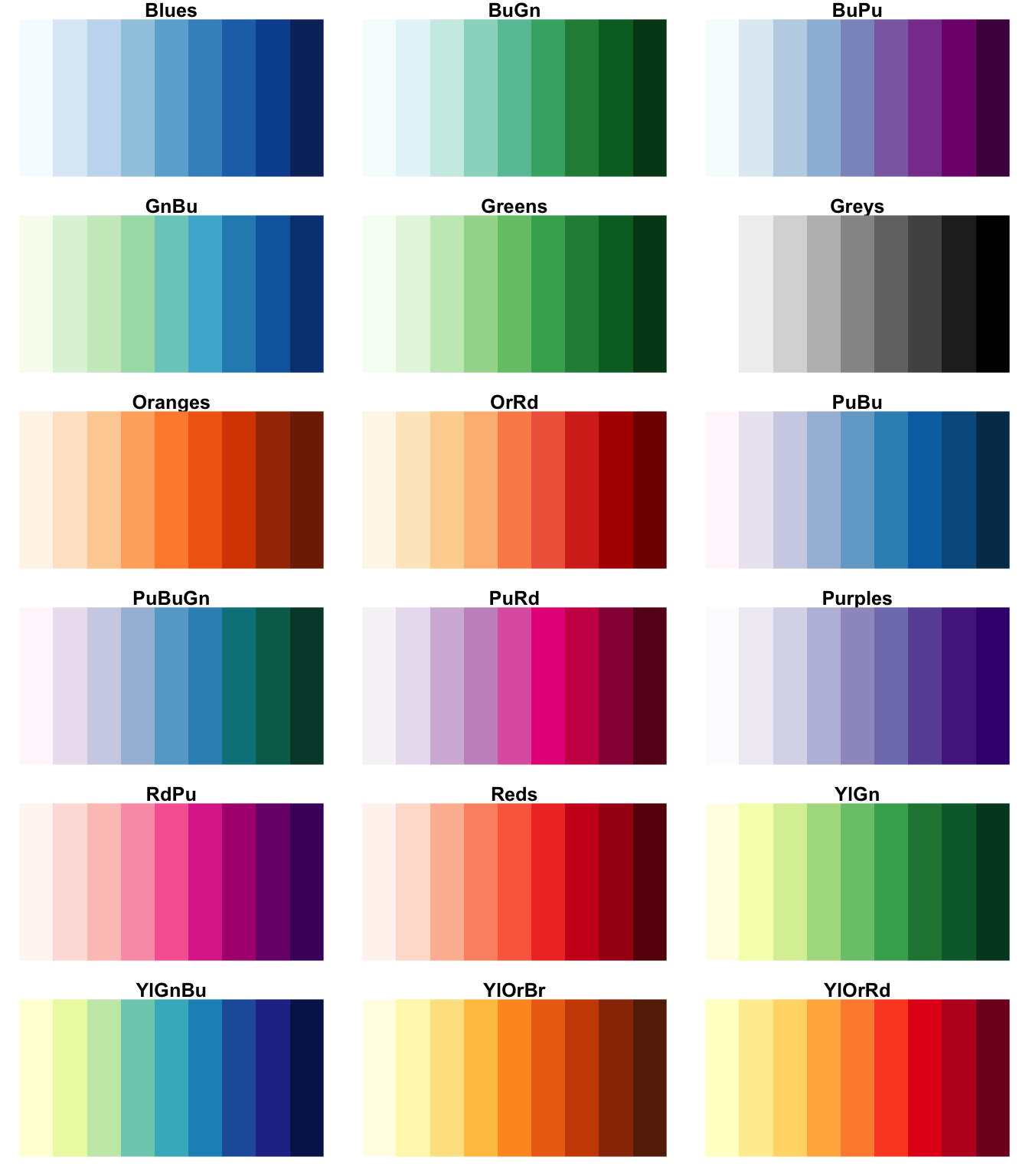
Sequential palettes
We can use sequential palettes to represent ordered data, either categorical or numeric. Sequential Brewer palettes use lighter colors for low values, and darkdf for high values. Sequential Brewer palettes can be monochrome, like Greens or Greys, or part-spectral like YlGn or YlGnBu. Here are presented the 18 sequential Brewer palettes:
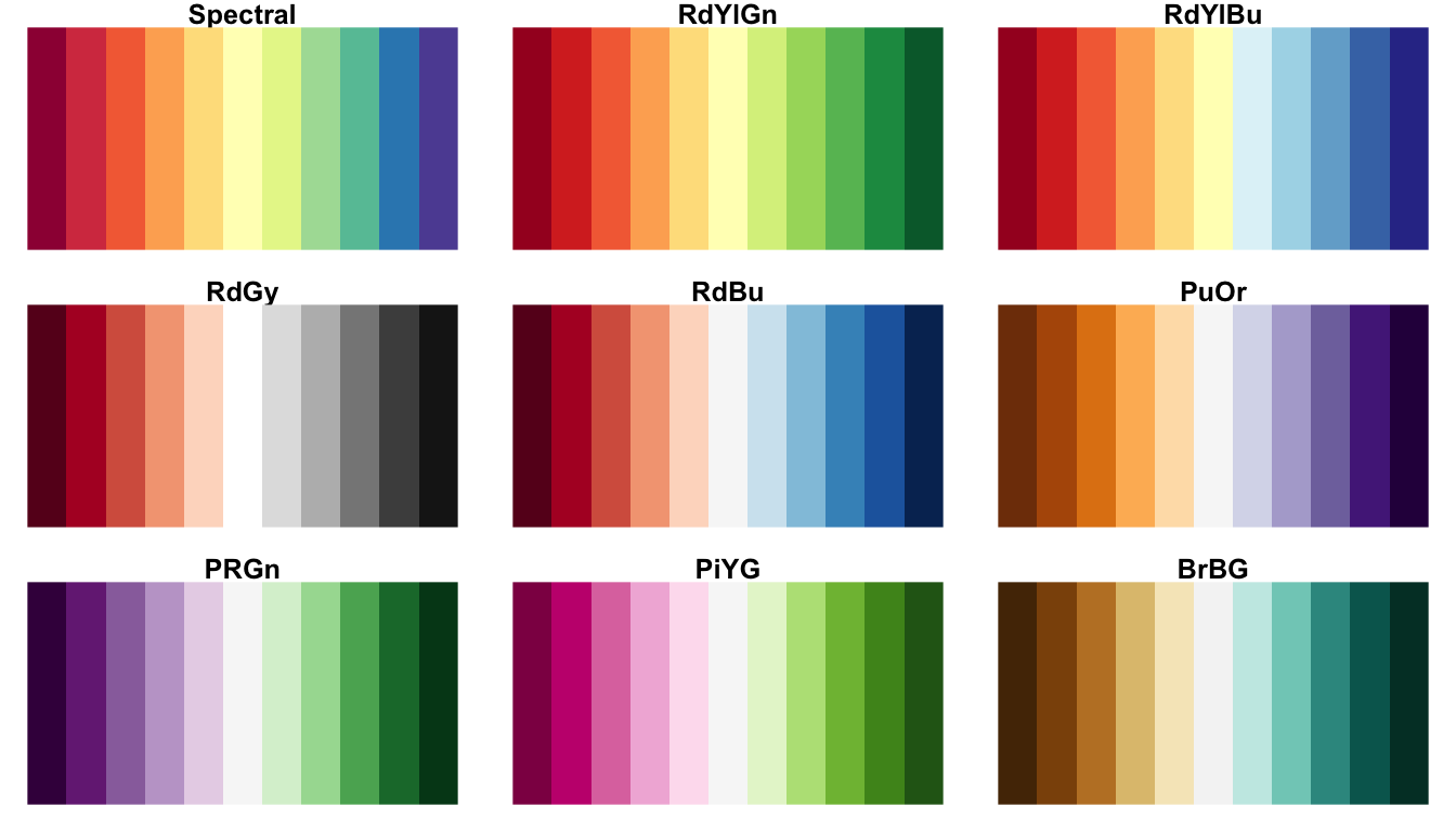
Diverging palettes
Diverging palettes represent dychotomic, ordered data. We can use diverging palettes to represent the degree of polarization of a region or individual in a two-party political spectrum. These palettes use dark colors at extremes and paler colors in the middle. Here are presented the nine diverging Brewer palettes:
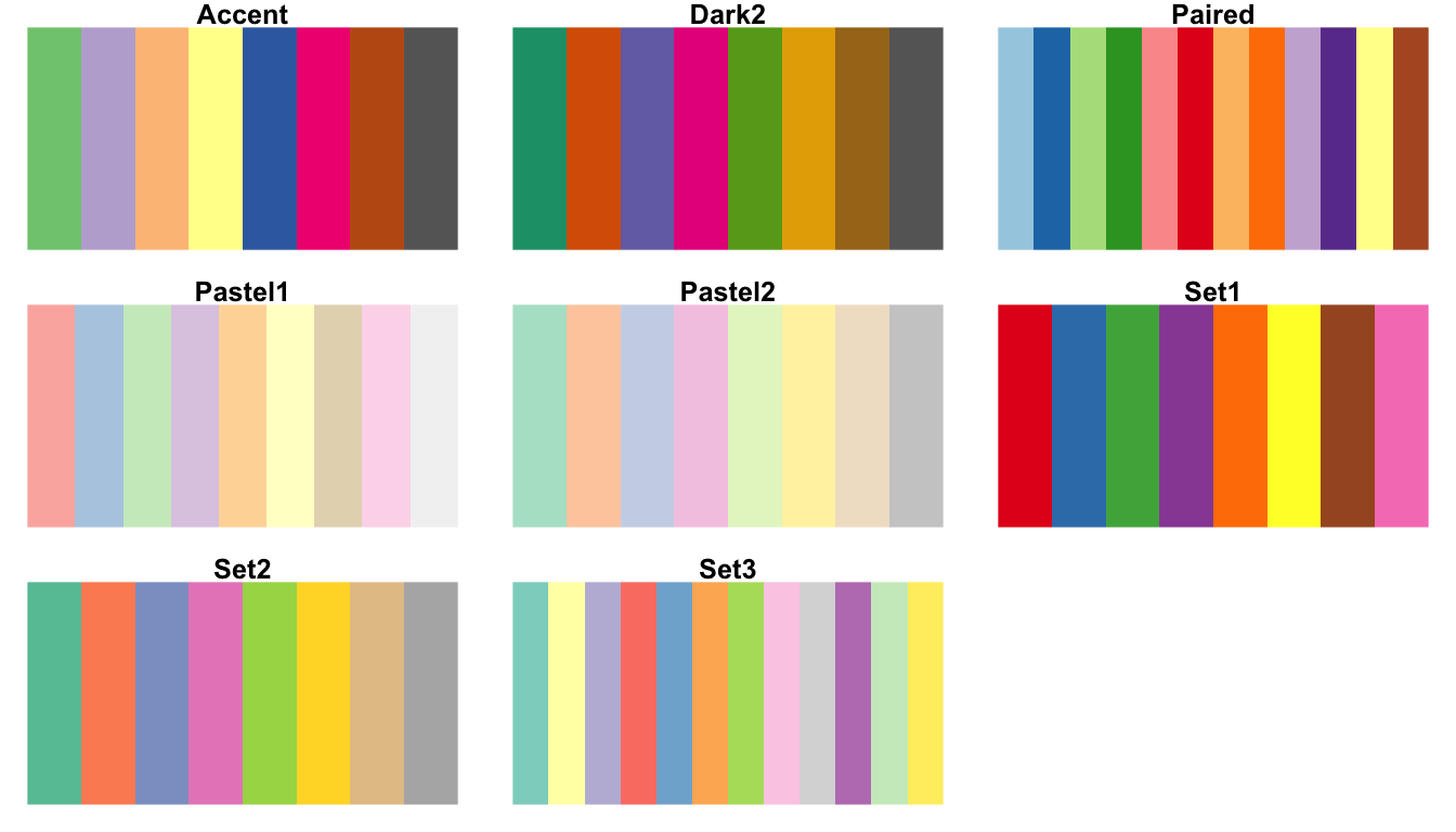
Qualitative palettes
We use qualitative palettes to represent categorical, unordered data. Here we want to differentiate across categories, so we will be using spectral color schemes covering a large range of hue. Here we can see the eight Brewer qualitative palettes.
In all cases, I have presented each palette with its largest number of available colors, although they can be used with less colors for categorical variables with less levels.
Using Brewer palettes in ggplot
We can use the Brewer palettes in ggplot with scale_color_brewer or scale_fill_brewer. These are used in the same way as manual scales, although the colors are chosen with parameters type ("seq", "div" or "qual") and palette, a number specifying the palette. Palettes are ordered as they are listed here. For instance, with type = "qual" and palette = 2 we are choosing palette Dark2.
Let’s make the classical iris plot choosing the colors from the Dark2 Brewer palette.
ggplot(iris, aes(Sepal.Length, Sepal.Width, color = Species)) +
  geom_point(size=1.5) +
  theme_bw() +
scale_color_brewer(type = "qual", palette = 2) 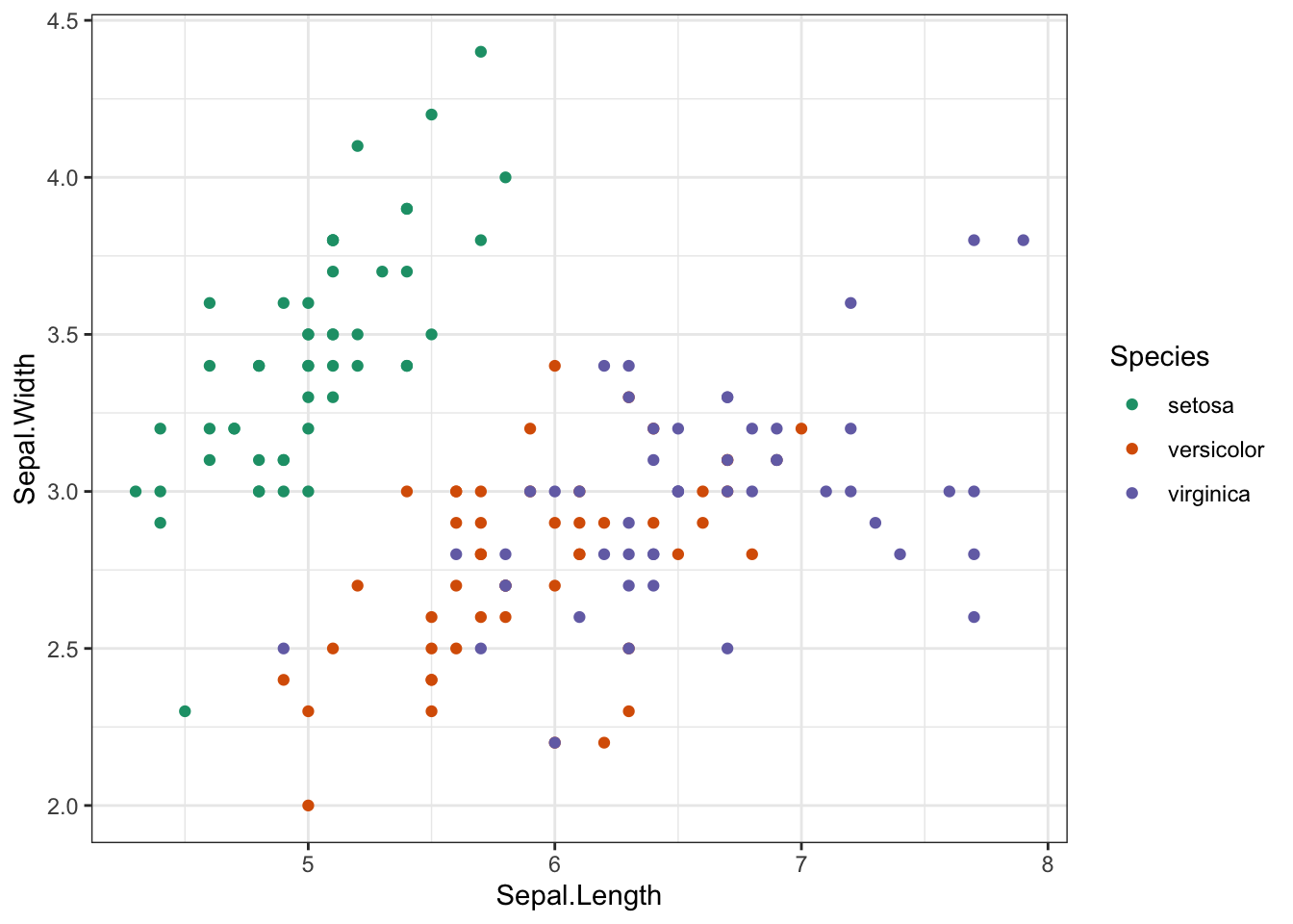
To illustrate the use of a sequential palette I am presenting a bivariate plot of a subset of the diamonds dataset. Here the color represents the type of cut. Better cuts are presented in darker colors.
diamonds %>%
  sample_n(1000) %>%
  ggplot(aes(carat, price, color = cut)) +
  geom_point() +
  theme_bw() +
  scale_color_brewer(type = "seq", palette = 1)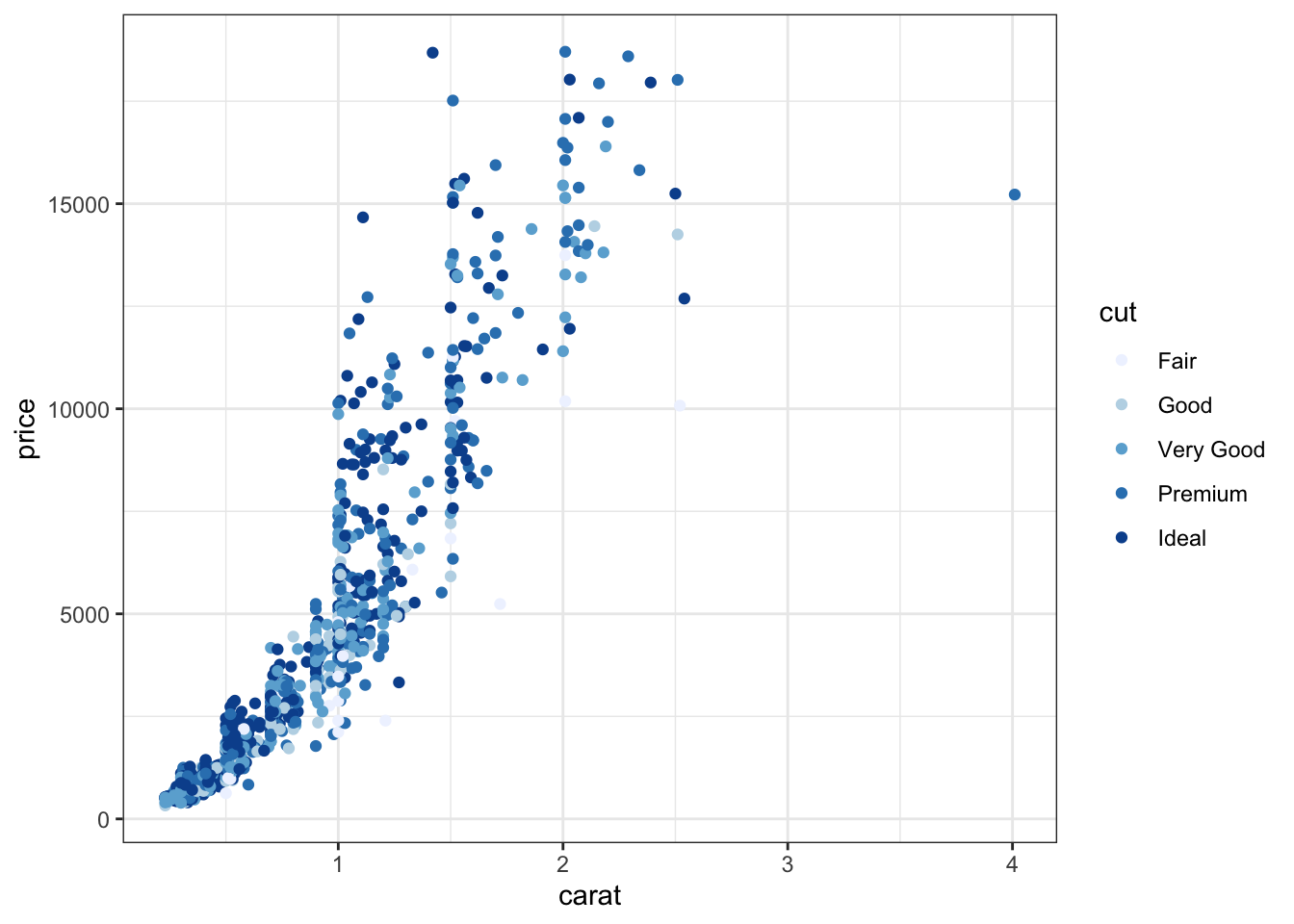
Color palettes in data visualization
Colors are frequently used in data visualization to represent categorical data or to add a third variable in a bivariate plot. We can define sets of colors manually, but we can also take advantage of predefined colors scheme or palettes. In this post I have presented how to use the Brewer palettes in R using the RColorBrewer package.
References
- Cynthia Brewer https://en.wikipedia.org/wiki/Cynthia_Brewer
- ColorBrewer 2.0: color advice for maps https://colorbrewer2.org/#type=sequential&scheme=BuGn&n=3
- Using manual scales in ggplot https://jmsallan.netlify.app/blog/2021-03-12-colors-and-shapes-of-points-in-ggplot2/
- Top R color palettes to know for great data visualization https://www.datanovia.com/en/blog/top-r-color-palettes-to-know-for-great-data-visualization/
- Sequential, diverging and qualitative colour scales from ColorBrewer https://ggplot2.tidyverse.org/reference/scale_brewer.html
Built with R 4.1.0, tidyverse 1.3.1 and RColorBrewer 1.1-2