ggplot function returns plots with convenient default settings, at least for a first glance of results. If we want a prettier presentation, we can change those settings to suit our needs. Here we see an example of changing colors of an histogram: fill is the color of the bars, and color is the border of the bars:
library(ggplot2)
ggplot(iris, aes(Sepal.Length)) +
  geom_histogram(bins=20,
                 fill="blue",
                 color="red")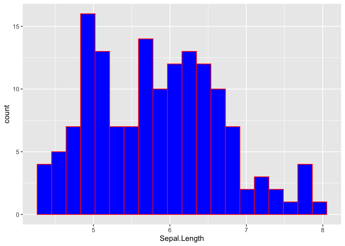
This use of fill and color can be useful in some situations, but it is more frequent that we use colors and shapes to distinguish different levels of a categorical variable. Let’s see some examples of this usage in scatterplots.
Points with colors
Let’s do a scatterplot of two variables of iris. I will use the color of the dots to distinguish observations of each species. To see the colors better, I have added a theme theme_bw() and increased the size of the points. I am doing by that specifying in the aesthetic mapping aes that the color of each observation is determined by its value of Species:
ggplot(iris, aes(Sepal.Length, Sepal.Width, color=Species)) +
  geom_point(size=2) +
  theme_bw()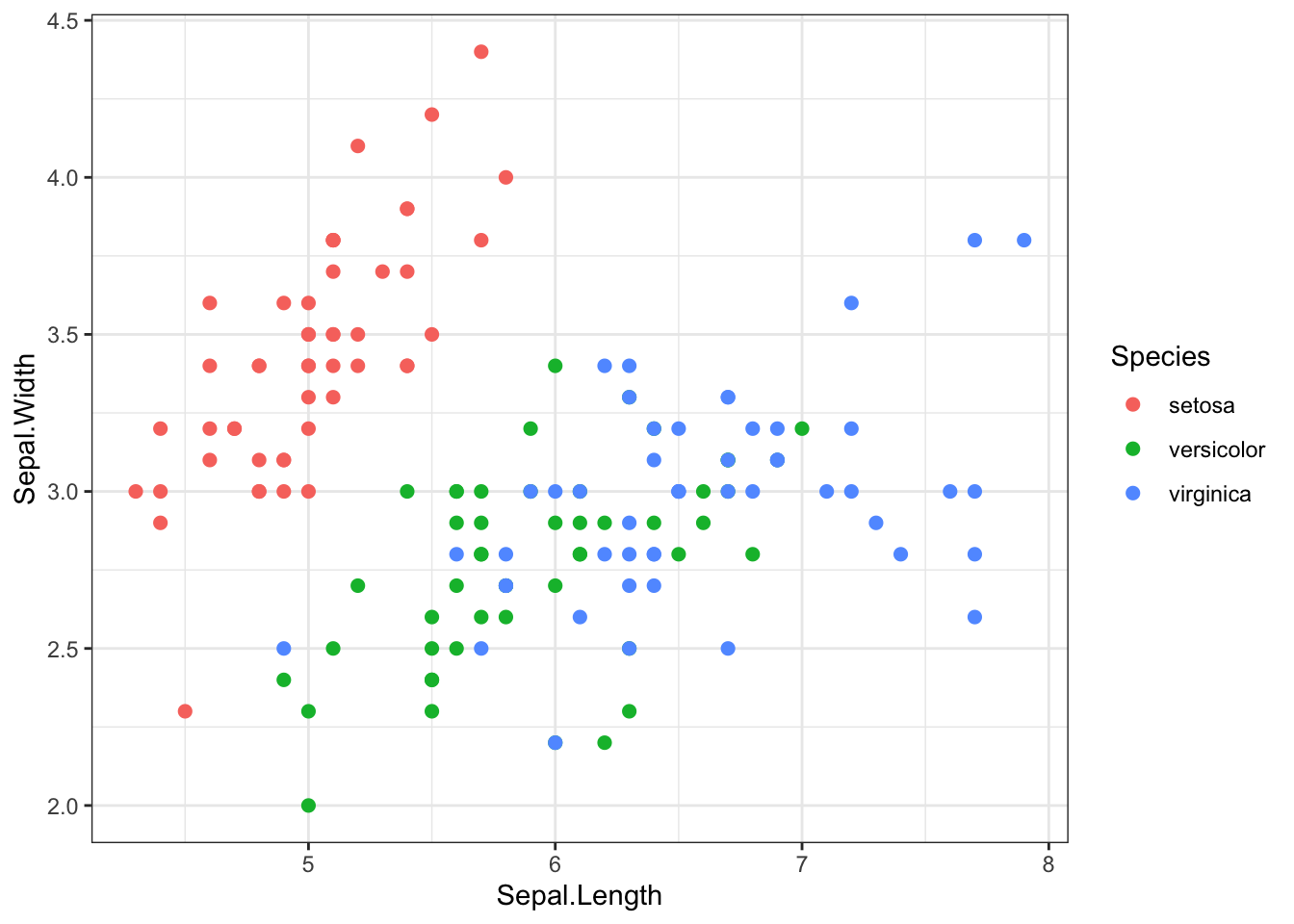
When a parameter like color is inside the aesthetics, we are not fixing what colors to use, but what is the use of the color in the plot (here, examining differences across the Species categorical variable).
To make the plot, ggplot uses a default palette of colors. If we are not happy with the result, we can change them with a scale (see a systematic presentation of scales at the ggplot book).
Here I am using scale_color_manual, meaning that I will use a manual palette to define the colors for each value of Species. In the scale is also specified:
- the
nameof the legend, - the
labelsto appear in the legend for each level of the categorical variable - and the
valuesof colors for each level of the categorical variable.
I have changed the three default values in this scale, using three different shades of blue to color the points.
ggplot(iris, aes(Sepal.Length, Sepal.Width, color=Species)) +
  geom_point(size=2) +
  theme_bw() +
  scale_color_manual(name = "iris species",
                     labels = c("iris setosa", "iris versicolor", "iris virginica"),
                     values = c("#000099", "#0080FF", "#99CCFF"))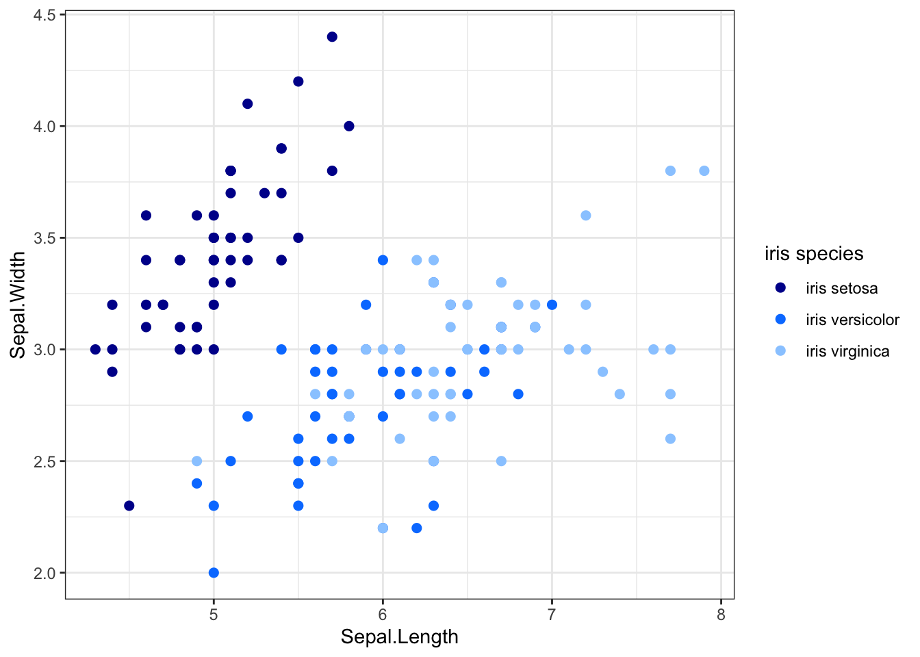
Points with shapes
If your plot is in black and white, you might want to distinguish the categories with a shape. Shapes in points in R are defined with a number going from 0 to 25. You can learn about them in this post of Alberts Kuo’s blog.
Here is the plot with the default values of shapes of points:
ggplot(iris, aes(Sepal.Length, Sepal.Width, shape=Species)) +
  geom_point(size=2) +
  theme_bw()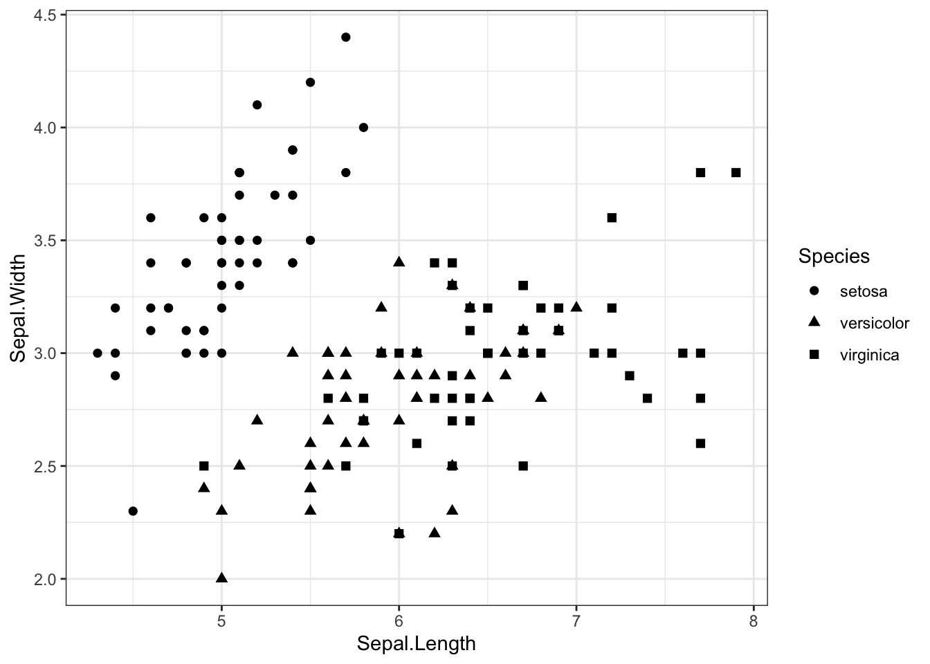
We can change those default shapes with scale_shape_manual.
ggplot(iris, aes(Sepal.Length, Sepal.Width, shape=Species)) +
  geom_point(size=2) +
  theme_bw() +
  scale_shape_manual(name = "iris species",
                     labels = c("iris setosa", "iris versicolor", "iris virginica"),
                     values = c(0, 3, 4))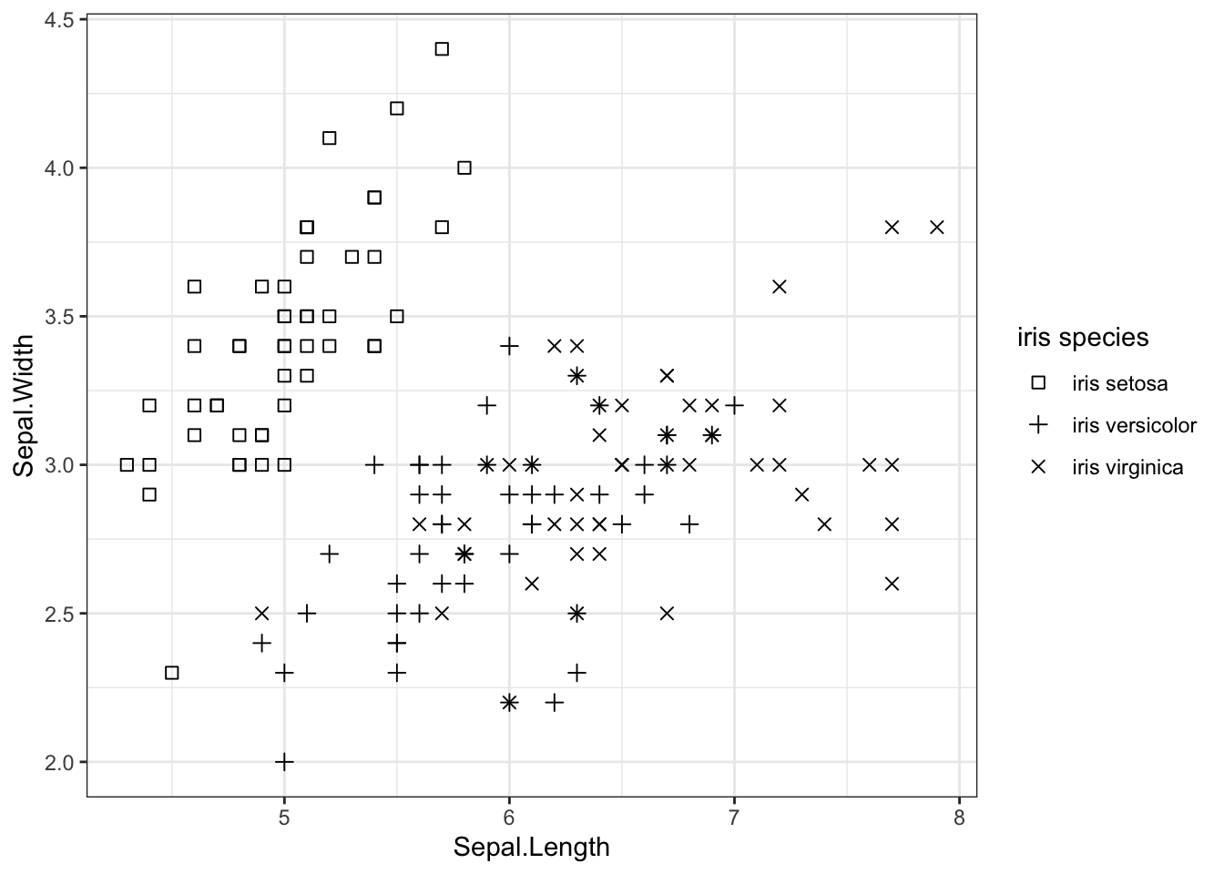
We are seeing asterisks in some places because two observations of categories represented with plus and cross signs a are overlaid.
Points with shapes and colors
We can assign a shape and a color to each category using a scale for each. If we use the same variable in both scales, we obtain a single legend. I have also enlarged point size to see the shapes better:
ggplot(iris, aes(Sepal.Length, Sepal.Width, color=Species, shape=Species)) +
  geom_point(size=2) +
  theme_bw() +
  scale_shape_manual(name = "iris species",
                     labels = c("iris setosa", "iris versicolor", "iris virginica"),
                     values = c(0, 3, 4)) +
  scale_color_manual(name = "iris species",
                     labels = c("iris setosa", "iris versicolor", "iris virginica"),
                     values=c("#FF0000", "#009900", "#0000FF"))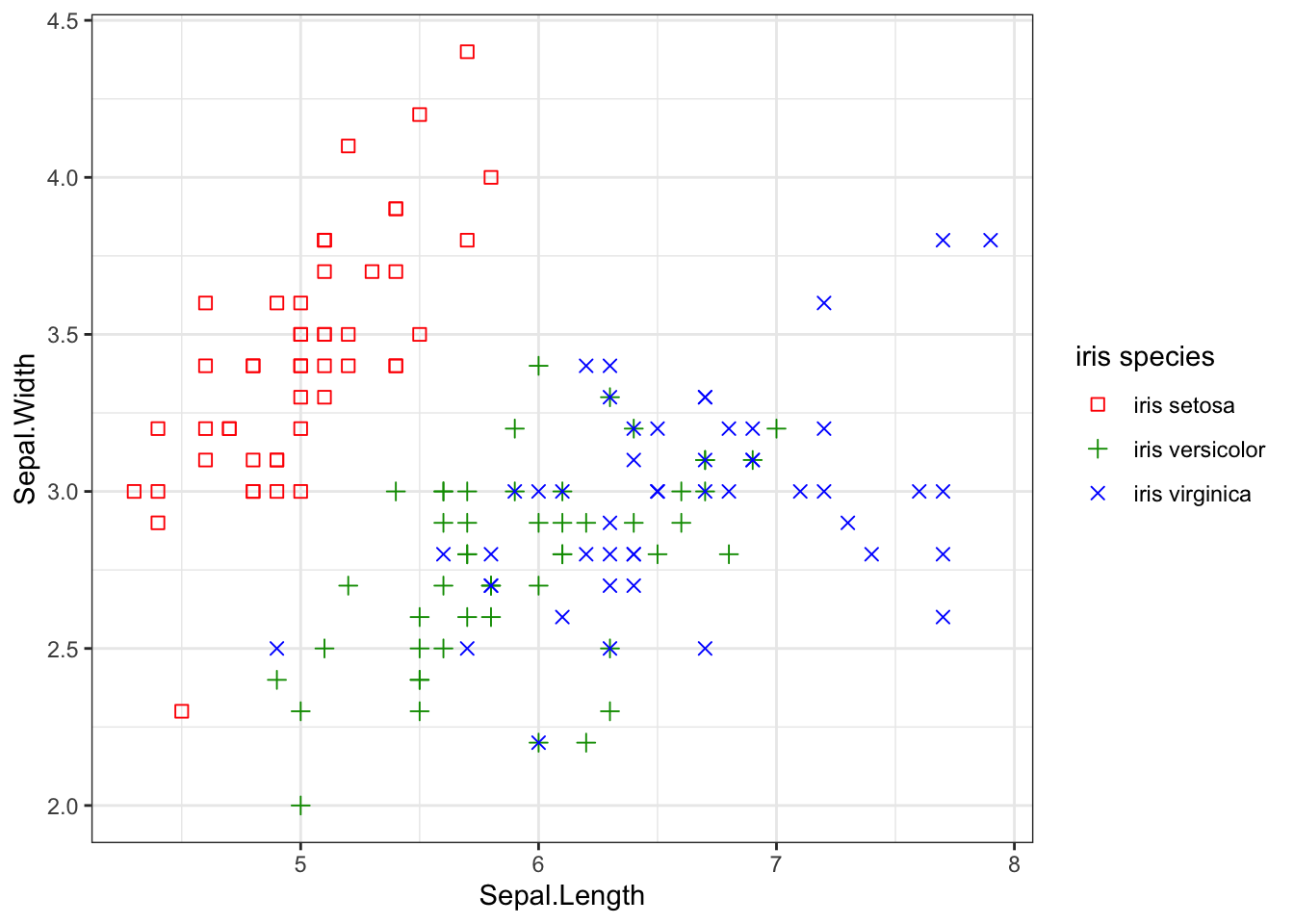
(For a listing of colors available through the hex triplet syntax, visit this RapidTables page, or the Web colors Wikipedia page.)
Colors and shapes in ggplot
We can use colors and shapes to distinguish between elements of different values of a category introducing them in an aesthetic. We must keep in mind that we are not specifying which colors to use, but defining the use of the color in the plot If we are not satisfied with the default colors or shapes, we cqn add a scale to customize them.
I have presented how to control the appearance of scatterplots built with geom_point() presenting different colors and shapes for the levels of a categorical variable. I have used scale_color_manual for colors, and scale_shape_manual for shapes.
Scales not only control the values of colors that we assign to each category, but also legend parameters like its name or title or the labels we assign to each category.