In this post I present how to visualize the evolution of two sets of variables from the same individuals. I have used data of the Gini index obtained from the World Bank with the wbstats package to show the evolution of inequality of the current members of the European Union between 2010 and 2018. I rely on the tidyverse for data handling and visualization, with additional elements from ggimage.
library(tidyverse)
library(wbstats)
library(ggimage)
I start retrieving the Gini index from the World Bank, which is presented in the series SI.POV.GINI, with wbstats::wb_data. The vector eu_iso2c contains the Alpha 2 codes (ISO 3166) of the current members of the European Union.
gini <- wb_data("SI.POV.GINI", start_date = 2000, end_date = 2020)

eu_iso2c <- c("AT", "BE", "BG", "HR", "CY", "CZ",
              "DK", "EE", "FI", "FR", "DE", "GR",
              "HU", "IE", "IT", "LV", "LU", "MT",
              "NL", "PL", "PT", "RO", "SK", "SI",
              "ES", "SE")

gini_eu <- gini |>
  filter(iso2c %in% eu_iso2c, date %in% c(2010, 2018)) |>
  select(iso2c, date, SI.POV.GINI)
The gini_eu table contains the Gini indices of EU countries of 2010 and 2018:
gini_eu## # A tibble: 52 × 3
## iso2c date SI.POV.GINI
## <chr> <dbl> <dbl>
## 1 AT 2018 30.8
## 2 AT 2010 30.3
## 3 BE 2018 27.2
## 4 BE 2010 28.4
## 5 BG 2018 41.3
## 6 BG 2010 35.7
## 7 HR 2018 29.7
## 8 HR 2010 32.4
## 9 CY 2018 32.7
## 10 CY 2010 31.5
## # ℹ 42 more rowsWith this table, I have created an horizontal bar chart presenting the Gini indices for each country in 2010 and 2018. The character variable iso2c is mutated into a factor, with levels reordered with forcats::fct_reorder2 by the value of two variables: year and Gini index. Then, countries are ordered by value of Gini index in 2018.
gini_eu |>
  mutate(iso2c = fct_reorder2(iso2c, date, -SI.POV.GINI)) |>
  ggplot(aes(SI.POV.GINI, iso2c, fill = factor(date))) +
  geom_bar(stat = "identity", position = "dodge") +
  theme_minimal() +
  scale_fill_manual(name = "year", values = c("#66B2FF", "#004C99")) +
  theme(legend.position = "top") +
  labs(title = "Evolution of inequality in EU", x = "Gini index", y = NULL)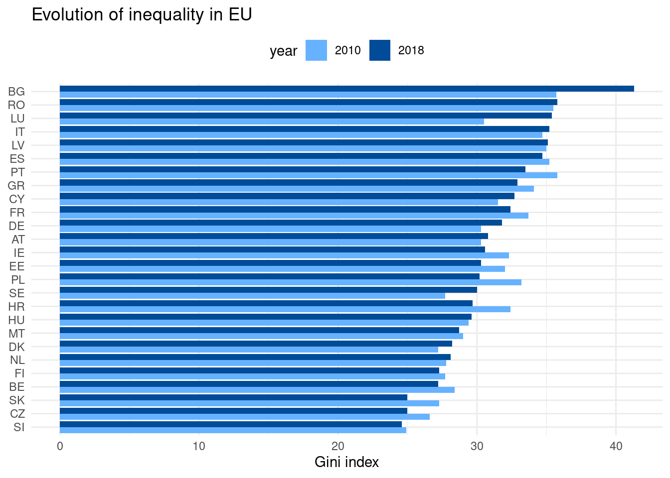
This bar chart is useful to present absolute values of Gini index, but can become somewhat cluttered to observe variation. Let’s present the same information with a dumbbell plot.
To create the dumbbell plot, we need to plot a segment for each of the countries with geom_segment(). As I need the values of Gini index for 2010 and 2018 for each country in the same row, I have created a gini_eu_wide with tidyr::pivot_wider(). I have also ordered countries by decreasing value of Gini index in 2018 using forcats::fct_reorder().
As I am focusing in visualizing variations, it can be of interest to show if Gini index has increased or decreased. That’s why I have created an ev variable, equal to the year when Gini index is higher.
gini_eu_wide <- gini_eu |>
  select(iso2c, date, SI.POV.GINI) |>
  pivot_wider(names_from = "date", values_from = "SI.POV.GINI") |>
  mutate(iso2c = as.factor(iso2c)) |>
  mutate(iso2c = fct_reorder(iso2c, `2018`)) |>
  mutate(ev = ifelse(`2018` > `2010`, "2018", "2010"))
That’s how gini_eu_wide looks like:
gini_eu_wide## # A tibble: 26 × 4
## iso2c `2018` `2010` ev
## <fct> <dbl> <dbl> <chr>
## 1 AT 30.8 30.3 2018
## 2 BE 27.2 28.4 2010
## 3 BG 41.3 35.7 2018
## 4 HR 29.7 32.4 2010
## 5 CY 32.7 31.5 2018
## 6 CZ 25 26.6 2010
## 7 DK 28.2 27.2 2018
## 8 EE 30.3 32 2010
## 9 FI 27.3 27.7 2010
## 10 FR 32.4 33.7 2010
## # ℹ 16 more rowsLet’s do a first draft of the dumbbell plot:
- I have ordered the levels of
iso2cin the same way as in the previous plot, which is also the ordering ofgini_eu_wide. - In the x axis is presented the Gini index value
SI.POV.GINI, and in the y axis the countries. - The plates of the dumbbell are created with
geom_point(). I have used different colors for values of 2010 and 2018 so we can see if the index increases or decreases. - The bars of the dumbbell are created with
geom_segment(), and with thegini_eu_widetable. The color of the segments is assigned with theevvariable. - To give an additional cue for Gini index increasing or decreasing, I have added an arrow to the segment, pointing at the value of 2018.
gini_eu |>
  mutate(iso2c = fct_reorder2(iso2c, date, -SI.POV.GINI)) |>
  ggplot(aes(SI.POV.GINI, iso2c)) +
  geom_point(aes(color = as.factor(date))) +
  geom_segment(data = gini_eu_wide,
               mapping = aes(y = as.numeric(iso2c),
                             yend = as.numeric(iso2c),
                             x = `2010`,
                             xend = `2018`,
                             color = ev), arrow = arrow(length = unit(0.02, "npc"))) +
  theme_minimal()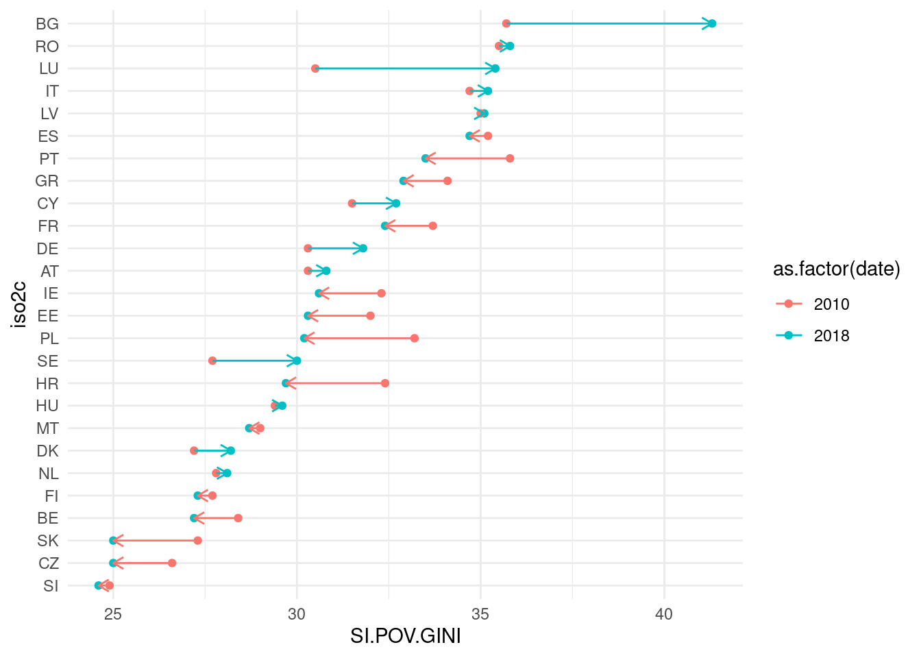
The resulting plot presents the required information: the red points are values of Gini index in 2010 and the blue ones of 2018. Blue segments present an increase of Gini index and red segments a decrease. Let’s do some additional aesthetic improvements:
- Title and caption are added with
labs(). I have also removed the label of the x axis. - Countries axis: I have replaced country names with flags. I have removed default labels and axis name with
scale_y_discrete()and added the flags withgeom_flag()fromggimage. - Colors: I have changed the default colors with the same blues of the barplot with
scale_color_manual(). - Background color and legend position: in the
theme()I have changed the position of the legend, and changed the color background default by a light yellow, so that the flags can be perceived better.
gini_eu |>
  mutate(iso2c = fct_reorder2(iso2c, date, -SI.POV.GINI)) |>
  ggplot(aes(SI.POV.GINI, iso2c)) +
  geom_point(aes(color = as.factor(date))) +
  geom_segment(data = gini_eu_wide,
               mapping = aes(y = as.numeric(iso2c),
                             yend = as.numeric(iso2c),
                             x = `2010`,
                             xend = `2018`,
                             color = ev), arrow = arrow(length = unit(0.02, "npc"))) +
  labs(title = "Evolution of inequality in EU",
       caption = "Source: World Bank",
       x = NULL) +
  geom_flag(mapping = aes(x = 24, y = as.numeric(iso2c), image = iso2c),
            data = gini_eu_wide, size = 0.03) +
  scale_color_manual(name = "year", values = c("#66B2FF", "#004C99")) +
  scale_y_discrete(name = element_blank(), labels = element_blank()) +
  theme_minimal() +
  theme(plot.background = element_rect(fill = "#FFFFDD"), legend.position = "top")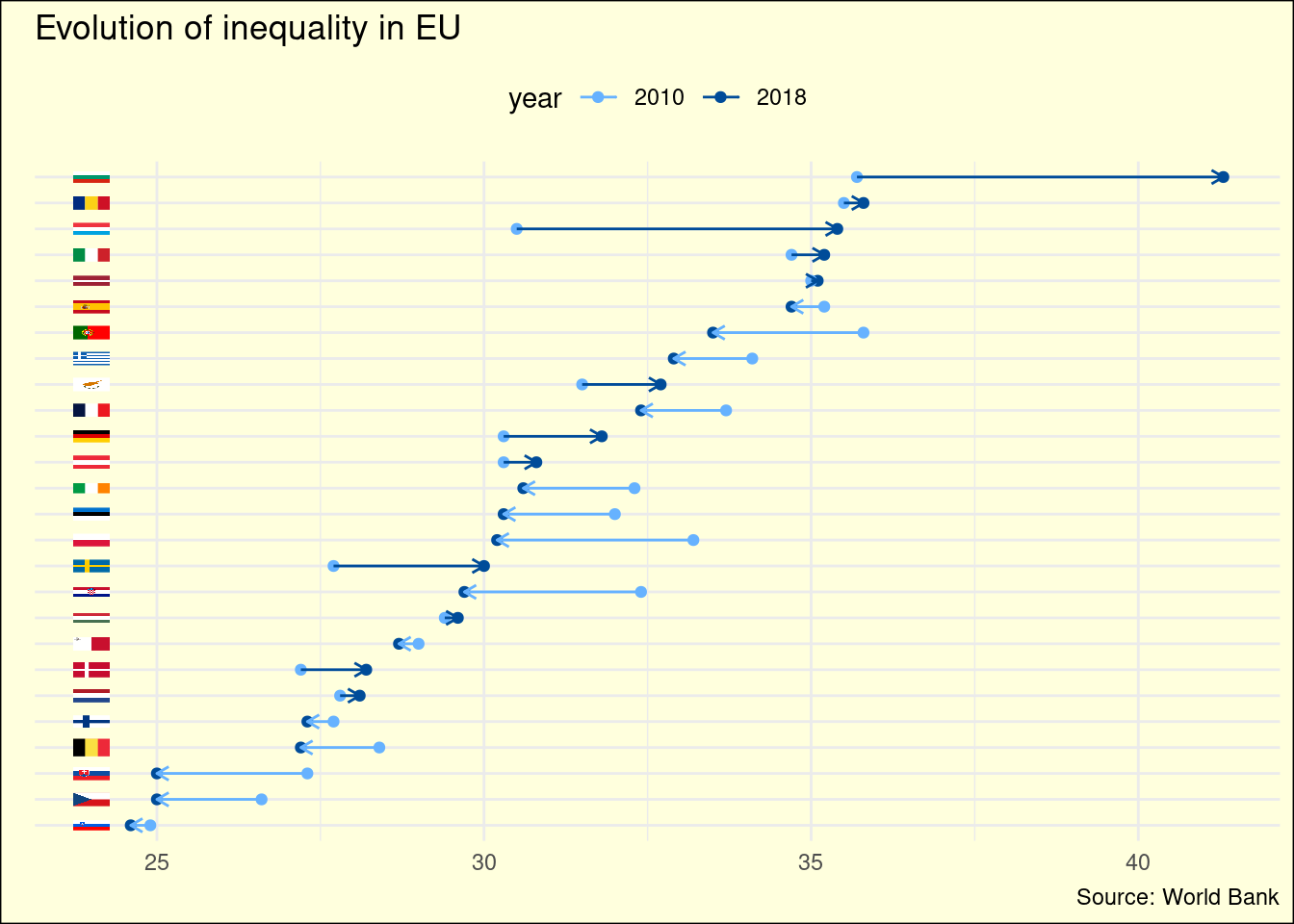
An horizontal bar chart is useful to compare absolute values of a set of observations, although it can become too cluttered to present the evolution of two sets of observations. The dumbbell plot is a good alternative to visualize this evolution. It is not included by default in ggplot, but here I have presented how to draw it using plots and segments.
References
- Three measures of inequality https://jmsallan.netlify.app/blog/three-measures-of-inequality/ (includes Gini index explanation).
- Gini index in World Bank Data https://data.worldbank.org/indicator/SI.POV.GINI
Session Info
## R version 4.3.0 (2023-04-21)
## Platform: x86_64-pc-linux-gnu (64-bit)
## Running under: Linux Mint 21.1
##
## Matrix products: default
## BLAS:   /usr/lib/x86_64-linux-gnu/blas/libblas.so.3.10.0
## LAPACK: /usr/lib/x86_64-linux-gnu/lapack/liblapack.so.3.10.0
##
## locale:
##  [1] LC_CTYPE=es_ES.UTF-8       LC_NUMERIC=C
##  [3] LC_TIME=es_ES.UTF-8        LC_COLLATE=es_ES.UTF-8
##  [5] LC_MONETARY=es_ES.UTF-8    LC_MESSAGES=es_ES.UTF-8
##  [7] LC_PAPER=es_ES.UTF-8       LC_NAME=C
##  [9] LC_ADDRESS=C               LC_TELEPHONE=C
## [11] LC_MEASUREMENT=es_ES.UTF-8 LC_IDENTIFICATION=C
##
## time zone: Europe/Madrid
## tzcode source: system (glibc)
##
## attached base packages:
## [1] stats     graphics  grDevices utils     datasets  methods   base
##
## other attached packages:
##  [1] ggimage_0.3.2   wbstats_1.0.4   lubridate_1.9.2 forcats_1.0.0
##  [5] stringr_1.5.0   dplyr_1.1.2     purrr_1.0.1     readr_2.1.4
##  [9] tidyr_1.3.0     tibble_3.2.1    ggplot2_3.4.2   tidyverse_2.0.0
##
## loaded via a namespace (and not attached):
##  [1] yulab.utils_0.0.6  sass_0.4.5         utf8_1.2.3         generics_0.1.3
##  [5] ggplotify_0.1.0    blogdown_1.16      stringi_1.7.12     hms_1.1.3
##  [9] digest_0.6.31      magrittr_2.0.3     evaluate_0.20      grid_4.3.0
## [13] timechange_0.2.0   bookdown_0.33      fastmap_1.1.1      jsonlite_1.8.4
## [17] httr_1.4.5         fansi_1.0.4        scales_1.2.1       jquerylib_0.1.4
## [21] cli_3.6.1          rlang_1.1.0        munsell_0.5.0      withr_2.5.0
## [25] cachem_1.0.7       yaml_2.3.7         tools_4.3.0        tzdb_0.3.0
## [29] colorspace_2.1-0   curl_5.0.0         gridGraphics_0.5-1 vctrs_0.6.2
## [33] R6_2.5.1           magick_2.7.4       lifecycle_1.0.3    ggfun_0.0.9
## [37] pkgconfig_2.0.3    pillar_1.9.0       bslib_0.4.2        gtable_0.3.3
## [41] Rcpp_1.0.10        glue_1.6.2         highr_0.10         xfun_0.39
## [45] tidyselect_1.2.0   rstudioapi_0.14    knitr_1.42         farver_2.1.1
## [49] htmltools_0.5.5    labeling_0.4.2     rmarkdown_2.21     compiler_4.3.0