As stated by authors of the viridis package:
Use the color scales in this package to make plots that are pretty, better represent your data, easier to read by those with colorblindness, and print well in gray scale.
The strengths of viridis are that:
- plots are more beautiful,
- colors are perfectly perceptually-uniform, even when printed in black and white,
- color schemes are perceived by the most common forms of color blindness.
viridis is now the default color scheme for Python mathlotlib.We can access the viridis scales through the viridis package, which also loads viridisLite.
Continuous viridis scales
Unlike the brewer palettes, the viridis color scales can have any number of colors, so they are apt to present continuous variables. We can use the viridis function with a large value of n to see how these continuous scales look like. There are eight palettes available, that can be accessed giving values A to H to the options parameter. For instance, the cividis palette is accessed with option = "E".
viridis_names <-c("magma", "inferno", "plasma", "viridis", "cividis", "rocket", "mako", "turbo")

n <- 50
par(mfrow=c(4,2), mar = c(1,1,1,1))
f <- sapply(1:8, function(x) image(matrix(1:n, n, 1), col = viridis(n=n, option = LETTERS[x]), axes =FALSE, main = viridis_names[x]))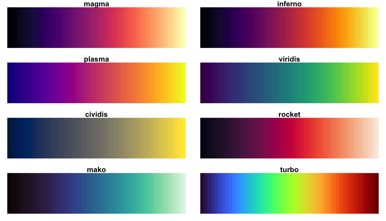
Discrete viridis scales
Using viridis with a lower value of n let us see discrete viridis scales:
viridis_names <-c("magma", "inferno", "plasma", "viridis", "cividis", "rocket", "mako", "turbo")

n <- 8
par(mfrow=c(4,2), mar = c(1,1,1,1))
f <- sapply(1:8, function(x) image(matrix(1:n, n, 1), col = viridis(n=n, option = LETTERS[x]), axes =FALSE, main = viridis_names[x]))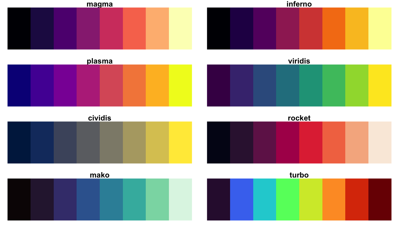
viridis and ggplot
viridis adds scale_*_viridis_* functions to use the above palettes in ggplot. We use scale_color_viridis_d, scale_fill_viridis_d and the like for discrete scales:
ggplot(iris, aes(Sepal.Length, Sepal.Width, color = Species)) +
geom_point() +
labs(x = "sepal length", y = "sepal width", title = "iris sepal plot") +
scale_color_viridis_d(name = "iris species",
labels = c("Setosa", "Versicolor", "Virgininca"),
option = "viridis")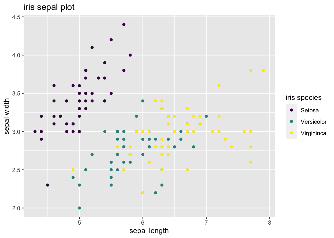 virids is the default color scale when we use ordered factors:
set.seed(1313)
diamonds %>%
  sample_n(1000) %>%
  ggplot(aes(carat, price, color = cut)) +
  geom_point() +
  labs(title = "A sample of the diamonds dataset")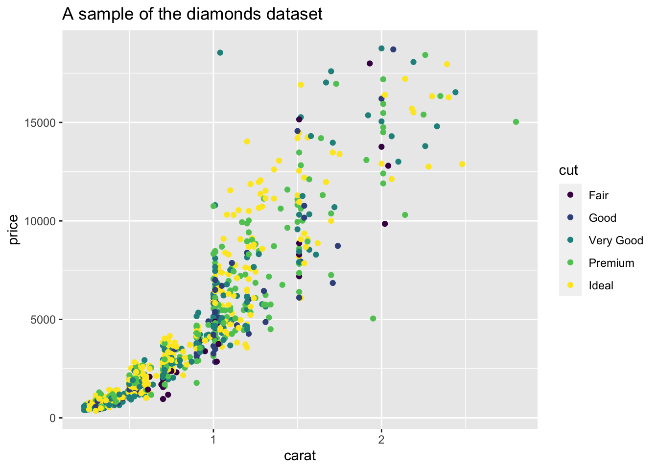
We use viridis to convey the values of a continous variable using a gradient scale. To illustrate this, I will generate a grid of values of the sin(x) + cos(y) function:
points <- seq(-2*pi, 2*pi, length.out = 100)
grid <- expand.grid(points, points)
names(grid) <- c("x", "y")
grid <- grid %>%
  mutate(z = sin(x) + cos(y))
In this figure, I represent the value of the two-variable function with a color scale. I have used the magma palette of viridis with scale_fill_viridis_c:
ggplot(grid, aes(x = x, y = y, fill = z)) +
  geom_tile() +
  theme_void() +
  scale_fill_viridis_c(name = "sin(x) + cos(y)", option = "magma") +
  theme(legend.position = "bottom") +
    labs(title = "Colors with magma palette")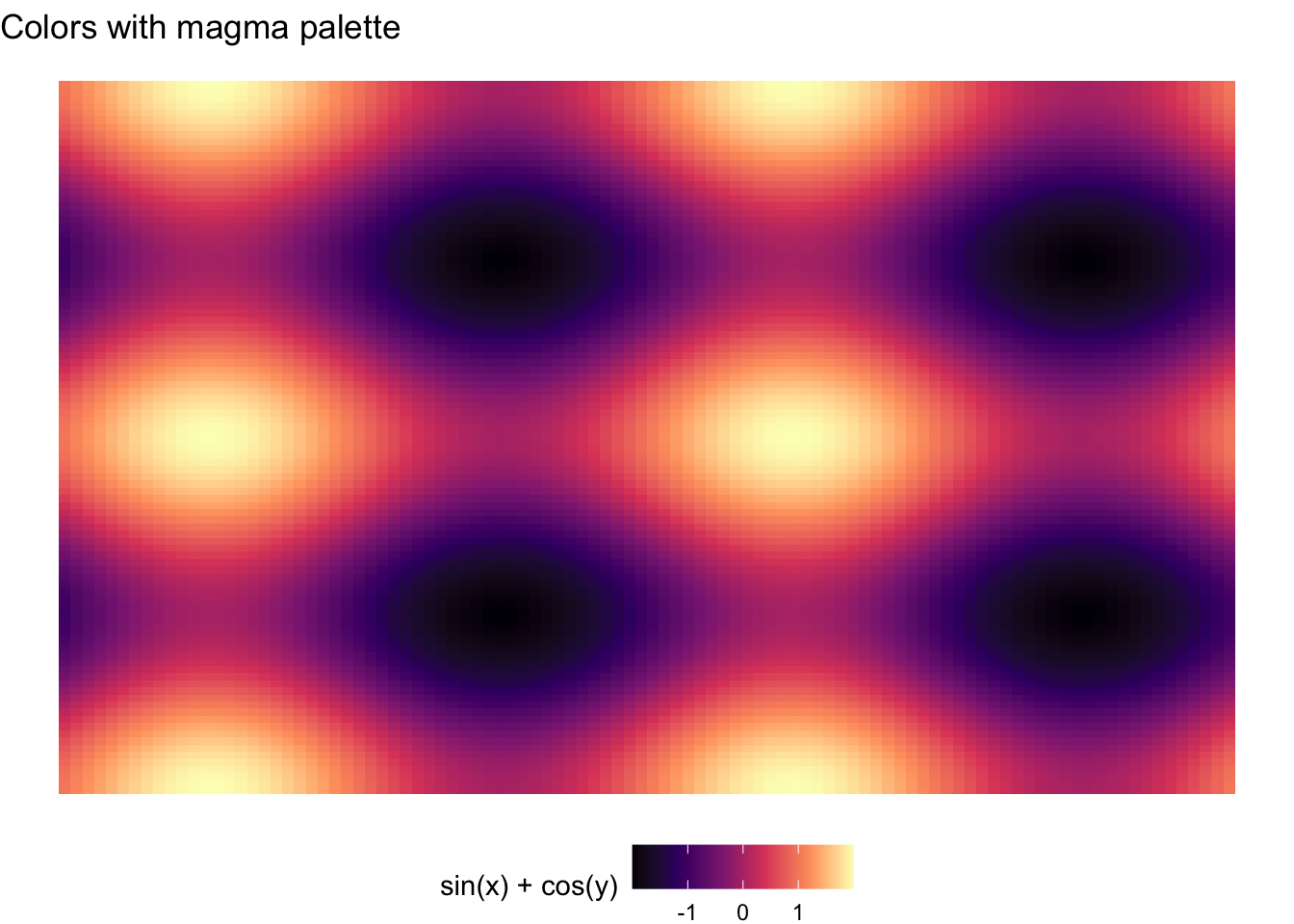
The result is much prettier, in my opinion, than the obtained with the default ggplot colors for gradient scales:
ggplot(grid, aes(x = x, y = y, fill = z)) +
  geom_tile() +
  theme_void() +
  theme(legend.position = "bottom") +
  labs(title = "Colors with default palette")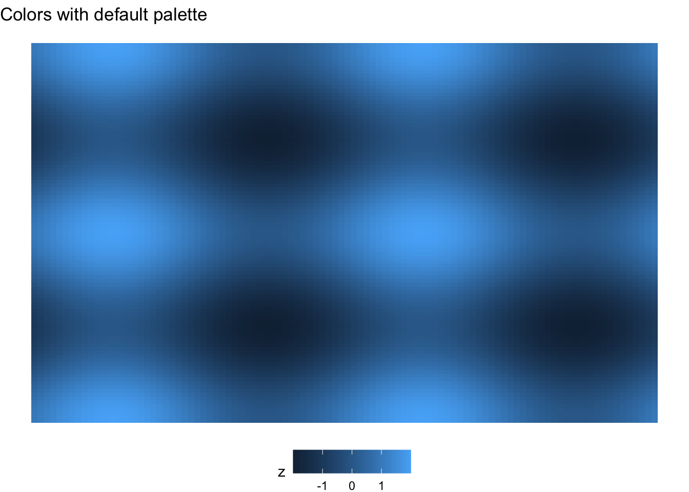
Data for the plot are not continuous, but a 100 x 100 grid. To give a unique color to each grid element, we can use a binned scale with scale_fill_viridis_b:
ggplot(grid, aes(x = x, y = y, fill = z)) +
  geom_tile() +
  theme_void() +
  scale_fill_viridis_b(name = "sin(x) + cos(y)", option = "magma") +
    theme(legend.position = "bottom")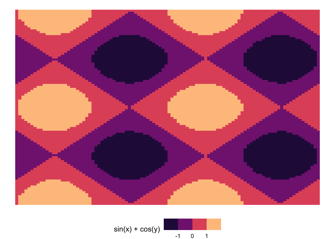
The viridis color schemes
The viridis color schemes have been designed to use color in data visualization. The eight color schemes are beautiful, perceptually-uniform and accessible for people with color-blindness. We can generate viridis palettes of any number of colors, so we can use them to plot continuous, binned and discrete data. viridis is the default color scheme for the popular matplotlib Python package, and they are the default in ggplot to represent ordered factors.
An alternative to viridis are the Brewer palettes, developed by Cynthia A. Brewer for choropleth maps. Those scales are only for categorical data, but they offer the possibility of representing sequential, diverging or qualitative values.
References
- [ggplot2] Welcome viridis! https://www.r-bloggers.com/2018/07/ggplot2-welcome-viridis/
- Introduction to the
viridiscolor maps https://cran.r-project.org/web/packages/viridis/vignettes/intro-to-viridis.html - Top R color palettes to know for great data visualization https://www.datanovia.com/en/blog/top-r-color-palettes-to-know-for-great-data-visualization/
viridiscolour scales fromviridisLitehttps://ggplot2.tidyverse.org/reference/scale_viridis.html
Built with R 4.1.0, tidyverse 1.3.1 and viridis 0.6.1