A power law is a functional relationship between two quantities, where a relative change in one quantity results in a proportional relative change in the other quantity, independent of the initial size of those quantities. That relationship can be expressed as:
\[ y = cx^{-\gamma} \]
where \(\gamma > 0\) is the exponent of the power law.
Power law relationships are pervasive in physics, biology, economics and sociology. Here I will introduce how to represent power laws using R and present two empirical phenomena that can follow a power law: the degree distribution of a Barabási-Albert (BA) graph and the count of occurrences of words in a text as a function of its ranking, know as Zipf’s law.
The R packages I will be using are:
data.tablefor data frame manipulation,ggplot2,viridisandpatchworkfor visualization,igraphto generate a sample of a BA graph and obtain node degree,- and
tmlibrary for word count.
library(data.table)
library(ggplot2)
library(viridis)
library(patchwork)
library(igraph)
library(tm)
Let’s start defining a function to generate the values of a power law of exponent gamma. I will scale the outcome with the sum of original values, so they can be understood as relative frequencies or probability of occurrence:
pl_freq <- function(val, gamma){

  res <- val^gamma
  res <- res/sum(res)

  return(res)
}
Let’s create a power_law data table with 30 points of power laws of different exponents:
x_pl <- 10^c(seq(0, 4, length.out = 30))
power_law <- data.table(x = x_pl,
                        y1 = pl_freq(x_pl, -1/2),
                        y2 = pl_freq(x_pl, -1),
                        y3 = pl_freq(x_pl, -2))
Let’s see how can we represent power laws. The plot on the left presents a straight representation of the power law. We see that all three power laws decay fast, so it is hard to distinguish them. The best way to represent a power law is in a log-log plot. That’s why I have defined x_pl as a set of points evenly spaced in a log plot. We can use scale_x_log10() and scale_y_log10() to transform axis in log scale without transforming data.
In the rigth plot, we observe that power laws appear as straigth lines in a log-log plot. I have used the patchwork package to present both plots in the same panel, and viridis scales to distinguish each value of gamma.
pl <- ggplot(melt(power_law, id.vars = "x"), aes(x, value, color = variable)) +
  geom_point(size=2) +
  geom_line() +
  theme_bw() +
  scale_color_viridis_d(name = "gamma", labels = c("1/2", "1", "2")) +
  labs(title = "Power law", x = "value", y = "frequence")

pl_log <- ggplot(melt(power_law, id.vars = "x"), aes(x, value, color = variable)) +
  geom_point(size=2) +
  geom_line() +
  theme_bw() +
  scale_color_viridis_d(name = "gamma", labels = c("1/2", "1", "2")) +
  labs(title = "Power law (log-log)", x = "value", y = "frequence") +
  scale_x_log10() +
  scale_y_log10()


pl + pl_log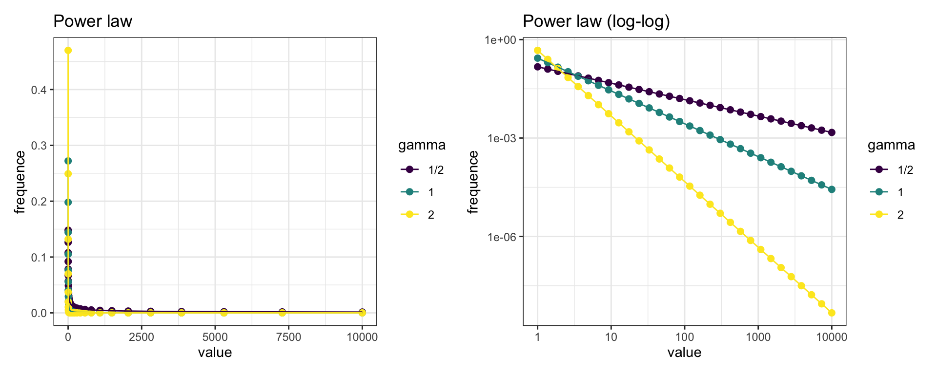
Another useful plot for power laws is the plot of cumulative probability. It is defined as:
\[p_{cum}\left(X\right) = p \left(X \geq x \right)\]
I have ordered the probabilities by decreasing order of x and used cumsum to obtain the cumulative probability. As we will see later, this plot is more regular than the frequency plot for empirical power law distributions.
power_law <- power_law[order(-x)]
power_law[, pcum_y3 := cumsum(y3)]

ggplot(power_law, aes(x, pcum_y3)) +
  geom_point(size = 2) +
  geom_line() +
  theme_bw() +
  scale_x_log10() +
  scale_y_log10() +
  labs(title = "Cumulative probability for gamma = 2", x = "value", y = "cumulative probability")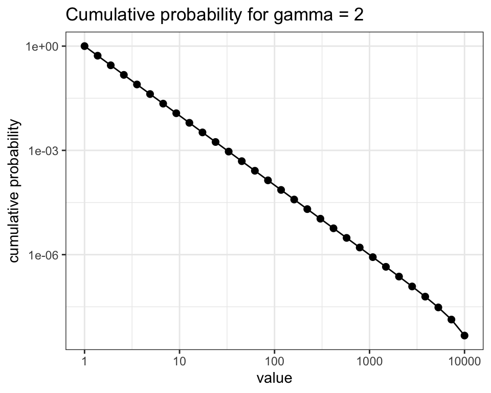
Let’s now examine two examples of emergence of power laws: the degree distribution of BA graphs and frequency versus rank word count.
BA graphs
Barabási-Albert (BA) graphs are undirected graphs constructed through growth and preferential attachment mechanisms. By growth we mean that the graph is constructed iteratively, adding one node at a time. Through the preferential attachment mechanisms, each new node is linked to existing nodes with a probability proportional to the degree \(k\) (number of incident links) of the later. BA graphs work as a good modelling approximation to friendship or airport networks, among others.
We can construct a BA graph using the barabasi.game function of igraph. We can obtain the degree of each node with an igraph function. Then I build a deg_dist data table with the frequence of occurrence of each degree. This is the degree distribution. Finally, I calculate the cumulative probability of each degree cum_pr.
n <- 10000
g <- barabasi.game(n)
deg_df <- data.table(k = degree(g))
deg_dist <- deg_df[ , .N, k][order(-k)]
deg_dist[, cum_pr := cumsum(N)/n]
Let’s plot the degree distribution and cumulative probability of degree in log-log plots.
sf_dd <- ggplot(deg_dist, aes(k , N)) +
  geom_point() +
  theme_bw() +
  scale_x_log10() +
  scale_y_log10() +
  labs(title = "Degree distribution of a BA graph", x = "degree", y = "frequence")

sf_cdd <- ggplot(deg_dist, aes(k , cum_pr)) +
  geom_point() +
  geom_line() +
  theme_bw() +
  scale_x_log10() +
  scale_y_log10() +
  labs(title = "Degree cumulative probability of a BA graph", x = "degree", y = "cumulative probability")

sf_dd + sf_cdd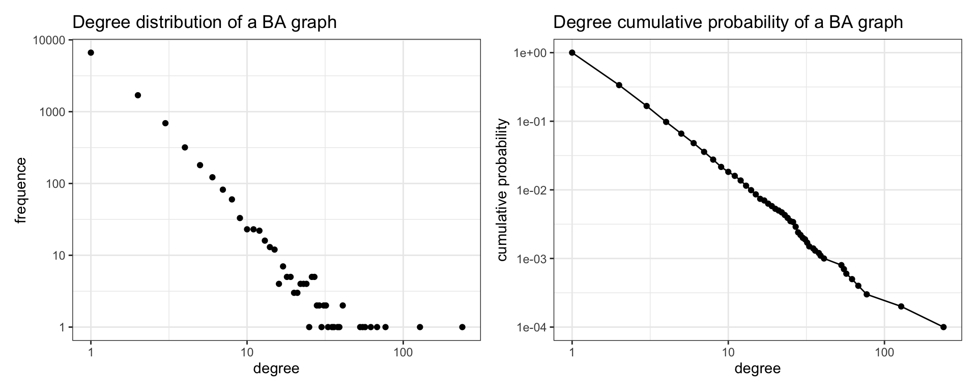
We learn from the plots that the degree distribution of BA graphs is heterogeneous. Most of the nodes have low degree, while a few nodes are hubs of high degree. In the plot of the left we appreciate that the variance of frequency increases for high values of degree. The cumulative degree plot has less variability, and fits reasonably to a straight line. This analysis allows us to conclude that the degree distribution of BA graphs follows a power law.
Word count
The number of occurrences of a word in a text is said to follow the Zipf’s law, which states that the frequency of a word is inversely proportional to a power of its rank in the frequency table. This means that the frequency versus rank plot for words of a text is expected to follow a power law.
To evaluate this, I am using the acq database, a corpus of 50 articles from the Reuters-21578 data set. It is included in tm, a text mining package for R.
Here I am using tm functions to obtain a words table containing all words present in the text. Then, I build the freq_words table of frequencies (number of apparitions) of each word, and calculate its relative frequence and cumulative probability.
data(acq)
acq <- tm_map(acq, removePunctuation)
acq <- tm_map(acq, removeNumbers)
acq <- tm_map(acq, tolower)
acq <- tm_map(acq, stripWhitespace)
acq <- tm_map(acq, PlainTextDocument)

wrds <- strsplit(paste(unlist(acq), collapse = " "), ' ')[[1]]

words <- data.table(word = wrds)
freq_words <- words[, .N, words][order(-N)]
freq_words[, `:=`(freq = N/sum(N), rank = 1:nrow(freq_words))]
freq_words <- freq_words[order(-rank)]
freq_words[, p_cum := cumsum(freq)]
Let’s look at the first and last values of the table:
head(freq_words[order(rank)])## word N freq rank p_cum
## 1: the 414 0.05316553 1 1.0000000
## 2: of 284 0.03647104 2 0.9468345
## 3: to 199 0.02555541 3 0.9103634
## 4: said 186 0.02388596 4 0.8848080
## 5: a 175 0.02247335 5 0.8609220
## 6: and 173 0.02221651 6 0.8384487tail(freq_words[order(rank)])## word N freq rank p_cum
## 1: profitably 1 0.0001284192 1679 0.0007705150
## 2: someone 1 0.0001284192 1680 0.0006420958
## 3: catalyst 1 0.0001284192 1681 0.0005136766
## 4: extending 1 0.0001284192 1682 0.0003852575
## 5: specialty 1 0.0001284192 1683 0.0002568383
## 6: 38.4382979869843 1 0.0001284192 1684 0.0001284192And plot the log-log graphs for relative frequences and cumulative probability:
zipf <- ggplot(freq_words, aes(rank , freq)) +
  geom_point() +
  theme_bw() +
  scale_x_log10() +
  scale_y_log10() +
  labs(title = "Word count vs rank", x = "rank", y = "relative frequence")

zipf_cum <- ggplot(freq_words, aes(rank , p_cum)) +
  geom_point() +
  geom_line() +
  theme_bw() +
  scale_x_log10() +
  scale_y_log10() +
  labs(title = "Word count vs rank", x = "rank", y = "cumulative probability")

zipf + zipf_cum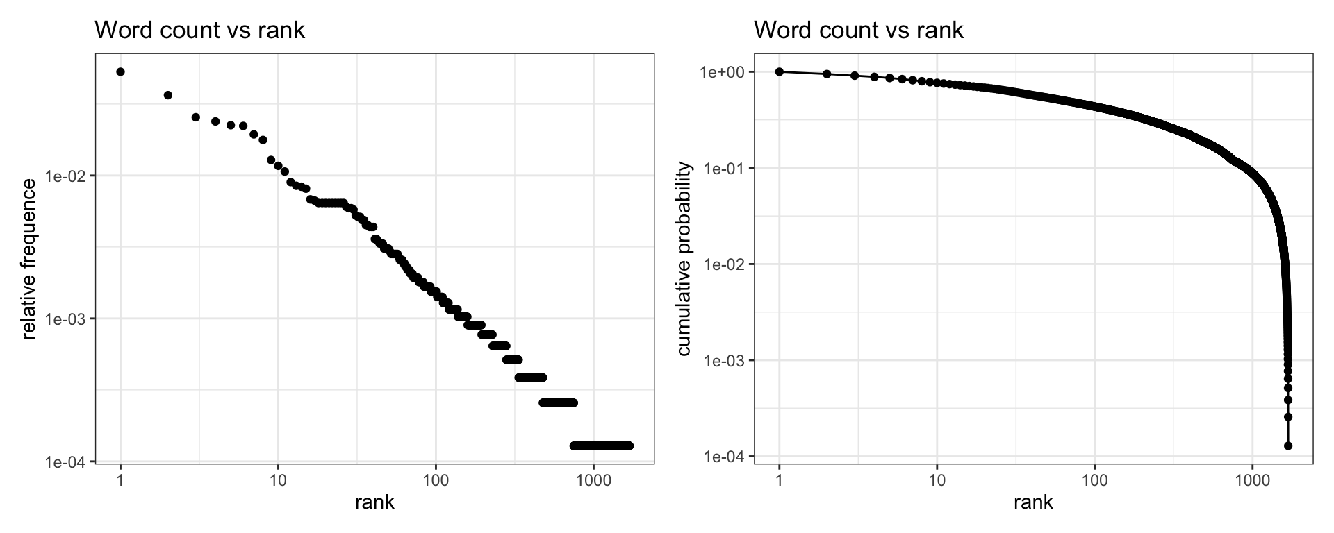
We observe that the left plot fits reasonably well to a power law. The plot of cumulative probability shows an exponential decay for high values of rank (non-frequent words), suggesting that the number of unique words of the corpus is too small to fully check if frequency versus rank plot is really a power law in this sample.
References and further reading
- Barabási, A.-L., & Albert, R. (1999). Emergence of scaling in random networks. Science, 286(5439), 509–512. https://doi.org/10.1126/science.286.5439.509
- Clauset, A., Shalizi, C. R., & Newman, M. E. J. (2009). Power-Law Distributions in Empirical Data. SIAM Review, 51(4), 661–703. https://doi.org/10.1137/070710111
- Newman, M. E. J. (2005). Power laws, Pareto distributions and Zipf’s law. Contemporary Physics, 46(5), 323–351. https://doi.org/10.1080/00107510500052444
- Counting occurence of a word in a text file using R https://stackoverflow.com/questions/35887730/counting-occurence-of-a-word-in-a-text-file-using-r
Built with R 4.1.0, data.table 1.14.0, ggplot2 3.3.4, viridis 0.6.1, patchwork 1.1.1, igraph 1.2.6 and tm 0.7-8.