In this post, I will show how to retrieve data from the Warld Bank with the package wbstats and countrycode. I will use some datasets to present some posibilities of ggplot2 from the tidyverse to produce frequently used plots, such as line plots, horizontal bar charts and scatter plots. I will also use kableExtra to present tables nicely, and ggrepel to deal with overlapping text labels.
library(wbstats)
library(countrycode)
library(tidyverse)
library(kableExtra)
library(ggrepel)
I have used the wb_data function from wbstats to retrieve three datasets:
NY.GDP.PCAP.PP.KD: GDP per capita (constant 2017 international dollars).SP.POP.TOTL: Population, total.SP.DYN.TFRT.IN: Fertility rate, total (births per woman).
gdp <- wb_data(indicator = "NY.GDP.PCAP.PP.KD")
population <- wb_data(indicator = "SP.POP.TOTL")
fertility <- wb_data(indicator = "SP.DYN.TFRT.IN")
The three tables have a similar structure, presenting information for each country and year:
population |>
  slice(1:10) |>
  kbl() |>
kable_styling(full_width = FALSE)| iso2c | iso3c | country | date | SP.POP.TOTL | unit | obs_status | footnote | last_updated |
|---|---|---|---|---|---|---|---|---|
| AF | AFG | Afghanistan | 2021 | 40099462 | NA | NA | NA | 2022-12-22 |
| AF | AFG | Afghanistan | 2020 | 38972230 | NA | NA | NA | 2022-12-22 |
| AF | AFG | Afghanistan | 2019 | 37769499 | NA | NA | NA | 2022-12-22 |
| AF | AFG | Afghanistan | 2018 | 36686784 | NA | NA | NA | 2022-12-22 |
| AF | AFG | Afghanistan | 2017 | 35643418 | NA | NA | NA | 2022-12-22 |
| AF | AFG | Afghanistan | 2016 | 34636207 | NA | NA | NA | 2022-12-22 |
| AF | AFG | Afghanistan | 2015 | 33753499 | NA | NA | NA | 2022-12-22 |
| AF | AFG | Afghanistan | 2014 | 32716210 | NA | NA | NA | 2022-12-22 |
| AF | AFG | Afghanistan | 2013 | 31541209 | NA | NA | NA | 2022-12-22 |
| AF | AFG | Afghanistan | 2012 | 30466479 | NA | NA | NA | 2022-12-22 |
As I am interested in introducing the continents in the analysis, I will create a countries table including the iso3c three-digit code, the name and continent of each country in the datasets. I will use the countries in population for reference. Names and continents are retrieved with the countrycode package.
countries <- tibble(iso3c = unique(population$iso3c),
                    name = countrycode(iso3c, origin = "iso3c", destination = "country.name"),
                    continent = countrycode(iso3c, origin = "iso3c", destination = "continent"))
## Warning in countrycode_convert(sourcevar = sourcevar, origin = origin, destination = dest, : Some values were not matched unambiguously: CHI, XKX
## Warning in countrycode_convert(sourcevar = sourcevar, origin = origin, destination = dest, : Some values were not matched unambiguously: CHI, XKXWe observe that countrycode data does not include:
- the Channel Islands, which aggregates the two Crown dependencies of Jersey and Guernsey, with iso3c code CHI.
- the partially recognized state of Kosovo, with iso3c code XKX.
I am using the base function replace in combination with mutate to complete these two elements manually:
countries <- countries |>
  mutate(name = replace(name, list = which(iso3c %in% c("CHI", "XKX")), values = c("Channel Islands", "Kosovo"))) |>
  mutate(continent = replace(continent, list = which(iso3c %in% c("CHI", "XKX")), values = "Europe"))
Let’s check that both elements are complete now:
countries |>
  filter(iso3c %in% c("CHI", "XKX")) |>
  kbl() |>
kable_styling(full_width = FALSE)| iso3c | name | continent |
|---|---|---|
| CHI | Channel Islands | Europe |
| XKX | Kosovo | Europe |
The next step is to create a wb_indicators table with the value of each indicator for each country and date, and the continent of each country. The merges required to build that table are:
wb_indicators <- left_join(population |> select(iso3c, date, country, SP.POP.TOTL),
                           gdp |> select(iso3c, date, NY.GDP.PCAP.PP.KD),
                           by = c("iso3c", "date"))

wb_indicators <- left_join(wb_indicators,
                           fertility |> select(iso3c, date, SP.DYN.TFRT.IN),
                           by = c("iso3c", "date"))

wb_indicators <- left_join(wb_indicators,
                           countries |> select(iso3c, continent),
                           by = "iso3c")
Let’s take a look at wb_indicators:
wb_indicators |>
  slice(1:10) |>
  kbl() |>
kable_styling(full_width = FALSE)| iso3c | date | country | SP.POP.TOTL | NY.GDP.PCAP.PP.KD | SP.DYN.TFRT.IN | continent |
|---|---|---|---|---|---|---|
| AFG | 2021 | Afghanistan | 40099462 | 1516.306 | NA | Asia |
| AFG | 2020 | Afghanistan | 38972230 | 1968.341 | 4.750 | Asia |
| AFG | 2019 | Afghanistan | 37769499 | 2079.922 | 4.870 | Asia |
| AFG | 2018 | Afghanistan | 36686784 | 2060.699 | 5.002 | Asia |
| AFG | 2017 | Afghanistan | 35643418 | 2096.093 | 5.129 | Asia |
| AFG | 2016 | Afghanistan | 34636207 | 2101.422 | 5.262 | Asia |
| AFG | 2015 | Afghanistan | 33753499 | 2108.714 | 5.405 | Asia |
| AFG | 2014 | Afghanistan | 32716210 | 2144.450 | 5.560 | Asia |
| AFG | 2013 | Afghanistan | 31541209 | 2165.341 | 5.696 | Asia |
| AFG | 2012 | Afghanistan | 30466479 | 2122.831 | 5.830 | Asia |
Evolution of population by continent
Let’s start showing how has evolved the total population in each of the continents between years 1995 and 2020. I will obtain the total population for each continent and date using summarise and group_by.
pop_cont_table <- wb_indicators |>
  filter(date >= 1993, date <= 2020) |>
  group_by(date, continent) |>
  summarise(pop_cont = sum(SP.POP.TOTL, na.rm = TRUE), .groups = "drop")
Then we can obtain a first plot draft with the ggplot defaults.
pop_cont_table |>
  ggplot(aes(date, pop_cont, color = continent)) +
  geom_line()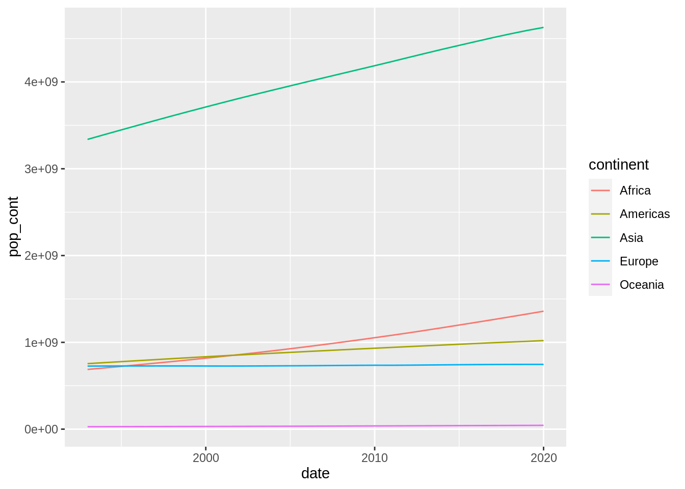
This plot can be improved in several ways. Firstly, I will scale population to millions of people so it is easier to interpret.
pop_cont_table <- pop_cont_table |>
  mutate(pop_cont = pop_cont/1e6)
Then, I will make some transformations to the plot:
- Increase line size in
geom_line. - Remove the legend with
legend.position = "none"and replace with direct labels usinggeom_text. Those labels will have the same color as continent lines. - Transform the x axis with
scale_x_continuousto customize date labels and to enlarge limits to make room for the continent direct labels. - Change the line colors with
scale_color_manual. Here I want to stand out that Asia and Africa have a different evolution than the other continents, so I am using one color for them and other for the rest. Note that values of continents are set in alphabetical order. - Use
theme_minimalfor a clear background. - Relabel axis and adding title, subtitle and caption with
labs. I am using the title to convey the message that Asia and Africa populations grow.
pop_cont_table  |>
  ggplot(aes(date, pop_cont, color = continent)) +
  geom_line(size = 1) +
  geom_text(data = pop_cont_table |> filter(date == 2020), aes(date, pop_cont, label = continent, color = continent), hjust = 0, nudge_x = 0.5) +
  scale_x_continuous(breaks = seq(1995, 2020, 5), limits = c(1993, 2025)) +
  scale_color_manual(values = c("#0066CC", "#606060", "#0066CC", "#606060", "#606060")) +
  theme_minimal() +
  theme(legend.position = "none") +
  labs(title = "The world population is increasing", subtitle = "Mostly in Asia and Africa", x = "year", y = "population (milions)", caption = "source: World Bank")
## Warning: Using `size` aesthetic for lines was deprecated in ggplot2 3.4.0.
## ℹ Please use `linewidth` instead.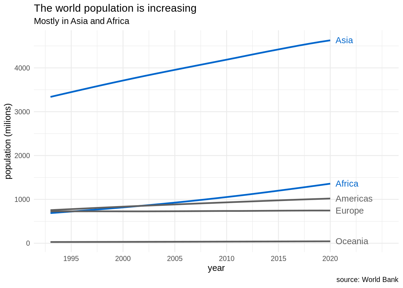
The resulting plot is hopefully better than the default at least for two reasons:
- Eliminating clutter: I have eliminated some elements like the legend and the grey background that can distract the reader. I have replaced the legend by direct labels for better readability.
- Strategic use of color: The use of direct labels eliminates the need to assign a color for each continent, that the reader has to check in a legend box. Then, i can use the color strategically to stand out Asia and Africa to the rest of continents, to reinforce the message I am presenting in the title and subtitle.
Ranking of countries with lowest fertility rate
The next job is to evaluate the evolution of fertility rate between 1995 and 2020. For doing so, I will examine which are the countries with a population larger than one million people with lowest fertility rate in 2020, and compare those values with 1995 values.
Let’s filter the wb_indicators dataset and arrange by increasing order of fertility rate:
wb_indicators |>
  filter(date == 2020, SP.POP.TOTL >= 1e06) |>
  arrange(SP.DYN.TFRT.IN) |>
  select(country, date, SP.DYN.TFRT.IN, SP.POP.TOTL)
## # A tibble: 160 × 4
## country date SP.DYN.TFRT.IN SP.POP.TOTL
## <chr> <dbl> <dbl> <dbl>
## 1 Korea, Rep. 2020 0.837 51836239
## 2 Hong Kong SAR, China 2020 0.868 7481000
## 3 Puerto Rico 2020 0.9 3281538
## 4 Singapore 2020 1.1 5685807
## 5 Ukraine 2020 1.22 44132049
## 6 Spain 2020 1.23 47365655
## 7 Italy 2020 1.24 59438851
## 8 China 2020 1.28 1411100000
## 9 North Macedonia 2020 1.3 2072531
## 10 Cyprus 2020 1.33 1237537
## # … with 150 more rowsLet’s pick the eight countries with lowest fertility in 2020 in fert_countries vector and retrieve their fertility in 1995 and 2020 in the fert_table data frame.
fert_countries <- wb_indicators |>
  filter(date == 2020, SP.POP.TOTL >= 1e06) |>
  arrange(SP.DYN.TFRT.IN) |>
  slice(1:8) |>
  pull(country)

fert_table <- wb_indicators |>
  filter(date %in% c(1995, 2020), country %in% fert_countries)
And let’s present the evolution of fertility with a dodged barplot with the default settings:
fert_table |>
  mutate(date = factor(date)) |>
  ggplot(aes(country, SP.DYN.TFRT.IN, fill = date)) +
  geom_bar(stat = "identity", position = "dodge")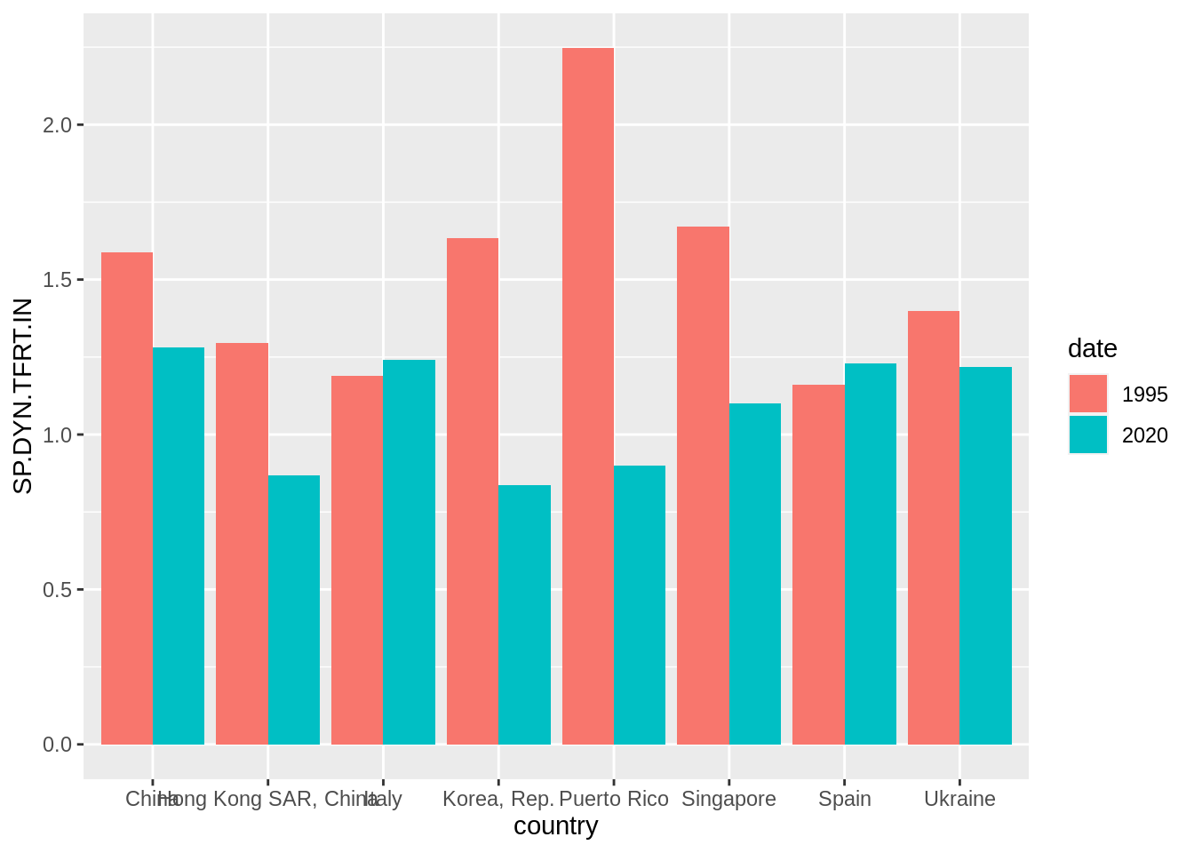
This plot has a large range of improvement. Firstly, I will shorten the name of Hong Kong, and define a f_label equal to fertility rates for 2020 and blank for 1995.
fert_table <- fert_table |>
  mutate(f_label = ifelse(date == 2020, format(round(SP.DYN.TFRT.IN, digits = 2), nsmall = 2), ""),
         country = replace(country, which(country == "Hong Kong SAR, China"), "Hong Kong"),
         date = factor(date))
Here is the transformed barplot:
- I have reordered countries by increasing order of fertility rate of 2020. Before, I have used
arrangeto order the table by year, so the last value for each country is of year 2020. This allows usingfct_reorderto achieve the desired effect. - I have reversed the values of country and fertility rate in
aes, so we hove an horizontal bar plot. - I have transformed the x axis so the limits are enlarged and presented at the top.
- I have presented the value of fertility rate of 2020 with
f_labelusinggeom_text. To make appear the value next to the 2020 bar I have usedposition = position_dodge(width = 1). - When choosing the colors I have used the same blue of the previous plot for values of 2020, and a lighter grey for values of 1985. By lighting the grey of 1985, I am emphasizing the values of 2020.
- I have selected a
theme_minimaland placed the legend at the bottom of the plot. - I have selected the title and subtitle of the plot to convey the message and to avoid placing labels in x and y axis.
fert_table |>
  arrange(country, date) |>
  mutate(country = fct_reorder(country, -SP.DYN.TFRT.IN, last)) |>
  ggplot(aes(SP.DYN.TFRT.IN, country, fill = date)) +
  geom_bar(stat = "identity", position = "dodge") +
  scale_x_continuous(breaks = seq(0, 2.5, 0.5), limits = c(0,2.8), position = "top") +
  geom_text(aes(label = f_label), position = position_dodge(width = 1), hjust = -0.3, size = 3, color = "#0066CC") +
  scale_fill_manual(values = c("#C0C0C0", "#0066CC")) +
  theme_minimal() +
  theme(legend.position = "bottom") +
  labs(title = "Asian countries are experiencing low fertility rates", subtitle = "Fertility in European countries is increasing", x ="", y ="", caption = "source: World Bank")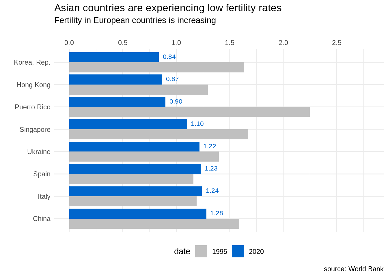
Like in the previous plot, in this new version of the plot I have removed clutter by removing the grey background and using an horizontal bar chart, that allows reading country names better. I have also used color strategically, using the same blue color as in the previous plot.
An alternative visualization for those data is the slopegraph. We can create slopegraphs with ggplot2 using geom_line and including the group in the plot aesthetic. The values of fertility in 2020 are quite similar for several countries, so I have used geom_text_repel to separate labels.
fert_table |>
  ggplot(aes(date, SP.DYN.TFRT.IN, group = country), color = "#808080") +
  geom_point(color = "#808080", size = 2) +
  geom_line(color = "#808080", size = 1) +
  geom_text_repel(data = fert_table |> filter(date == 1995), aes(label = country), hjust = 1, nudge_x = -0.05, size = 4, color = "#808080") +
  geom_text_repel(data = fert_table |> filter(date == 2020), aes(label = country), hjust = 0, nudge_x = 0.05, size = 4, color = "#808080") +
  theme_minimal() +
  labs(title = "Asian countries are experiencing low fertility rates", subtitle = "Fertility in European countries is increasing", x="", y = "Total fertiity rate", caption = "source: World Bank")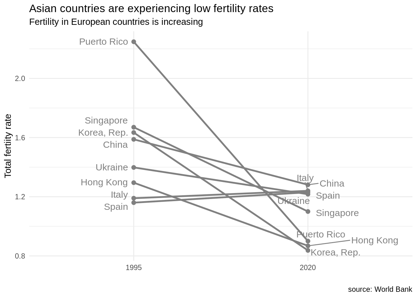
In this plot, I have chosen to set the color to dark grey
Relationship between GDP per capita and fertility rate
Let’s examine the relationship between GDP per capita and fertility rate in 2020 with a scatterplot:
wb_indicators |>
  filter(date == 2020) |>
  ggplot(aes(NY.GDP.PCAP.PP.KD, SP.DYN.TFRT.IN)) +
  geom_point(aes(color = continent))
## Warning: Removed 32 rows containing missing values (`geom_point()`).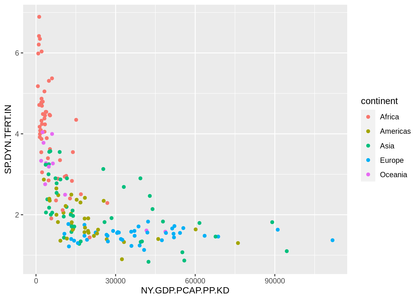
We observe that the GDP per capita has a long tail distribution: a few countries have values of GDP per capita much larger than other countries. Let’s tune the plot adding a logarithmic scale in the GDP per capita axis, removing the grey background and using a viridis scale to distinguish continents.
wb_indicators |>
  filter(date == 2020, !is.na(NY.GDP.PCAP.PP.KD), !is.na(SP.DYN.TFRT.IN)) |>
  ggplot(aes(NY.GDP.PCAP.PP.KD, SP.DYN.TFRT.IN)) +
  geom_point(aes(color = continent)) +
  scale_x_log10() +
  theme_minimal() +
  theme(legend.position = c(0.8, 0.8)) +
  scale_color_viridis_d() +
  labs(x = "GDP per capita", y = "total fertility rate", title = "Relationship between GDP and TRFT", caption = "source: World Bank")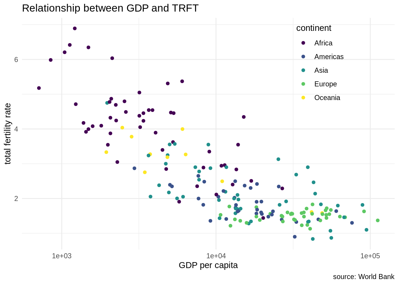
Let’s suppose that we are focusing in the evolution of GDP per capita and fertility rate of Assian countries across time. Then, we can use a facet grid and use color strategically to highlight Asian countries. Note that we can remove the legend as the use of color is explained by the title plot. I have also removed axis labels to avoid clutter.
wb_indicators |>
  filter(date %in% c(1995, 2020), !is.na(NY.GDP.PCAP.PP.KD), !is.na(SP.DYN.TFRT.IN)) |>
  ggplot(aes(NY.GDP.PCAP.PP.KD, SP.DYN.TFRT.IN)) +
  geom_point(aes(color = continent)) +
  scale_x_log10() +
  theme_minimal() +
  scale_color_manual(values = c("#C0C0C0", "#C0C0C0", "#0066CC", "#C0C0C0", "#C0C0C0")) +
  theme(axis.text = element_blank(), legend.position = "none") +
  facet_grid(. ~ date) +
  labs(x = "GDP per capita", y = "total fertility rate", title = "Asian countries are now richer and have less children", caption = "source: World Bank")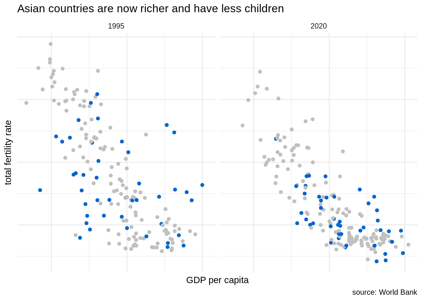
In this plot, we can observe how has moved the swarm of blue points, representing Asian countries, from 1995 to 2020. In 2020, Asian countries tend to be richer and have lower fertility rate. In some cases, like South Korea, Hong Kong or Singapore the vales of fertility rate are lower than of European countries.
The plots presented here try to follow the criteria presented by Cole Nussbaumer Knafic in her book Storytelling with Data, specially about avoiding clutter and using color strategically.
References
- cole nussbaumer knafic (2015). Storytelling with Data. Wiley. https://www.storytellingwithdata.com/
countrycodeR package GitHub repository. https://github.com/vincentarelbundock/countrycode- Nguyen, C. (2021). 7-day Challenge — Mastering Ggplot2: Day 3 — Slope Graph. https://towardsdatascience.com/7-day-challenge-mastering-ggplot2-day-3-slope-graph-a7cb373dc252
wbstats: An R package for searching and downloading data from the World Bank API. https://cran.r-project.org/web/packages/wbstats/vignettes/wbstats.html- World Bank data indicators. https://data.worldbank.org/indicator
Session Info
## R version 4.2.2 Patched (2022-11-10 r83330)
## Platform: x86_64-pc-linux-gnu (64-bit)
## Running under: Linux Mint 19.2
##
## Matrix products: default
## BLAS:   /usr/lib/x86_64-linux-gnu/openblas/libblas.so.3
## LAPACK: /usr/lib/x86_64-linux-gnu/libopenblasp-r0.2.20.so
##
## locale:
##  [1] LC_CTYPE=es_ES.UTF-8       LC_NUMERIC=C
##  [3] LC_TIME=es_ES.UTF-8        LC_COLLATE=es_ES.UTF-8
##  [5] LC_MONETARY=es_ES.UTF-8    LC_MESSAGES=es_ES.UTF-8
##  [7] LC_PAPER=es_ES.UTF-8       LC_NAME=C
##  [9] LC_ADDRESS=C               LC_TELEPHONE=C
## [11] LC_MEASUREMENT=es_ES.UTF-8 LC_IDENTIFICATION=C
##
## attached base packages:
## [1] stats     graphics  grDevices utils     datasets  methods   base
##
## other attached packages:
##  [1] ggrepel_0.9.1     kableExtra_1.3.4  forcats_0.5.2     stringr_1.4.1
##  [5] dplyr_1.0.10      purrr_0.3.5       readr_2.1.3       tidyr_1.2.1
##  [9] tibble_3.1.8      ggplot2_3.4.0     tidyverse_1.3.1   countrycode_1.4.0
## [13] wbstats_1.0.4
##
## loaded via a namespace (and not attached):
##  [1] Rcpp_1.0.9        svglite_2.1.0     lubridate_1.9.0   assertthat_0.2.1
##  [5] digest_0.6.30     utf8_1.2.2        R6_2.5.1          cellranger_1.1.0
##  [9] backports_1.4.1   reprex_2.0.2      evaluate_0.17     highr_0.9
## [13] httr_1.4.4        blogdown_1.9      pillar_1.8.1      rlang_1.0.6
## [17] readxl_1.4.1      rstudioapi_0.13   jquerylib_0.1.4   rmarkdown_2.14
## [21] labeling_0.4.2    webshot_0.5.3     munsell_0.5.0     broom_1.0.1
## [25] compiler_4.2.2    modelr_0.1.10     xfun_0.34         systemfonts_1.0.4
## [29] pkgconfig_2.0.3   htmltools_0.5.3   tidyselect_1.1.2  bookdown_0.26
## [33] viridisLite_0.4.1 fansi_1.0.3       crayon_1.5.2      tzdb_0.3.0
## [37] dbplyr_2.2.1      withr_2.5.0       grid_4.2.2        jsonlite_1.8.3
## [41] gtable_0.3.0      lifecycle_1.0.3   DBI_1.1.2         magrittr_2.0.3
## [45] scales_1.2.1      cli_3.4.1         stringi_1.7.8     farver_2.1.1
## [49] fs_1.5.2          xml2_1.3.3        bslib_0.3.1       ellipsis_0.3.2
## [53] generics_0.1.2    vctrs_0.5.0       tools_4.2.2       glue_1.6.2
## [57] hms_1.1.2         fastmap_1.1.0     yaml_2.3.6        timechange_0.1.1
## [61] colorspace_2.0-3  rvest_1.0.3       knitr_1.40        haven_2.5.1
## [65] sass_0.4.1