A population pyramid is a graphical illustration of the distribution of a population by age groups and sex. When the population is growing, this representation takes the shape of a pyramid, whence its name. Males are usually shown on the left and females on the right, and they may be measured in absolute numbers or as a percentage of the total population.
If we have data by age group available, we can draw our own age pyramids using the tidyverse functions for plotting and handling data. This representation, though, requires some formatting and adjusting of the dataset.
library(tidyverse)Let’s read with the read_csv() function from the readr package a .csv file from Idescat with population data by nationality and age group for different years.
pop <- read_csv("censph-536-19792-cat.csv") |>
  janitor::clean_names()
## Rows: 3192 Columns: 8
## ── Column specification ────────────────────────────────────────────────────────
## Delimiter: ","
## chr (5): Catalunya, nacionalitat, sexe, edat quinquennal, concepte
## dbl (2): any, valor
## lgl (1): estat
##
## ℹ Use `spec()` to retrieve the full column specification for this data.
## ℹ Specify the column types or set `show_col_types = FALSE` to quiet this message.pop## # A tibble: 3,192 × 8
## any catalunya nacionalitat sexe edat_quinquennal concepte estat valor
## <dbl> <chr> <chr> <chr> <chr> <chr> <lgl> <dbl>
## 1 1991 Catalunya espanyola homes de 0 a 4 anys població NA 143821
## 2 1991 Catalunya espanyola homes de 5 a 9 anys població NA 172906
## 3 1991 Catalunya espanyola homes de 10 a 14 anys població NA 235146
## 4 1991 Catalunya espanyola homes de 15 a 19 anys població NA 262054
## 5 1991 Catalunya espanyola homes de 20 a 24 anys població NA 246040
## 6 1991 Catalunya espanyola homes de 25 a 29 anys població NA 232504
## 7 1991 Catalunya espanyola homes de 30 a 34 anys població NA 217492
## 8 1991 Catalunya espanyola homes de 35 a 39 anys població NA 200722
## 9 1991 Catalunya espanyola homes de 40 a 44 anys població NA 199194
## 10 1991 Catalunya espanyola homes de 45 a 49 anys població NA 181117
## # ℹ 3,182 more rowsFormatting and Adjusting Data
Let’s format and adjust data to draw an age pyramid. I will start with filtering, removing some columns with unnecessary information and rows of total values of population for each year regarding age groups and gender.
pop <- pop |>
  select(any, nacionalitat, sexe, edat_quinquennal, valor) |>
  filter(edat_quinquennal != "total", sexe != "total")
I will present values for each gender and age group as percentage of total population, so I will obtain the prop variable by dividing each value by the total value of population of each year. Note how I am using group:by() together with mutate() to do this.
pop <- pop |>
  group_by(any) |>
  mutate(prop = valor/sum(valor)) |>
  ungroup()
Now I need to relabel the values of age groups so that they can be presented in a more compact way. I am generating a tab_groups table with the present and desired labels for age groups.
tab_groups <- tibble(edat_quinquennal = sort(unique(pop$edat_quinquennal)))

grups <- c("85 +  ", "  0 - 4", "10 - 14", "15 - 19", "20 - 24", "25 - 29",
           "30 - 34", "35 - 39", "40 - 44", "45 - 49", "  5 - 9", "50 - 54",
           "55 - 59", "60 - 64", "65 - 69", "70 - 74", "75 - 79", "80 - 84")

tab_groups <- tab_groups |>
  mutate(age_groups = grups)

tab_groups
## # A tibble: 18 × 2
## edat_quinquennal age_groups
## <chr> <chr>
## 1 85 anys o més "85 + "
## 2 de 0 a 4 anys " 0 - 4"
## 3 de 10 a 14 anys "10 - 14"
## 4 de 15 a 19 anys "15 - 19"
## 5 de 20 a 24 anys "20 - 24"
## 6 de 25 a 29 anys "25 - 29"
## 7 de 30 a 34 anys "30 - 34"
## 8 de 35 a 39 anys "35 - 39"
## 9 de 40 a 44 anys "40 - 44"
## 10 de 45 a 49 anys "45 - 49"
## 11 de 5 a 9 anys " 5 - 9"
## 12 de 50 a 54 anys "50 - 54"
## 13 de 55 a 59 anys "55 - 59"
## 14 de 60 a 64 anys "60 - 64"
## 15 de 65 a 69 anys "65 - 69"
## 16 de 70 a 74 anys "70 - 74"
## 17 de 75 a 79 anys "75 - 79"
## 18 de 80 a 84 anys "80 - 84"Then, I am attaching the new labels for age groups joining the obtained table with the original table.
pop <- inner_join(pop, tab_groups, by = "edat_quinquennal")Now let’s format the age_groups column as an ordered factor, so that the age groups will be plotted in the correct order.
grups_ord <- grups[c(2, 11, 3:10, 12:18, 1)]

pop <- pop |>
  mutate(age_groups = factor(age_groups, ordered = TRUE, levels = grups_ord))
Finally, we can remove the edat_quinquennal and valor columns, which have been replaced by age_group and prop.
pop <- pop |>
  select(-c(edat_quinquennal, valor))
This is how the dataset looks like after formatting and adjusting:
pop## # A tibble: 2,016 × 5
## any nacionalitat sexe prop age_groups
## <dbl> <chr> <chr> <dbl> <ord>
## 1 1991 espanyola homes 0.0119 " 0 - 4"
## 2 1991 espanyola homes 0.0143 " 5 - 9"
## 3 1991 espanyola homes 0.0194 "10 - 14"
## 4 1991 espanyola homes 0.0216 "15 - 19"
## 5 1991 espanyola homes 0.0203 "20 - 24"
## 6 1991 espanyola homes 0.0192 "25 - 29"
## 7 1991 espanyola homes 0.0179 "30 - 34"
## 8 1991 espanyola homes 0.0166 "35 - 39"
## 9 1991 espanyola homes 0.0164 "40 - 44"
## 10 1991 espanyola homes 0.0149 "45 - 49"
## # ℹ 2,006 more rowsPlotting an Age Pyramid
Let’s plot an age pyramid with these data. An age pyramid is a stacked, horizontal barplot, with negative values for men and positive values for women. Here I am selecting data from 2011 and total population.
pop |>
  filter(any == 2011, nacionalitat == "total") |>
  mutate(valor_pir = ifelse(sexe == "homes", -prop, prop)) |>
  select(sexe, valor_pir, age_groups) |>
  ggplot(aes(valor_pir, age_groups, fill = sexe)) +
  geom_col()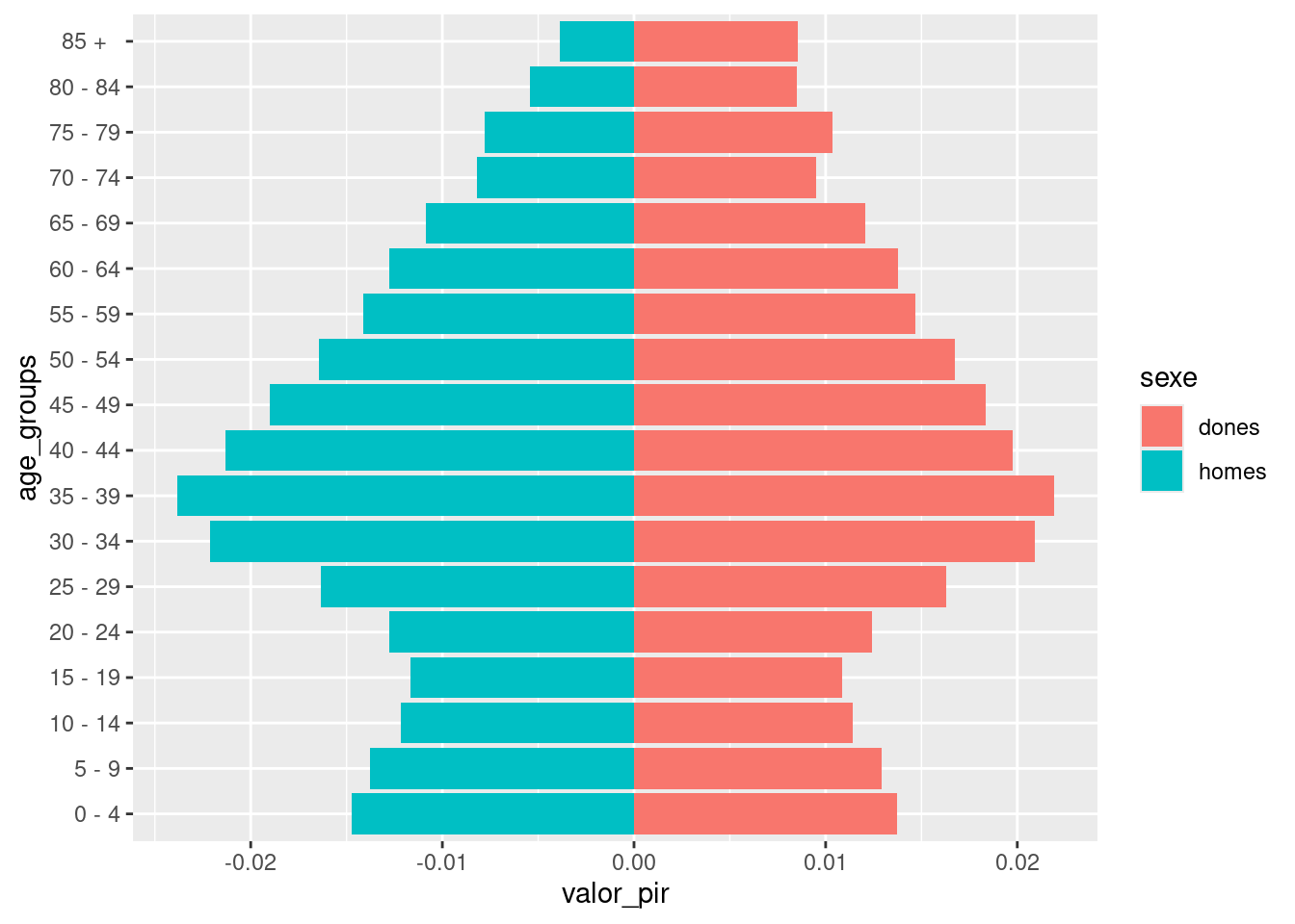
Once obtained the pyramid, let’s edit it to make it more readable by using:
scale_fill_manual()to change color bars and edit the legend.scale_x_continuous()to set percentages in absolute value in the x axis and remove label of x axis.theme_minimal()andtheme()to change theme and position legend at bottom.labs()to put a title and a caption to the plot, and remove label of y axis.
pop |>
  filter(any == 2011, nacionalitat == "total") |>
  mutate(valor_pir = ifelse(sexe == "homes", -prop, prop)) |>
  select(sexe, valor_pir, age_groups) |>
  ggplot(aes(valor_pir, age_groups, fill = sexe)) +
  geom_col() +
  scale_fill_manual(name = "sex", values = c("#FF0000", "#0000FF"), labels = c("female", "male"))  +
  scale_x_continuous(name = NULL,
                     breaks = seq(-0.05, 0.05, 0.01),
                     labels = \(x) paste0(abs(x*100), "%")) +
  theme_minimal() +
  labs(title = "Catalan age pyramid (2011)", y = NULL, caption = "source: Idescat") +
  theme(legend.position = "bottom")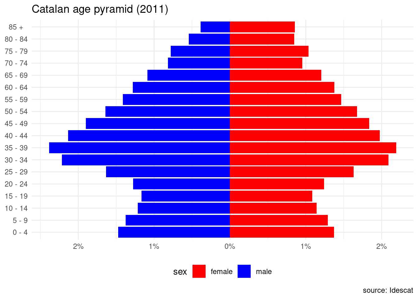
Age Pyramid with Gender Excess
An alternative representation of age pyramids is presenting gender excess, that is, indicating which of the two genders has more individuals for an age group. This requires creating new variables from the original table for each age group:
min_mandmin_w, representing the minimum value of men and women. Both variables have the same value.excess_mequal to the difference between men and women if it is positive and zero otherwise.excess_wequal to the difference between women and men if it is positive and zero otherwise.
I am using pivot_wider() to get values of men and women of an age group in the same row, and pivot_longer() to put the table in long format after the calculations. I have also formatted the gender column as an ordered factor.
pop_excess <- pop |>
  pivot_wider(names_from = "sexe", values_from = "prop") |>
  mutate(min_m = ifelse(homes < dones, homes, dones),
         min_w = min_m,
         excess_m = ifelse(homes > dones, homes - dones, 0),
         excess_w = ifelse(homes < dones, dones - homes, 0)) |>
  select(-c(homes, dones)) |>
  pivot_longer(min_m:excess_w,
               names_to = "gender", values_to = "prop") |>
  mutate(gender = factor(gender,
                         levels = c("excess_m", "min_m", "excess_w", "min_w"),
                         ordered = TRUE))
pop_excess
## # A tibble: 4,032 × 5
## any nacionalitat age_groups gender prop
## <dbl> <chr> <ord> <ord> <dbl>
## 1 1991 espanyola " 0 - 4" min_m 0.0110
## 2 1991 espanyola " 0 - 4" min_w 0.0110
## 3 1991 espanyola " 0 - 4" excess_m 0.000842
## 4 1991 espanyola " 0 - 4" excess_w 0
## 5 1991 espanyola " 5 - 9" min_m 0.0133
## 6 1991 espanyola " 5 - 9" min_w 0.0133
## 7 1991 espanyola " 5 - 9" excess_m 0.000940
## 8 1991 espanyola " 5 - 9" excess_w 0
## 9 1991 espanyola "10 - 14" min_m 0.0181
## 10 1991 espanyola "10 - 14" min_w 0.0181
## # ℹ 4,022 more rowsNow we can plot the age pyramid from the pop_excess table. Instead of a legend, I have set an annotation to signal data for men and women.
pop_excess |>
  filter(any == 1991, nacionalitat == "total") |>
  mutate(prop = ifelse(gender %in% c("min_m", "excess_m"), -prop, prop)) |>
  ggplot(aes(prop, age_groups, fill = gender)) +
  geom_col() +
  scale_fill_manual(values = c("#0000FF", "#9999FF", "#FF0000", "#FF9999")) +
  scale_x_continuous(name = NULL,
                     breaks = seq(-0.05, 0.05, 0.01),
                     labels = \(x) paste0(abs(x*100), "%")) +
  theme_light(base_size = 12) +
  labs(title = "Catalan age pyramid (1991)", y = NULL) +
  theme(legend.position = "none") +
  annotate("text", x = -0.015, y = "70 - 74", label = "men", size = 5) +
  annotate("text", x = 0.015, y = "70 - 74", label = "women", size = 5)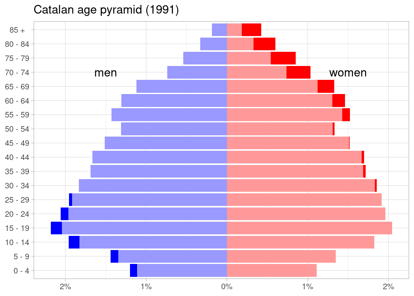
Faceted Plot of Age Pyramids
The original data has values for nationality and year, so we can present age pyramids for different years by facetting with facet_wrap().
pop_excess |>
  filter(any %in% c(1991, 2001, 2011, 2021), nacionalitat == "total") |>
  mutate(prop = ifelse(gender %in% c("min_m", "excess_m"), -prop, prop)) |>
  ggplot(aes(prop, age_groups, fill = gender)) +
  geom_col() +
  scale_fill_manual(values = c("#0000FF", "#9999FF", "#FF0000", "#FF9999")) +
  scale_x_continuous(name = NULL,
                     breaks = seq(-0.05, 0.05, 0.01),
                     labels = \(x) paste0(abs(x*100), "%")) +
  theme_light(base_size = 10) +
  labs(title = "Catalan age pyramid", y = NULL, caption = "source: Idescat") +
  theme(legend.position = "none") +
  facet_wrap(. ~ any, ncol = 2)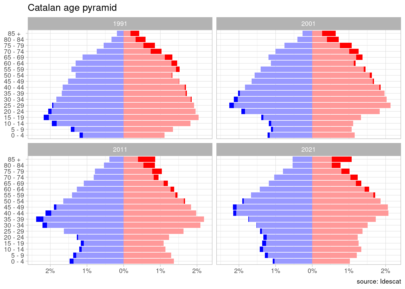
References
- Idescat data of population by nationality (continents), sex and five-year age group. https://www.idescat.cat/pub/?id=censph&n=536
Session Info
## R version 4.4.2 (2024-10-31)
## Platform: x86_64-pc-linux-gnu
## Running under: Linux Mint 21.1
##
## Matrix products: default
## BLAS:   /usr/lib/x86_64-linux-gnu/blas/libblas.so.3.10.0
## LAPACK: /usr/lib/x86_64-linux-gnu/lapack/liblapack.so.3.10.0
##
## locale:
##  [1] LC_CTYPE=es_ES.UTF-8       LC_NUMERIC=C
##  [3] LC_TIME=es_ES.UTF-8        LC_COLLATE=es_ES.UTF-8
##  [5] LC_MONETARY=es_ES.UTF-8    LC_MESSAGES=es_ES.UTF-8
##  [7] LC_PAPER=es_ES.UTF-8       LC_NAME=C
##  [9] LC_ADDRESS=C               LC_TELEPHONE=C
## [11] LC_MEASUREMENT=es_ES.UTF-8 LC_IDENTIFICATION=C
##
## time zone: Europe/Madrid
## tzcode source: system (glibc)
##
## attached base packages:
## [1] stats     graphics  grDevices utils     datasets  methods   base
##
## other attached packages:
##  [1] lubridate_1.9.4 forcats_1.0.0   stringr_1.5.1   dplyr_1.1.4
##  [5] purrr_1.0.2     readr_2.1.5     tidyr_1.3.1     tibble_3.2.1
##  [9] ggplot2_3.5.1   tidyverse_2.0.0
##
## loaded via a namespace (and not attached):
##  [1] utf8_1.2.4        sass_0.4.9        generics_0.1.3    blogdown_1.19
##  [5] stringi_1.8.3     hms_1.1.3         digest_0.6.35     magrittr_2.0.3
##  [9] evaluate_0.23     grid_4.4.2        timechange_0.3.0  bookdown_0.39
## [13] fastmap_1.1.1     jsonlite_1.8.9    scales_1.3.0      jquerylib_0.1.4
## [17] cli_3.6.2         rlang_1.1.5       crayon_1.5.2      bit64_4.0.5
## [21] munsell_0.5.1     withr_3.0.0       cachem_1.0.8      yaml_2.3.8
## [25] tools_4.4.2       parallel_4.4.2    tzdb_0.4.0        colorspace_2.1-0
## [29] vctrs_0.6.5       R6_2.5.1          lifecycle_1.0.4   snakecase_0.11.1
## [33] bit_4.0.5         vroom_1.6.5       janitor_2.2.0     pkgconfig_2.0.3
## [37] pillar_1.10.1     bslib_0.7.0       gtable_0.3.5      glue_1.7.0
## [41] highr_0.10        xfun_0.43         tidyselect_1.2.1  rstudioapi_0.16.0
## [45] knitr_1.46        farver_2.1.1      htmltools_0.5.8.1 labeling_0.4.3
## [49] rmarkdown_2.26    compiler_4.4.2
Data retrieved at 29 January 2025.