It is frequent that we need to visualize the temporal evolution along time of one or several variables using a line plot. Doing multiple line plots with ggplot might not be easy at first, as usually we have each variable in a column. Here I will illustrate how to do that with the economics dataset, included in the tidyverse. I will also plot a variable and its rolling mean obtained with zoo.
library(tidyverse)
library(zoo)
data("economics")
economics was produced from US economic time series data available from https://fred.stlouisfed.org/:
economics## # A tibble: 574 × 6
## date pce pop psavert uempmed unemploy
## <date> <dbl> <dbl> <dbl> <dbl> <dbl>
## 1 1967-07-01 507. 198712 12.6 4.5 2944
## 2 1967-08-01 510. 198911 12.6 4.7 2945
## 3 1967-09-01 516. 199113 11.9 4.6 2958
## 4 1967-10-01 512. 199311 12.9 4.9 3143
## 5 1967-11-01 517. 199498 12.8 4.7 3066
## 6 1967-12-01 525. 199657 11.8 4.8 3018
## 7 1968-01-01 531. 199808 11.7 5.1 2878
## 8 1968-02-01 534. 199920 12.3 4.5 3001
## 9 1968-03-01 544. 200056 11.7 4.1 2877
## 10 1968-04-01 544 200208 12.3 4.6 2709
## # … with 564 more rowsWe see that we have multiple series of macroeconomic aggregates, presented on a monthly basis.
A Single Line Plot
Let’s start plotting the evolution of the personal savings rate psavert. This is straightforward with geom_line().
economics |>
  ggplot(aes(date, psavert)) +
  geom_line()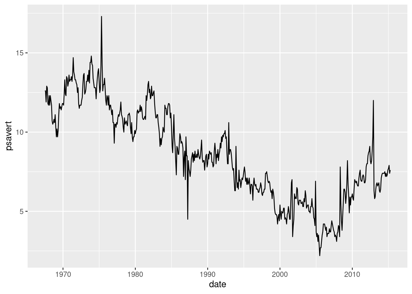
We can remove some clutter by applying theme_minimal and replacing axis labels with a descriptive title.
economics |>
  ggplot(aes(date, psavert)) +
  geom_line() +
  theme_minimal() +
  labs(title = "Temporal evolution of personal savings rate", x = NULL, y = NULL)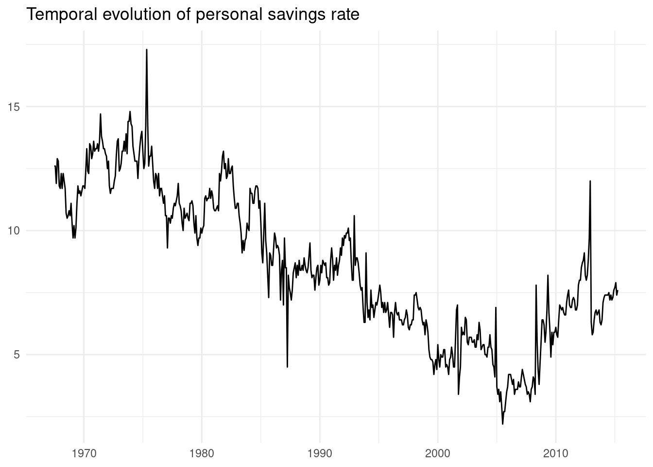
Two or More Lines
Let’s do a plot including personal savings rate psavert and median duration of unemployment uempmed. Each variable is presented in its column, so we need to transform data in two steps.
First, let’s select the variables included in the plot:
- y-axis variables
psavertanduempmed - the x-axis time variable
date
economics |>
  select(date, psavert, uempmed)
## # A tibble: 574 × 3
## date psavert uempmed
## <date> <dbl> <dbl>
## 1 1967-07-01 12.6 4.5
## 2 1967-08-01 12.6 4.7
## 3 1967-09-01 11.9 4.6
## 4 1967-10-01 12.9 4.9
## 5 1967-11-01 12.8 4.7
## 6 1967-12-01 11.8 4.8
## 7 1968-01-01 11.7 5.1
## 8 1968-02-01 12.3 4.5
## 9 1968-03-01 11.7 4.1
## 10 1968-04-01 12.3 4.6
## # … with 564 more rowsSecond, apply pivot_longer to have a long table excluding the time variable.
economics |>
  select(date, psavert, uempmed) |>
  pivot_longer(-date)
## # A tibble: 1,148 × 3
## date name value
## <date> <chr> <dbl>
## 1 1967-07-01 psavert 12.6
## 2 1967-07-01 uempmed 4.5
## 3 1967-08-01 psavert 12.6
## 4 1967-08-01 uempmed 4.7
## 5 1967-09-01 psavert 11.9
## 6 1967-09-01 uempmed 4.6
## 7 1967-10-01 psavert 12.9
## 8 1967-10-01 uempmed 4.9
## 9 1967-11-01 psavert 12.8
## 10 1967-11-01 uempmed 4.7
## # … with 1,138 more rowsNo matter how many variables had, now we have three columns: the x axis variable, value for the y axis and name to define the color of each line. Now we can do the plot.
economics |>
  select(date, psavert, uempmed) |>
  pivot_longer(-date) |>
  ggplot(aes(date, value, color = name)) +
  geom_line()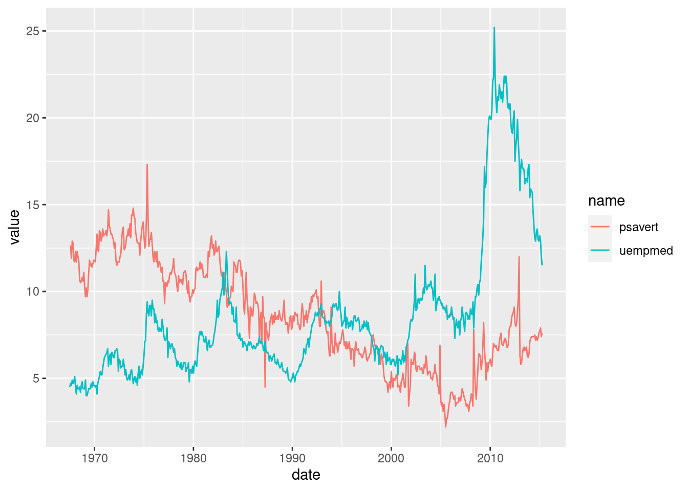
Here is an improved version. I have defined line colors and legend labels with scale_color_manual, and placed the legend below the plot with theme(legend.position = "bottom").
economics |>
  select(date, psavert, uempmed) |>
  pivot_longer(-date) |>
  ggplot(aes(date, value, color = name)) +
  geom_line() +
  theme_minimal() +
  theme(legend.position = "bottom") +
  scale_color_manual(values = c("#FF8000", "#0080FF"), name = "variable", labels = c("savings", "unemployment")) +
  labs(title = "Temporal evolution of savings and unemployment", x= NULL ,y = NULL)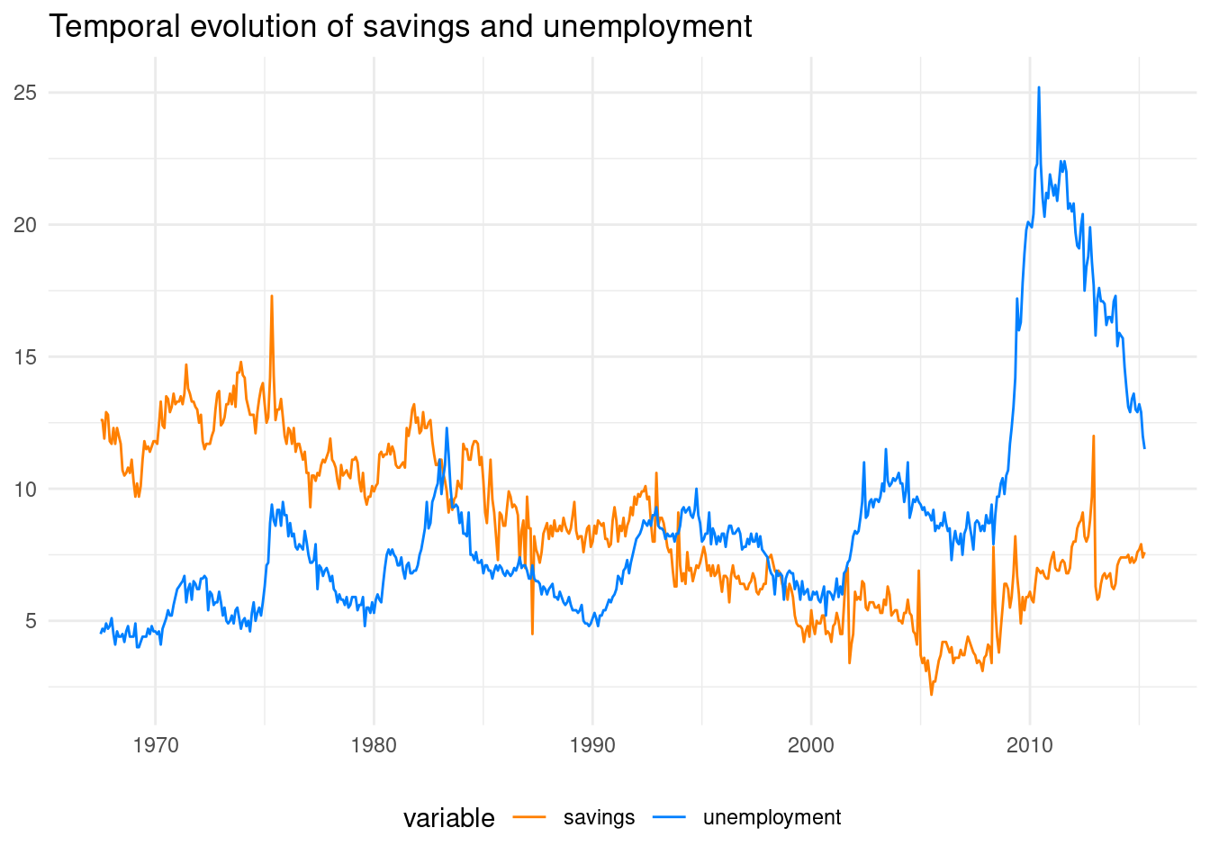
Variable and Rolling Mean
A special case of a two-line plot is presenting a variable and its rolling mean. We can obtain that mean with rollmean from the zoo package.
economics |>
  mutate(psavert_roll = rollmean(psavert, k = 12, fill = NA, align = "right")) |>
  select(date, psavert, psavert_roll) |>
  print(n = 15)
## # A tibble: 574 × 3
## date psavert psavert_roll
## <date> <dbl> <dbl>
## 1 1967-07-01 12.6 NA
## 2 1967-08-01 12.6 NA
## 3 1967-09-01 11.9 NA
## 4 1967-10-01 12.9 NA
## 5 1967-11-01 12.8 NA
## 6 1967-12-01 11.8 NA
## 7 1968-01-01 11.7 NA
## 8 1968-02-01 12.3 NA
## 9 1968-03-01 11.7 NA
## 10 1968-04-01 12.3 NA
## 11 1968-05-01 12 NA
## 12 1968-06-01 11.7 12.2
## 13 1968-07-01 10.7 12.0
## 14 1968-08-01 10.5 11.9
## 15 1968-09-01 10.6 11.8
## # … with 559 more rowsAfter that, let’s select the variables included in the plot. Then, we use apply pivot_longer to have a long table.
economics |>
  mutate(psavert_roll = rollmean(psavert, k = 12, fill = NA, align = "right")) |>
  select(date, psavert, psavert_roll) |>
  pivot_longer(-date)
## # A tibble: 1,148 × 3
## date name value
## <date> <chr> <dbl>
## 1 1967-07-01 psavert 12.6
## 2 1967-07-01 psavert_roll NA
## 3 1967-08-01 psavert 12.6
## 4 1967-08-01 psavert_roll NA
## 5 1967-09-01 psavert 11.9
## 6 1967-09-01 psavert_roll NA
## 7 1967-10-01 psavert 12.9
## 8 1967-10-01 psavert_roll NA
## 9 1967-11-01 psavert 12.8
## 10 1967-11-01 psavert_roll NA
## # … with 1,138 more rowsNow we are ready to do the plot:
economics |>
  mutate(psavert_roll = rollmean(psavert, k = 12, fill = NA, align = "right")) |>
  select(date, psavert, psavert_roll) |>
  pivot_longer(-date) |>
  ggplot(aes(date, value, color = name)) +
  geom_line()
## Warning: Removed 11 rows containing missing values (`geom_line()`).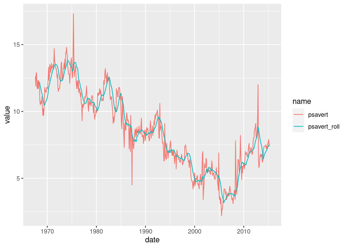
If we want to avoid the warning thrown by the NA of the rolling mean, we can remove these rows with filter(!is.na(value)). To plot the variable and its rolling mean, I have selected two colors with similar hue.
economics |>
  mutate(psavert_roll = rollmean(psavert, k = 24, fill = NA, align = "right")) |>
  select(date, psavert, psavert_roll) |>
  pivot_longer(-date) |>
  filter(!is.na(value)) |>
  ggplot(aes(date, value, color = name)) +
  geom_line() +
  theme_minimal() +
  theme(legend.position = "bottom") +
  scale_color_manual(values = c("#99CCFF", "#0066CC"), name = "savings", labels = c("raw", "detrended")) +
  labs(title = "Temporal evolution of savings (raw and detrended)", x= NULL ,y = NULL)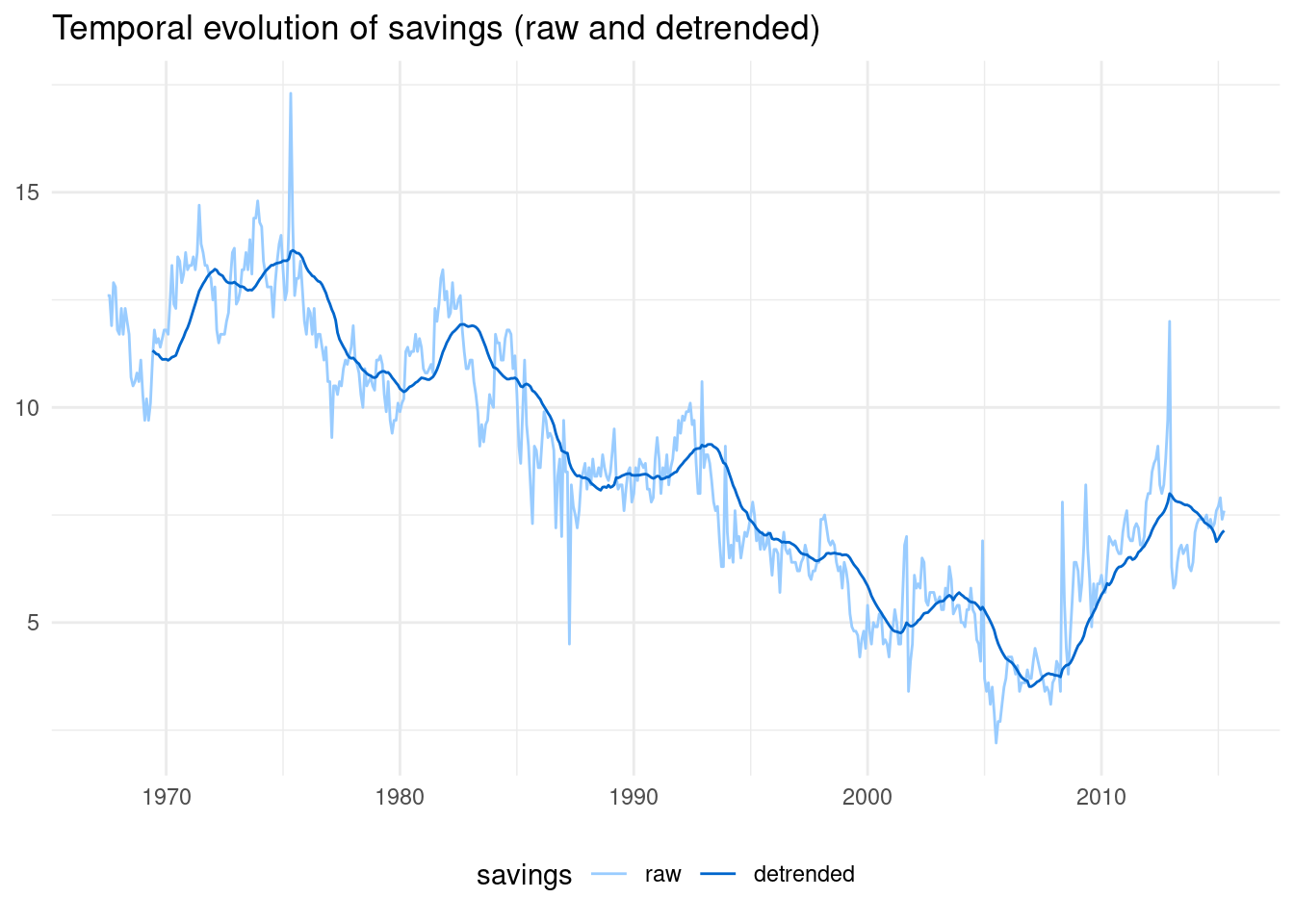
Whenever you need to do a multi line plot in ggplot, do no forget the two steps:
selectthe variables included in the plot- apply
pivot_longerto have a long table
## R version 4.2.2 Patched (2022-11-10 r83330)
## Platform: x86_64-pc-linux-gnu (64-bit)
## Running under: Linux Mint 21.1
##
## Matrix products: default
## BLAS:   /usr/lib/x86_64-linux-gnu/blas/libblas.so.3.10.0
## LAPACK: /usr/lib/x86_64-linux-gnu/lapack/liblapack.so.3.10.0
##
## locale:
##  [1] LC_CTYPE=es_ES.UTF-8       LC_NUMERIC=C
##  [3] LC_TIME=es_ES.UTF-8        LC_COLLATE=es_ES.UTF-8
##  [5] LC_MONETARY=es_ES.UTF-8    LC_MESSAGES=es_ES.UTF-8
##  [7] LC_PAPER=es_ES.UTF-8       LC_NAME=C
##  [9] LC_ADDRESS=C               LC_TELEPHONE=C
## [11] LC_MEASUREMENT=es_ES.UTF-8 LC_IDENTIFICATION=C
##
## attached base packages:
## [1] stats     graphics  grDevices utils     datasets  methods   base
##
## other attached packages:
##  [1] zoo_1.8-11      forcats_0.5.2   stringr_1.5.0   dplyr_1.0.10
##  [5] purrr_1.0.1     readr_2.1.3     tidyr_1.3.0     tibble_3.1.8
##  [9] ggplot2_3.4.0   tidyverse_1.3.2
##
## loaded via a namespace (and not attached):
##  [1] lubridate_1.9.1     lattice_0.20-45     assertthat_0.2.1
##  [4] digest_0.6.31       utf8_1.2.2          R6_2.5.1
##  [7] cellranger_1.1.0    backports_1.4.1     reprex_2.0.2
## [10] evaluate_0.20       highr_0.10          httr_1.4.4
## [13] blogdown_1.16       pillar_1.8.1        rlang_1.0.6
## [16] googlesheets4_1.0.1 readxl_1.4.1        rstudioapi_0.14
## [19] jquerylib_0.1.4     rmarkdown_2.20      labeling_0.4.2
## [22] googledrive_2.0.0   munsell_0.5.0       broom_1.0.3
## [25] compiler_4.2.2      modelr_0.1.10       xfun_0.36
## [28] pkgconfig_2.0.3     htmltools_0.5.4     tidyselect_1.2.0
## [31] bookdown_0.32       fansi_1.0.4         crayon_1.5.2
## [34] tzdb_0.3.0          dbplyr_2.3.0        withr_2.5.0
## [37] grid_4.2.2          jsonlite_1.8.4      gtable_0.3.1
## [40] lifecycle_1.0.3     DBI_1.1.3           magrittr_2.0.3
## [43] scales_1.2.1        cli_3.6.0           stringi_1.7.12
## [46] cachem_1.0.6        farver_2.1.1        fs_1.6.0
## [49] xml2_1.3.3          bslib_0.4.2         ellipsis_0.3.2
## [52] generics_0.1.3      vctrs_0.5.2         tools_4.2.2
## [55] glue_1.6.2          hms_1.1.2           fastmap_1.1.0
## [58] yaml_2.3.7          timechange_0.2.0    colorspace_2.1-0
## [61] gargle_1.2.1        rvest_1.0.3         knitr_1.42
## [64] haven_2.5.1         sass_0.4.5