In this post, I will present some insights on the evolution of the gross domestic product (GDP) per capita of of European Union (EU) countries in the 2000-2022 period, using data from the World Bank. While doing it, I will present some of the possibilities of ggplot to visualize information with a line graph.
In addition to the tidyverse, I have used wbstats to retrieve information from the World Bank, and ggrepel to present overlapping text labels.
library(tidyverse)
library(wbstats)
library(ggrepel) # https://ggrepel.slowkow.com/
Of all metrics of GDP per capita provided by the World Bank, I have chosen the NY.GDP.PCAP.PP.KD indicator. We can obtain the description of the indicator from wbstats::wbsearch():
wb_search("NY.GDP.PCAP.PP.KD")## # A tibble: 2 × 3
## indicator_id indicator indicator_desc
## <chr> <chr> <chr>
## 1 NY.GDP.PCAP.PP.KD GDP per capita, PPP (constant 2017 intern… GDP per capit…
## 2 NY.GDP.PCAP.PP.KD.ZG GDP per capita, PPP annual growth (%) Annual percen…wb_search("NY.GDP.PCAP.PP.KD")$indicator_desc[1]## [1] "GDP per capita based on purchasing power parity (PPP). PPP GDP is gross domestic product converted to international dollars using purchasing power parity rates. An international dollar has the same purchasing power over GDP as the U.S. dollar has in the United States. GDP at purchaser's prices is the sum of gross value added by all resident producers in the country plus any product taxes and minus any subsidies not included in the value of the products. It is calculated without making deductions for depreciation of fabricated assets or for depletion and degradation of natural resources. Data are in constant 2017 international dollars."This metric allows comparing across countries as it uses international dollars, and account the effect of inflation as it is presented in 2017 international dollars. We retrieve the data doing:
gdp_pc <- wb_data("NY.GDP.PCAP.PP.KD",
                  start_date = 2000, end_date = 2023)
Let’s pick the iso3c (ISO 3166-1 alpha-3) encoding of EU countries in a vector eu_iso3c, and use them to obtain the GDP per capita of EU countries in gdp_pc_eu.
eu_iso3c <- c("DEU", "AUT", "BEL", "BGR", "CYP", "HRV", "DNK", "SVK", "SVN", "ESP",
              "EST", "FIN", "FRA", "GRC", "HUN", "IRL", "ITA", "LVA", "LTU", "LUX",
              "MLT", "NLD", "POL", "PRT", "CZE", "ROU", "SWE")

gdp_pc_eu <- gdp_pc |>
  filter(iso3c %in% eu_iso3c) |>
  select(iso3c, country, date, NY.GDP.PCAP.PP.KD)
Let’s present the evolution of all EU countries in a line graph:
gdp_pc_eu |>
  ggplot(aes(date, NY.GDP.PCAP.PP.KD, color = iso3c)) +
  geom_line()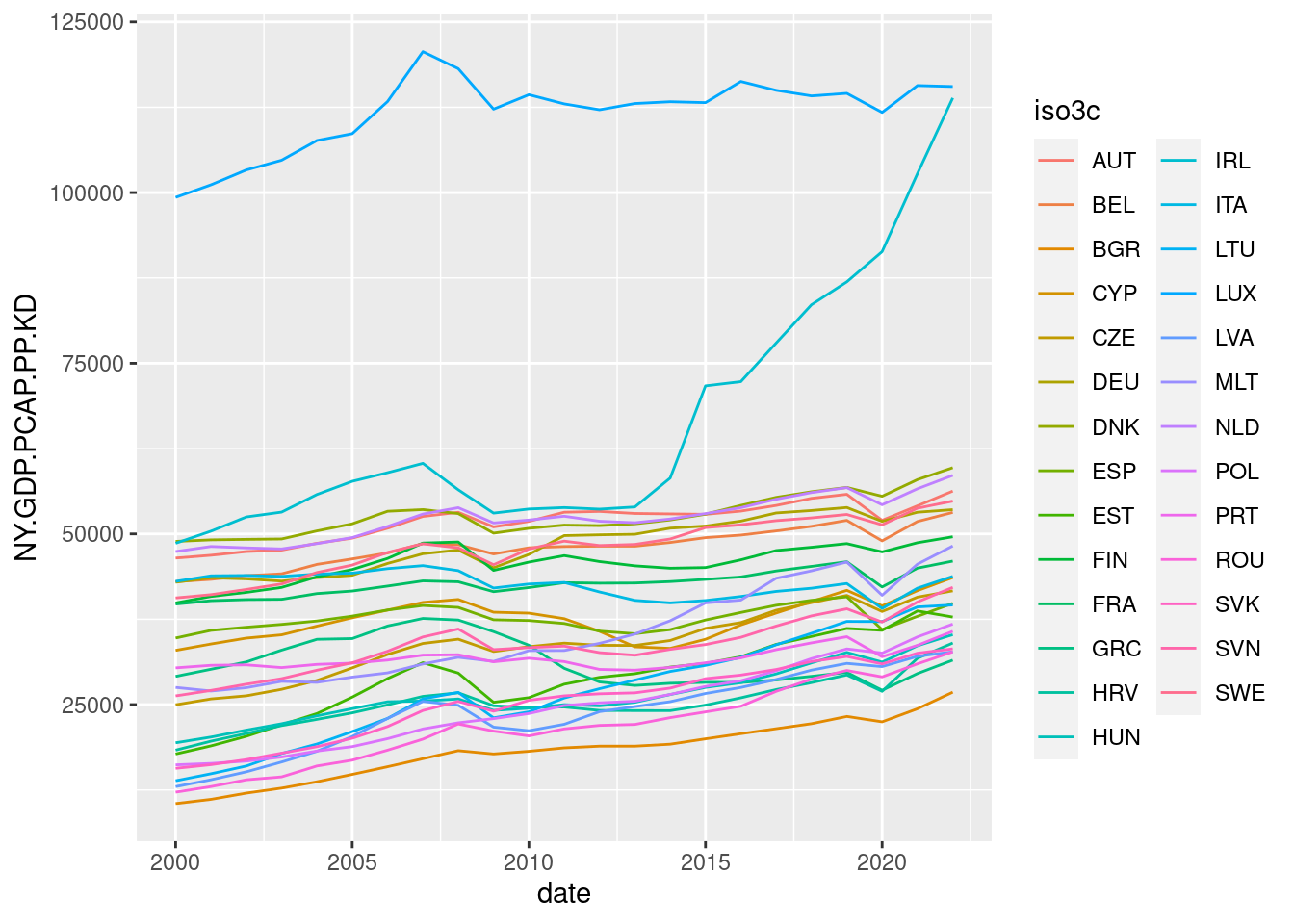
Aside from Luxembourg and Ireland, the evolution of the rest of countries is hard to tell, as there are too many countries represented in the same graph. This is an example of a spaghetti graph, a line graph with too many lines in it. Let’s see how can be modify this graph to convey relevant information.
Evolution of a Specific Country
A first strategy to present relevant information in a line graph is to emphasize one of the lines. In ggplot, we do this assigning a thicker line width to a specific observation. Here we emphasize the evolution of Ireland:
gdp_pc_eu |>
  mutate(mark = ifelse(iso3c == "IRL", "a", "b")) |>
  ggplot(aes(date, NY.GDP.PCAP.PP.KD, group = iso3c, linewidth = mark)) +
  geom_line() +
  scale_discrete_manual(aesthetic = "linewidth",
                        values = c(a = 2, b = 0.3))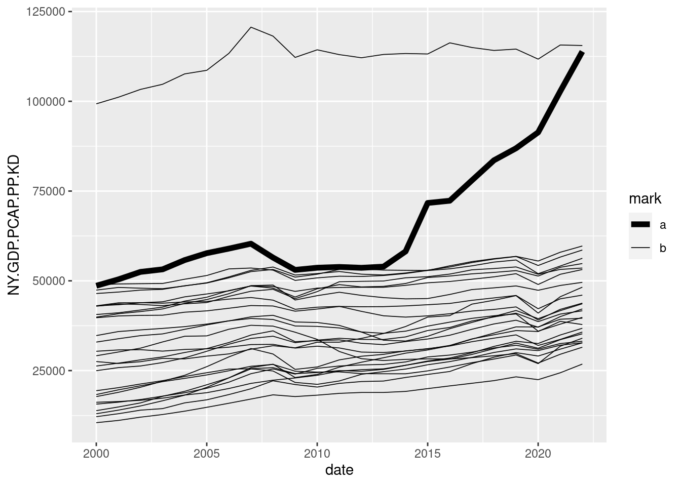
To emphasize Ireland from the rest, we need to do two things:
- Create a
markvariable with one value from IRL and the same value for the rest of observations. This variable will be used to assign the linewidth inside the aesthetic. The thickness of the lines is controlled byscale_discrete_manual(). - Now
countryis not related to a property of the lines, but we need to draw one line for each country. We achieve this usinggroupinside the aesthetic.
Let’s remove some clutter from the graph:
- Removing the legend by making
guide = "none"in the scale. - Using
theme_minimal(). - Removing axis labels and adding a title with
labs.
gdp_pc_eu |>
  mutate(mark = ifelse(iso3c == "IRL", "a", "b")) |>
  ggplot(aes(date, NY.GDP.PCAP.PP.KD, group = iso3c, linewidth = mark)) +
  geom_line() +
  scale_discrete_manual(aesthetic = "linewidth",
                        values = c(a = 2, b = 0.3),
                        guide = "none") +
  theme_minimal() +
  labs(title = "Evolution of Irish GDP along EU countries",
       x = NULL, y = NULL)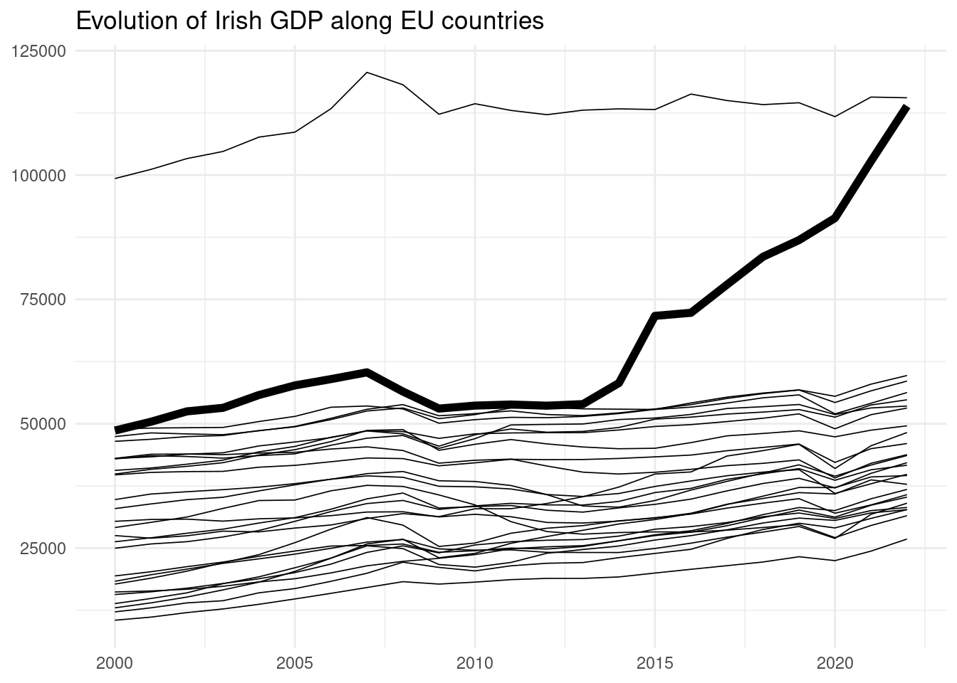
In this plot, we observe how the GDP per capita of Ireland has increased abruptly since the mid 2010s. According to this indicator, Ireland is the richest country on the EU after Luxembourg.
Groups of Selected Countries
Let’s focus on a set of selected EU countries, listed in selected_countries:
selected_countries <- c("EST", "LVA", "LTU",
                        "DEU", "FRA", "ITA", "NLD",
                        "ESP", "GRE", "PRT")

gdp_pc_sel <- gdp_pc_eu |>
  filter(iso3c %in% selected_countries)

gdp_pc_sel |>
  ggplot(aes(date, NY.GDP.PCAP.PP.KD, color = iso3c)) +
  geom_line()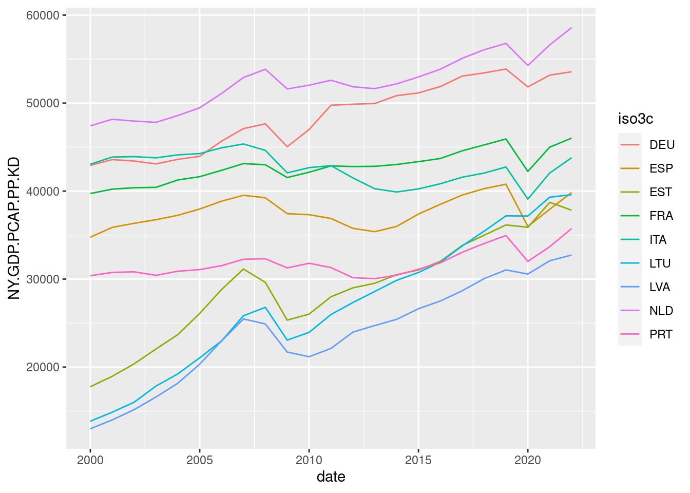
Although we have ten lines instead of twenty-seven, the resulting plot for ten countries is still hard to read. Let’s try to improve this defining three sets of Baltic, Southern and Northern countries. I am using case_when() to obtain the gr_country variable for each country:
gdp_pc_sel <- gdp_pc_sel |>
  mutate(gr_country = case_when(
    iso3c %in% c("EST", "LVA", "LTU") ~ "baltic",
    iso3c %in% c("ESP", "ITA", "GRE", "PRT") ~ "southern",
    iso3c %in% c("DEU", "FRA", "NLD") ~ "northern"
  ))
Now we can assign to each country the color of its group of countries. This means that we need to define an aesthetic for the color, and other aesthetic to group to define which lines to plot. Colors are defined by gr_country, and lines by country.
gdp_pc_sel |>
  ggplot(aes(date, NY.GDP.PCAP.PP.KD, group = country, color = gr_country)) +
  geom_line()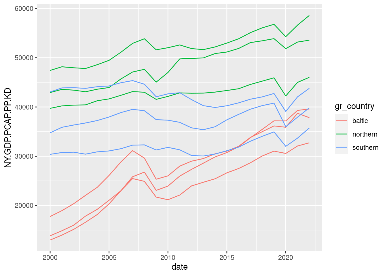
Let’s reduce clutter from the plot using theme_minimal(), redefining the legend and placing it at the bottom, removing axis labels and adding a title:
gdp_pc_sel |>
  ggplot(aes(date, NY.GDP.PCAP.PP.KD, group = country, color = gr_country)) +
  geom_line() +
  theme_minimal() +
  labs(title = "Evolution of GDP per capita of selected EU countries",
       x = NULL, y = NULL) +
  scale_color_manual(name = "groups",
                     values = c("#0080FF", "#00CC00", "#CC0000")) +
  theme(legend.position = "bottom")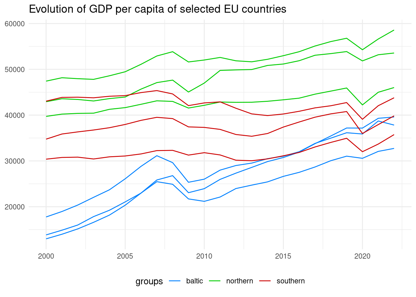
Placing Direct Labels
In this graph, we don’t know which are the countries represented in each line. Let’s try to add direct labels at the end of each line to present the country. Instead of relying on the directlabels package, I will create the labels from scratch.
The first step is to locate the labels. To do so, we need the values of GDP per capita of the last year of the series max_date. They are stored in gdp_pc_sel_ly.
max_date <- max(gdp_pc_sel$date)

gdp_pc_sel_ly <- gdp_pc_sel |>
  filter(date == max_date)
Now we can place the direct labels doing the following:
- Enlarging the x axis with
xlim(), so there is place for the country names at the right of the graph. - Using
geom_text()to plot the labels, usinggdp_pc_sel_lyas data. Values of date and NY.GDP.PCAP.PP.KD from that table give the position of the text, the color comes fromgr_countryand the text fromcountry.
gdp_pc_sel |>
  ggplot(aes(date, NY.GDP.PCAP.PP.KD, group = country, color = gr_country)) +
  geom_line(linewidth = 1) +
  theme_minimal(base_size = 9) +
  labs(title = "Evolution of GDP per capita of selected EU countries",
       x = NULL, y = NULL) +
  scale_color_manual(name = "groups",
                     values = c("#0080FF", "#00CC00", "#CC0000")) +
  xlim(2000, 2028) +
  geom_text(data = gdp_pc_sel_ly,
             aes(date, NY.GDP.PCAP.PP.KD, color = gr_country, label = country),
             hjust = 0, show.legend = FALSE) +
  theme(legend.position = "bottom")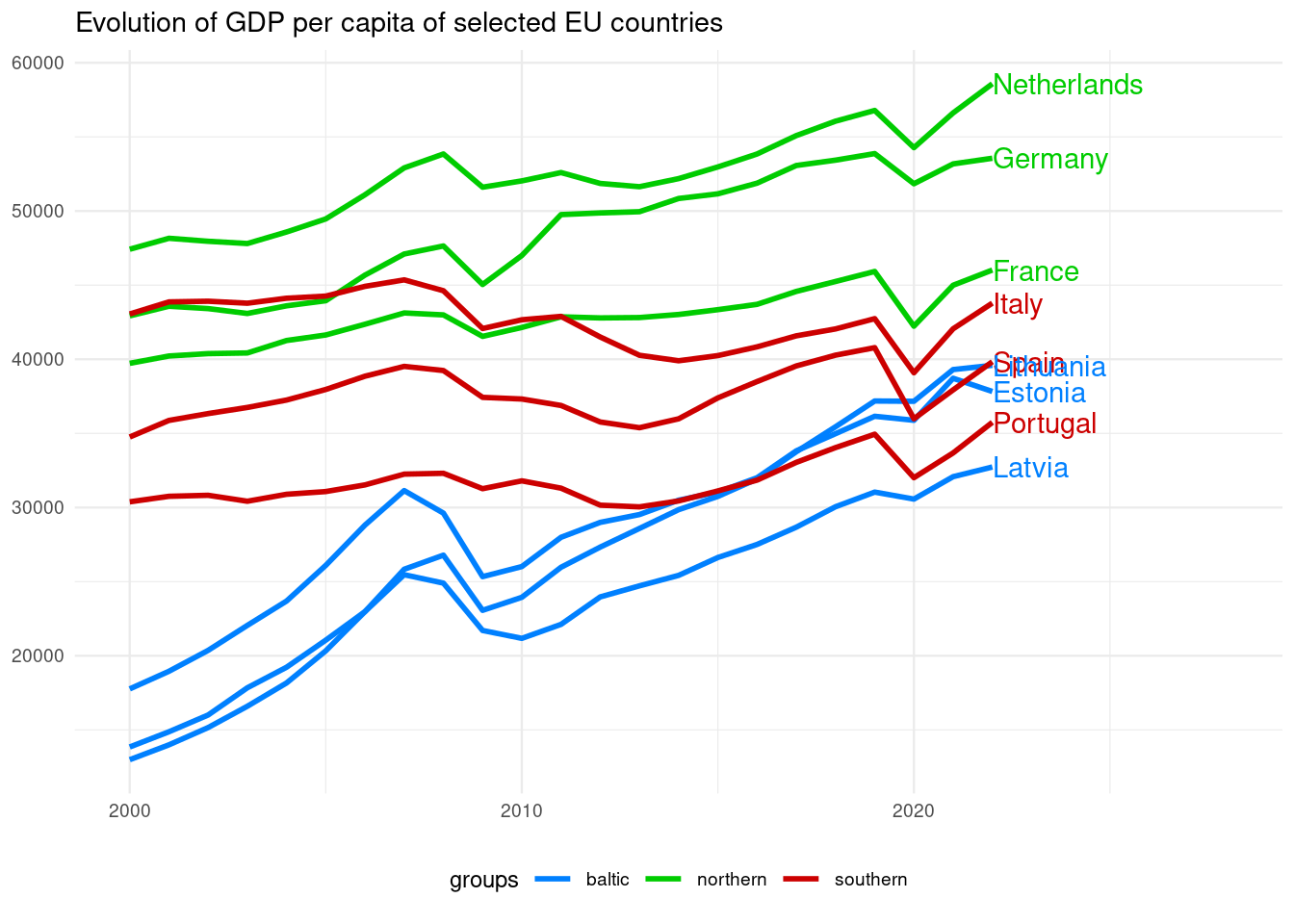
As the GDP per capita of EU countries has been converging in the last years, the labels are overlapping. To remedy this we can use ggprepel::geom_text_repel() instead of geom_text(). To separate labels only along the y axis I have set direction = "y".
gdp_pc_sel |>
  ggplot(aes(date, NY.GDP.PCAP.PP.KD, group = country, color = gr_country)) +
  geom_line(linewidth = 1) +
  theme_minimal(base_size = 9) +
  labs(title = "Evolution of GDP per capita of selected EU countries",
       x = NULL, y = NULL) +
  scale_color_manual(name = "groups",
                     values = c("#0080FF", "#00CC00", "#CC0000")) +
  xlim(2000, 2025) +
  geom_text_repel(data = gdp_pc_sel_ly,
                  aes(date, NY.GDP.PCAP.PP.KD, color = gr_country, label = country),
                  hjust = 0, direction = "y", show.legend = FALSE) +
  theme(legend.position = "bottom")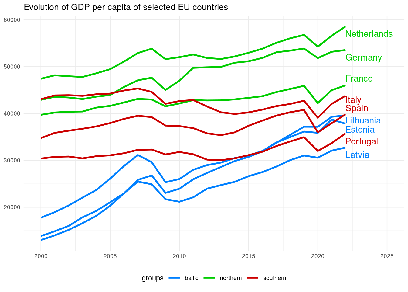
From the resulting plot, we can conclude that:
- The spread of values of GDP per capita across countries in 2000 is much larger than in 2022. This means that in the last twenty-two years the GDP per capita has converged across the selected sample of EU countries.
- The three Northern countries (The Netherlands, Germany and France) have the highest values of GDP per capita during most of the examined period.
- The fate of the four Southern countries is diverse: Italy seems to separate from France and getting closer to Spain.
- The Baltic countries are in a process of catching up with Southern countries: Lithuania and Estonia have surpassed Portugal, and in the 2020s have values of GDP similar to Spain.
References
- Hocking, T. D. (2023).
directlabelswebsite. https://github.com/tdhock/directlabels - nussbaumer knaflic, c. (2013). strategies for avoiding the spaghetti graph https://www.storytellingwithdata.com/blog/2013/03/avoiding-spaghetti-graph
- Slowikowski, K. (2022).
ggrepelwebsite. https://ggrepel.slowkow.com/ - World Bank Data: GDP per capita, PPP (constant 2017 international $) https://databank.worldbank.org/metadataglossary/world-development-indicators/series/NY.GDP.PCAP.PP.KD
- Would
scale_linewidth_discrete()be developed to set values manually like otherscale_size_manual()#5050 https://github.com/tidyverse/ggplot2/issues/5050
Session Info
## R version 4.3.2 (2023-10-31)
## Platform: x86_64-pc-linux-gnu (64-bit)
## Running under: Linux Mint 21.1
##
## Matrix products: default
## BLAS:   /usr/lib/x86_64-linux-gnu/blas/libblas.so.3.10.0
## LAPACK: /usr/lib/x86_64-linux-gnu/lapack/liblapack.so.3.10.0
##
## locale:
##  [1] LC_CTYPE=es_ES.UTF-8       LC_NUMERIC=C
##  [3] LC_TIME=es_ES.UTF-8        LC_COLLATE=es_ES.UTF-8
##  [5] LC_MONETARY=es_ES.UTF-8    LC_MESSAGES=es_ES.UTF-8
##  [7] LC_PAPER=es_ES.UTF-8       LC_NAME=C
##  [9] LC_ADDRESS=C               LC_TELEPHONE=C
## [11] LC_MEASUREMENT=es_ES.UTF-8 LC_IDENTIFICATION=C
##
## time zone: Europe/Madrid
## tzcode source: system (glibc)
##
## attached base packages:
## [1] stats     graphics  grDevices utils     datasets  methods   base
##
## other attached packages:
##  [1] ggrepel_0.9.3   wbstats_1.0.4   lubridate_1.9.3 forcats_1.0.0
##  [5] stringr_1.5.0   dplyr_1.1.3     purrr_1.0.2     readr_2.1.4
##  [9] tidyr_1.3.0     tibble_3.2.1    ggplot2_3.4.4   tidyverse_2.0.0
##
## loaded via a namespace (and not attached):
##  [1] sass_0.4.5       utf8_1.2.3       generics_0.1.3   blogdown_1.16
##  [5] stringi_1.7.12   hms_1.1.3        digest_0.6.31    magrittr_2.0.3
##  [9] evaluate_0.20    grid_4.3.2       timechange_0.2.0 bookdown_0.33
## [13] fastmap_1.1.1    jsonlite_1.8.7   fansi_1.0.4      scales_1.2.1
## [17] jquerylib_0.1.4  cli_3.6.1        rlang_1.1.2      munsell_0.5.0
## [21] withr_2.5.0      cachem_1.0.7     yaml_2.3.7       tools_4.3.2
## [25] tzdb_0.3.0       colorspace_2.1-0 vctrs_0.6.4      R6_2.5.1
## [29] lifecycle_1.0.3  pkgconfig_2.0.3  pillar_1.9.0     bslib_0.5.0
## [33] gtable_0.3.3     glue_1.6.2       Rcpp_1.0.10      highr_0.10
## [37] xfun_0.39        tidyselect_1.2.0 rstudioapi_0.14  knitr_1.42
## [41] farver_2.1.1     htmltools_0.5.5  rmarkdown_2.21   labeling_0.4.2
## [45] compiler_4.3.2