A Lissajous curve is a graph of a two-dimensional set of parametric equations of the form:
\[\begin{eqnarray} x &=& A sin \left( w_1t + \delta \right) \\ y &=& B sin \left( w_2t \right) \end{eqnarray}\]
These curves were first investigated in 1815 by Nathaniel Bowditch. Jules Antoine Lissajous studied them in more detail by 1857 and they were named after him since then.
Lissajous curves represent complex harmonic mation. \(A\) and \(B\) determine the width to height ratio, but the curve is more sensitive to the frequency ratio \(w_1/w_2\) ratio. Lissajous curves are closed if the frequency ratio is rational, and \(w_1\) and \(w_2\) determine the number of vertical and horizontal lobes, respectively.
Here I will be using Lissajous curves to introduce some features of data handling and visualization with the tidyverse family packages:
- tabular data handling with
dplyr, - functional programming with the
pmap_dffunction ofpurrr, - plotting Lissajous curves with
geom_path()andfacet_grid()fromggplot2 - and creating aminated GIFs with
gganimateandtransformr.
library(dplyr)##
## Attaching package: 'dplyr'## The following objects are masked from 'package:stats':
##
## filter, lag## The following objects are masked from 'package:base':
##
## intersect, setdiff, setequal, unionlibrary(purrr)
library(ggplot2)
library(gganimate)
library(transformr)Plotting a Lissajous curve
We can determine the points of a Lissajous curve with the lissajous function. The function returns a data frame with values of x and y, and ratio and phase variables are added for later plots
lissajous <- function(w1, w2, diff_phase, ratio, phase){
  t <- seq(0, 2*pi, length.out = 100)
  x <- sin(w1*t + diff_phase)
  y <- sin(w2*t)
  df <- data.frame(x = x, y = y, ratio = ratio, phase = phase)
  return(df)
}
Once we have the coordinates of the plots, we can represent the curve with geom_path(). This geom connects observations in the order they appear in the data. If we use geom_line() points are connected by order of the x axis. I use theme_void() because I don’t need coordinate axis in this kind of plots.
ggplot(lissajous(w1 = 1, w2 = 3, diff_phase = pi/4, ratio = "1/3", phase = "pi/4"), aes(x,y)) +
  geom_path() +
theme_void() 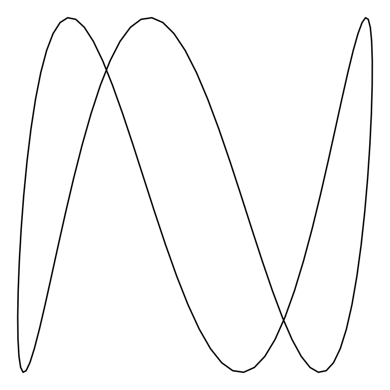
The above plot is a Lissajous curve with \(w_1=1\) and \(w_2=3\). Note that the figure has one vertical lobe and three horizontal lobes.
Plotting several Lissajous curves at once
Let’s try to plot several Lissajous curves together. I will be plotting eight ratios of frequencies for five different phase differences. I am using expand.grid for generating all combinations and mutate to obtain function parameters from ratio and phase labels.
lissajous_values <- expand.grid(ratio = c("1/1", "1/2", "1/3", "2/3", "3/4", "3/5", "4/5", "5/6"), phase = c("0", "pi/4", "pi/2", "3pi/4", "pi"))

lissajous_values <- lissajous_values %>%
  mutate(w1 = as.numeric(substr(ratio, 1, 1)),
         w2 =  as.numeric(substr(ratio, 3, 3)),
         phase_num = case_when(phase == "0" ~ 0,
                               phase == "pi/4" ~ pi/4,
                               phase == "pi/2" ~ pi/2,
                               phase == "3pi/4" ~ 3*pi/4,
                               phase == "pi" ~ pi))
Let’s glimpse at the table:
lissajous_values %>% glimpse()## Rows: 40
## Columns: 5
## $ ratio <fct> 1/1, 1/2, 1/3, 2/3, 3/4, 3/5, 4/5, 5/6, 1/1, 1/2, 1/3, 2/3, …
## $ phase <fct> 0, 0, 0, 0, 0, 0, 0, 0, pi/4, pi/4, pi/4, pi/4, pi/4, pi/4, …
## $ w1 <dbl> 1, 1, 1, 2, 3, 3, 4, 5, 1, 1, 1, 2, 3, 3, 4, 5, 1, 1, 1, 2, …
## $ w2 <dbl> 1, 2, 3, 3, 4, 5, 5, 6, 1, 2, 3, 3, 4, 5, 5, 6, 1, 2, 3, 3, …
## $ phase_num <dbl> 0.0000000, 0.0000000, 0.0000000, 0.0000000, 0.0000000, 0.000…Now we need to apply the lissajous function to each row of the table, and integrate the resulting 40 data frames of 100 rows into a single data frame. We can do that using the pmap_df function of the purrr package:
lissajous_table <- pmap_df(lissajous_values, function(ratio, phase, w1, w2, phase_num) lissajous(w1 = w1, w2 = w2, diff_phase = phase_num, ratio = ratio, phase = phase))The resulting data frame lissajous_table has 40 x 100 = 4,000 rows:
lissajous_table %>% glimpse()## Rows: 4,000
## Columns: 4
## $ x <dbl> 0.00000000, 0.06342392, 0.12659245, 0.18925124, 0.25114799, 0.31…
## $ y <dbl> 0.00000000, 0.06342392, 0.12659245, 0.18925124, 0.25114799, 0.31…
## $ ratio <fct> 1/1, 1/1, 1/1, 1/1, 1/1, 1/1, 1/1, 1/1, 1/1, 1/1, 1/1, 1/1, 1/1,…
## $ phase <fct> 0, 0, 0, 0, 0, 0, 0, 0, 0, 0, 0, 0, 0, 0, 0, 0, 0, 0, 0, 0, 0, 0…To plot the forty Lissajous curves we use a single plot:
xandyas aesthetics of each plot, created withgeom_path()andtheme_void().- we use
ratioandphaseas arguments offacet_grid()(that’s why they are added to thelissajousfunction). Theswitch = "y"argument sets the labels of frequency ratio to the left instead of to the right.
ggplot(lissajous_table, aes(x,y)) +
  geom_path() +
  theme_void() +
  facet_grid(ratio ~ phase, switch = "y")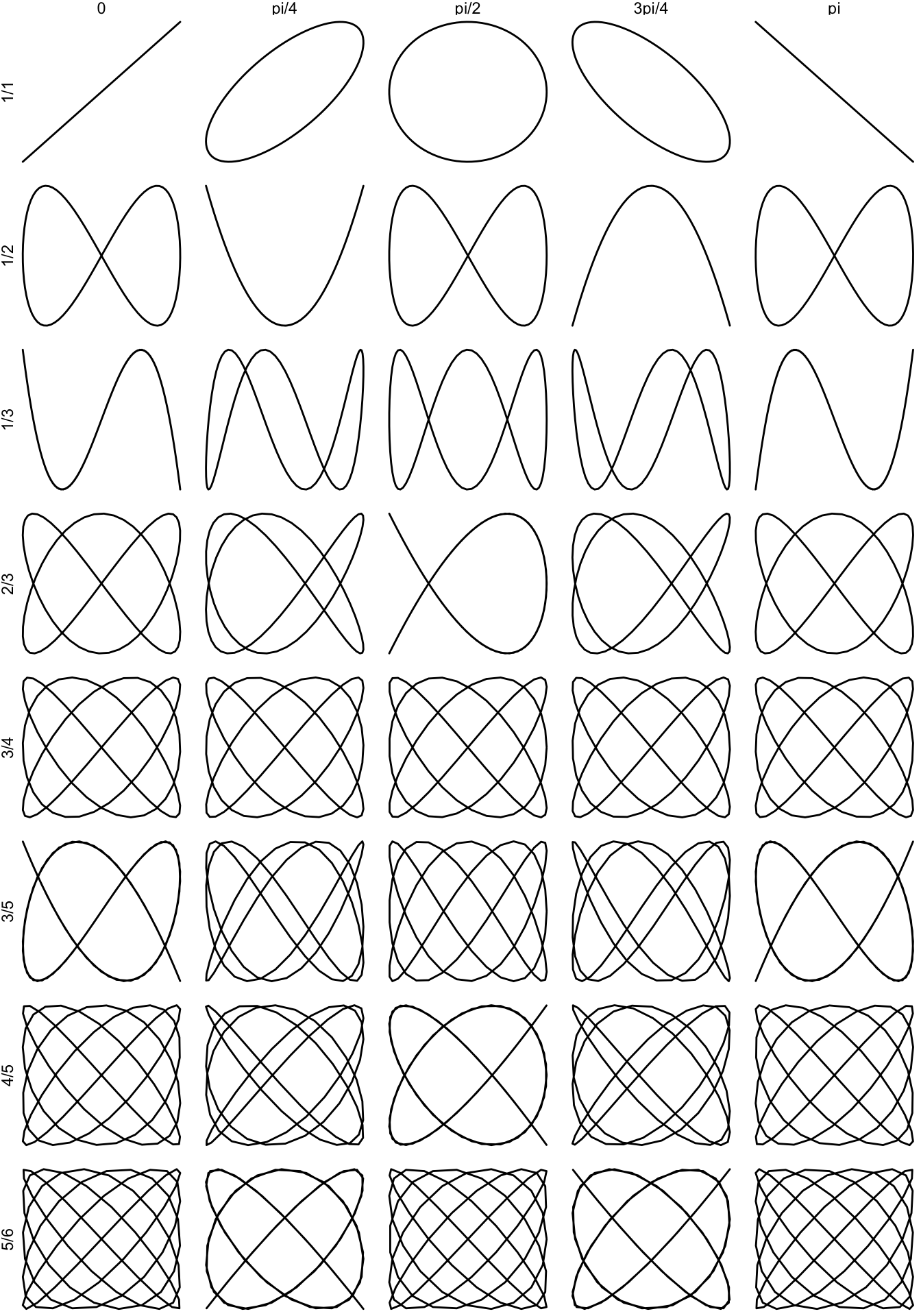
Examining the effect of phase with an animated GIF
To finish this gallery of Lissajous plots I have shown the effect of phase difference for a Lissajous curve. To run this on your computer you need:
- the
gganimatepackage to create the plots to be wrapped into the animation, - the
transformrpackage to generate smooth transitions between contiguous plots of the animation - and the
gifskipackage to create the GIF.
The code to build the GIF is wrapped into the lissajous_gif function:
- The
valuesdata frame haspointsvalues ofdiff_phasebetween 0 and \(2\pi\). We will be using 100 images to build the GIF, one for each value of phase difference. - The
l_giffunction returns the points of a Lissajous curve for eachdiff_phaseusing a number ofpoints. These values are stored in thetabledata frame. - I use the
transition_statesfunction ofgganimateto generate the plots to build the GIF. The function will generate one plot for each value ofdiff_phase. - The function returns the set of plots of the
animvariable.
lissajous_gif <- function(w1, w2, points = 100){

  values <- data.frame(w1, w2, diff_phase = seq(0, 2*pi, length.out = 100))

  l_gif <- function(w1, w2, diff_phase){
    t <- seq(0, 2*pi, length.out = points)
    x <- sin(w1*t + diff_phase)
    y <- sin(w2*t)
    df <- data.frame(x = x, y = y, diff_phase = diff_phase)
    return(df)
  }

  table <- pmap_df(values, function(w1, w2, diff_phase) l_gif(w1, w2, diff_phase))

  anim <- ggplot(table, aes(x, y)) +
    geom_path() +
    theme_void() +
    transition_states(diff_phase,
                      transition_length = 2,
                      state_length = 1)

  return(anim)
}
Let’s see an animation for a Lissajous curve of \(w_1 = 2\) and “w_2 = 3”
lissajous_gif(w1=2, w2=3, points=100)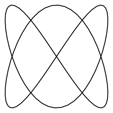
And an animation for \(w_1 = 4\) and \(w_2 = 5\):
lissajous_gif(w1=4, w2=5, points=500)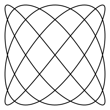
Built with R 4.1.0, dplyr 1.0.7, gganimate 1.0.7, ggplot2 3.3.4, purrr 0.3.4, and transformr 0.1.3