In this post, I will present the beta distribution of probability, and illustrate how to use the tidiyverse to represent probability distributions. Beta distribution functions are included in the R base, so I will only be using the tidyverse, complemented with the patchwork package.
library(tidyverse)
library(patchwork)
In probability theory and statistics, the beta distribution is a family of continuous probability distributions defined on the interval \(\left[0, 1\right]\). It is used to model distribution of the probability of a specific success.
The shape of the beta distribution is defined with two parameters \(\alpha \geq 0\) and \(\beta \geq 0\). The formula of the beta probability distribution is:
\[ d = \frac{x^{\alpha-1}\left(1-x\right)^{\beta-1}}{B\left(\alpha, \beta\right)} \]
The \(B\left(\alpha, \beta\right)\) is a fixed term to scale the area under the function to one, and it is defined using the gamma function:
\[B\left(\alpha, \beta\right) = \frac{\Gamma\left(\alpha\right)\Gamma\left(\beta\right)}{\Gamma\left(\alpha+\beta\right)}\]
With the tidyverse, we can use the dbeta function in stat_function to plot a probability distribution function. Parameters shape1 and shape2 of dbeta correspond with \(\alpha\) and \(\beta\).
  ggplot() +
  stat_function(fun = dbeta, args = list(shape1 = 10, shape2 = 40)) +
  theme_minimal()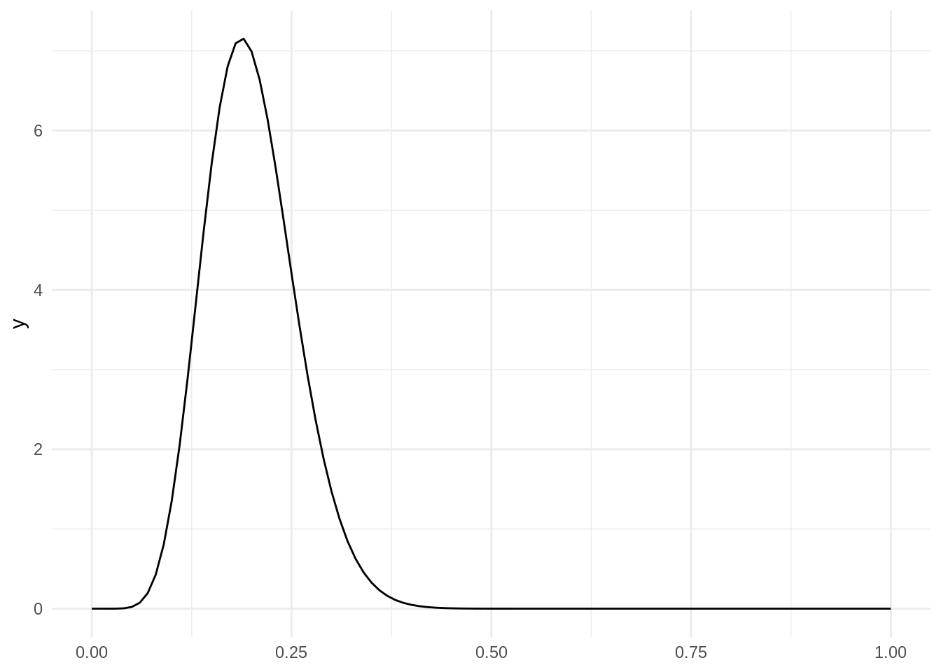
Interpretation of the beta distribution
The beta distribution:
\[ \frac{1}{B\left(\alpha, \beta\right)} x^{\alpha-1}\left(1-x\right)^{\beta-1}\]
is similar to the binomial distribution:
\[{n\choose x} p^{x}\left(1-p\right)^{n-x}\]
While the binomial gives the distribution of number of successes given a probability, the beta gives the distribution of probability of success given the number of successes and failures. Then, \(\alpha - 1\) is the number of successes and \(\beta - 1\) is the number of failures. This interpretation of beta is valid for integer values of \(\alpha0\) and \(\beta0\).
Let’s represent some beta distributions to illustrate this interpretation. First I am creating the table_beta function, that draws a the beta distribution for a number of sucesses s and failures f. The other parameter is a label l. I am using To draw the probability distribution, I create the variable x as a sequence of 100 values between 0 and 1, and then apply the dbeta function to obtain the value of density of probability d.
table_beta <- function(s, f, l){
  t <- tibble(x = seq(0, 1, length.out = 100),
              s = s,
              f = f,
              sample = l) %>%
    mutate(d = dbeta(x, shape1 = s + 1, shape2 = f + 1))
  return(t)
}
The table_plot function plots a set of beta distributions. The value of s, f and l for each distribution is stored in a table t. Each element of the set needs a different value of the label l. l is passed as color in the aes of the plot, so that we obtain one line for each value of l.
table_plot <- function(t){

  l <- lapply(1:nrow(t), \(i) table_beta(t$s[i], t$f[i], t$l[i]))

  df <- bind_rows(l)

  ggplot(df, aes(x, d, color = sample)) +
    geom_line() +
    theme_minimal() +
    scale_color_brewer(palette = "Reds", direction = -1)
}
Let’s generate two sets of distributions. t1 is a set of distribution with 20% of successes with a growing number of observations. t2 is similar, but with a 80% of successes.
t1 <- tibble(s = c(10, 50, 100, 200),
             f = c(40, 200, 400, 800),
             l = factor(s + f))

t2 <- tibble(s = c(40, 200, 400, 800),
             f = c(10, 50, 100, 200),
             l = factor(s + f))
Here I am presenting the plots of both families of distributions, t1 on the left and t2 on the right. They are put together thanks to the patchwork package.
p1a <- table_plot(t = t1) +
  geom_vline(xintercept = 0.2, color = "#004C99") +
  ggtitle("Samples with 20% of success")

p1b <- table_plot(t = t2) +
  geom_vline(xintercept = 0.8, color = "#004C99") +
  ggtitle("Samples with 80% of success")

p1a + p1b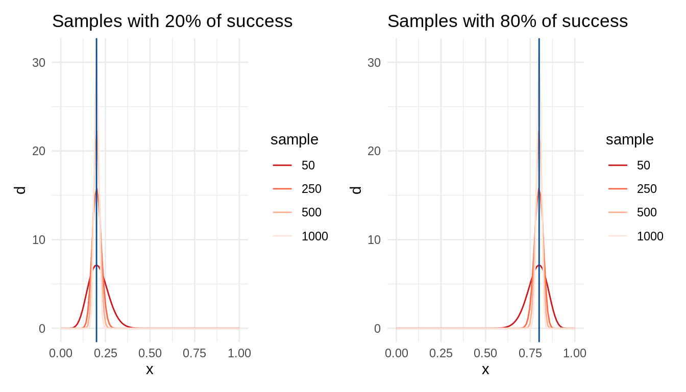
In both cases, the variability of the probability distribution decreases with the number of observations. This is an example of increase of statistical power with larger sample sizes.
We can see the effect of sample size on power calculating ranges of probabilities using pbeta. When we have 10 successes and 40 failures, the probability that the probability of success ranges between 0.21 and 0.19 is:
pbeta(0.21, 11, 41) - pbeta(0.19, 11, 41)## [1] 0.1418756But when we have 1000 successes and 4000 failures, the probability is:
pbeta(0.21, 1001, 4001) - pbeta(0.19, 1001, 4001)## [1] 0.9228958For additional clarification, I will examine a set of beta distributions with one hundred observations, but with different proportions of success and failure:
t3 <- tibble(s = c(10, 20, 50, 80, 90),
             f = c(90, 80, 50, 20, 10),
             l = as.factor(c(0.1, 0.2, 0.5, 0.8, 0.9)))

table_plot(t = t3) +
  ggtitle("Several samples of 100 observations")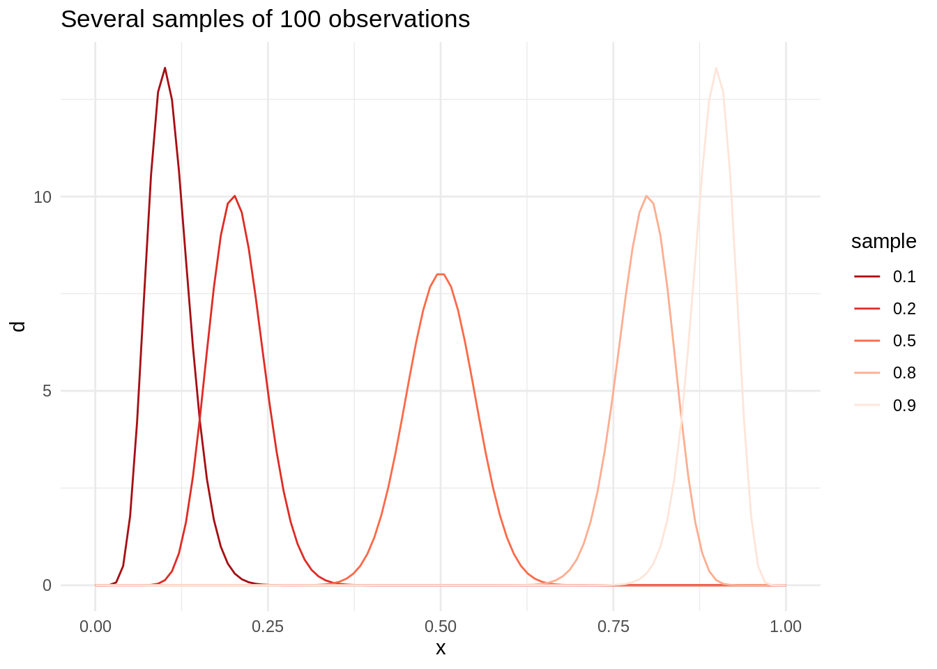
As the number of successes increases, the density of probability distribution leans to the right.
Beta distribution with alpha or beta smaller than one
The formula of the beta distribution also admits values of shape parameters \(\alpha\) and \(\beta\) between one and zero. To examine these distributions, I will create a new table_beta2 function taking alpha and beta as arguments…
table_beta2 <- function(alpha, beta, l){
  t <- tibble(x = seq(0, 1, length.out = 100),
              alpha = alpha,
              beta = beta,
              sample = l) %>%
    mutate(d = dbeta(x, shape1 = alpha, shape2 = beta))
  return(t)
}
.. and its corresponding table_plot2 function:
table_plot2 <- function(t){

  l <- lapply(1:nrow(t), \(i) table_beta2(t$alpha[i], t$beta[i], t$l[i]))

  df <- bind_rows(l)

  ggplot(df, aes(x, d, color = sample)) +
    geom_line() +
    theme_minimal() +
    scale_color_brewer(palette = "Reds", direction = -1)
}
Let’s examine first a t4 set with a combination of fractional alpha and integer beta and a symmetrical t5 set.
t4 <- tibble(alpha = seq(0.1, 0.8, 0.2),
             beta = 2,
             l = as.factor(alpha))

t5 <- tibble(alpha = 2,
             beta = seq(0.1, 0.8, 0.2),
             l = as.factor(beta))


table_plot2(t4) + table_plot2(t5)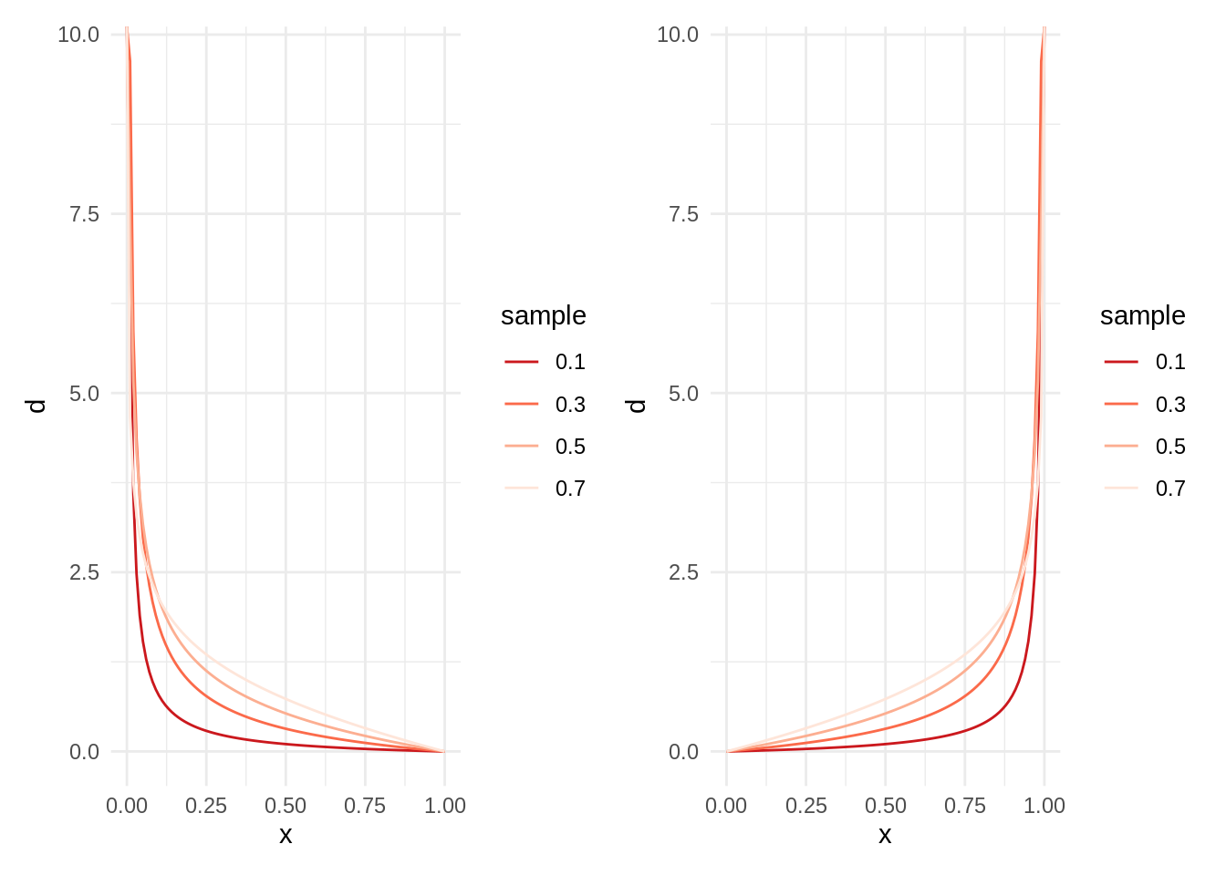
Being \(\alpha\) much smaller than \(\beta\), the probability distribution is skewed to the left. The swap of values of shape parameters would lead to a symmetrical distribution.
Let’s examine now two set of \(\alpha\) and \(beta\) smaller than one. In the t6 set (left plot), both shape parameters add one, while in the t7 set (right plot) are equal. In both plots, labels are the values of \(\alpha\).
t6 <- tibble(alpha = seq(0.1, 0.8, 0.2),
             beta = 1 - alpha,
             l = as.factor(alpha))

t7 <- tibble(alpha = seq(0.1, 0.8, 0.2),
             beta = alpha,
             l = as.factor(alpha))

table_plot2(t6) + table_plot2(t7)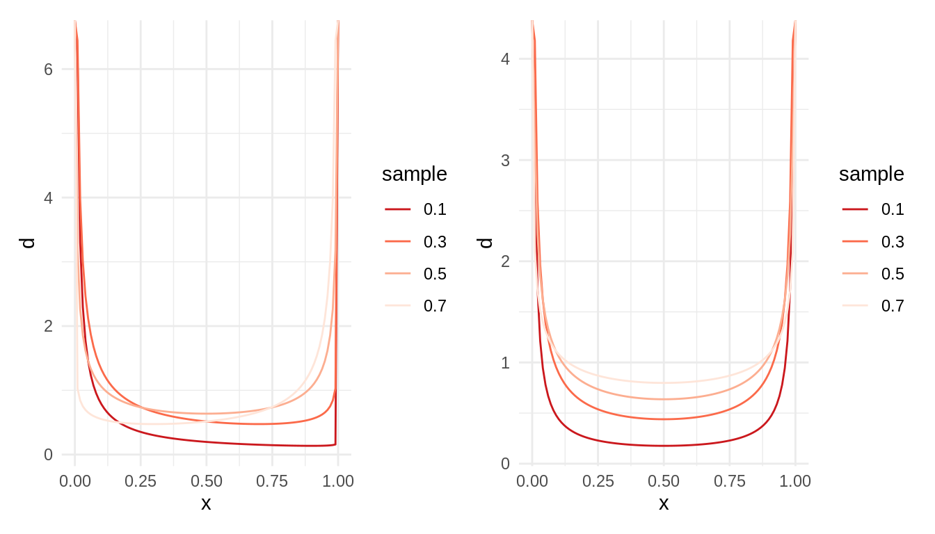
We observe U-shaped distributions, meaning that the distribution is skewed to extreme values of probability. In the StackExchange question listed in the references, one respondent provides an interpretation of this distribution based on a extrapolation of Polya urns to fractional values.
References
- Kim, Aerin (2020). Beta Distribution — Intuition, Examples, and Derivation. https://towardsdatascience.com/beta-distribution-intuition-examples-and-derivation-cf00f4db57af
- StackExchange. Why does the beta distribution become U shaped when \(\alpha\) and \(\beta\) <1? https://math.stackexchange.com/questions/3494530/why-does-the-beta-distribution-become-u-shaped-when-alpha-and-beta-1
Session info
## R version 4.2.1 (2022-06-23)
## Platform: x86_64-pc-linux-gnu (64-bit)
## Running under: Linux Mint 19.2
##
## Matrix products: default
## BLAS:   /usr/lib/x86_64-linux-gnu/openblas/libblas.so.3
## LAPACK: /usr/lib/x86_64-linux-gnu/libopenblasp-r0.2.20.so
##
## locale:
##  [1] LC_CTYPE=es_ES.UTF-8       LC_NUMERIC=C
##  [3] LC_TIME=es_ES.UTF-8        LC_COLLATE=es_ES.UTF-8
##  [5] LC_MONETARY=es_ES.UTF-8    LC_MESSAGES=es_ES.UTF-8
##  [7] LC_PAPER=es_ES.UTF-8       LC_NAME=C
##  [9] LC_ADDRESS=C               LC_TELEPHONE=C
## [11] LC_MEASUREMENT=es_ES.UTF-8 LC_IDENTIFICATION=C
##
## attached base packages:
## [1] stats     graphics  grDevices utils     datasets  methods   base
##
## other attached packages:
##  [1] patchwork_1.1.1 forcats_0.5.1   stringr_1.4.0   dplyr_1.0.9
##  [5] purrr_0.3.4     readr_2.1.2     tidyr_1.2.0     tibble_3.1.6
##  [9] ggplot2_3.3.5   tidyverse_1.3.1
##
## loaded via a namespace (and not attached):
##  [1] lubridate_1.8.0    assertthat_0.2.1   digest_0.6.29      utf8_1.2.2
##  [5] R6_2.5.1           cellranger_1.1.0   backports_1.4.1    reprex_2.0.1
##  [9] evaluate_0.15      httr_1.4.2         highr_0.9          blogdown_1.9
## [13] pillar_1.7.0       rlang_1.0.2        readxl_1.4.0       rstudioapi_0.13
## [17] jquerylib_0.1.4    rmarkdown_2.14     labeling_0.4.2     munsell_0.5.0
## [21] broom_0.8.0        compiler_4.2.1     modelr_0.1.8       xfun_0.30
## [25] pkgconfig_2.0.3    htmltools_0.5.2    tidyselect_1.1.2   bookdown_0.26
## [29] fansi_1.0.3        crayon_1.5.1       tzdb_0.3.0         dbplyr_2.1.1
## [33] withr_2.5.0        grid_4.2.1         jsonlite_1.8.0     gtable_0.3.0
## [37] lifecycle_1.0.1    DBI_1.1.2          magrittr_2.0.3     scales_1.2.0
## [41] cli_3.3.0          stringi_1.7.6      farver_2.1.0       fs_1.5.2
## [45] xml2_1.3.3         bslib_0.3.1        ellipsis_0.3.2     generics_0.1.2
## [49] vctrs_0.4.1        RColorBrewer_1.1-3 tools_4.2.1        glue_1.6.2
## [53] hms_1.1.1          fastmap_1.1.0      yaml_2.3.5         colorspace_2.0-3
## [57] rvest_1.0.2        knitr_1.39         haven_2.5.0        sass_0.4.1