In this document I will introduce how to plot maps in R, and to use them to convey spatial information.
Representing geographical information requires loading packages able to deal with geographical data, and have available geographical information. I have wrapped some geographical data in a package called BAdatasetsSpatial. To acquire this package, first install the devtools package:
install.packages("devtools")and then install the package from GitHub:
devtools::install_github("jmsallan/BAdatasetsSpatial")Now you can access to package datasets doing:
library(BAdatasetsSpatial)The package also loads the sf package, required to plot geographical data as simple features.
We will also need the tidyverse for data handling and plotting:
library(tidyverse)Geographical objects in R
A geographical object in R is a data frame with a geometry column that includes a spatial object (a simple feature collection sfc) for each region. Each region of the map is a row of the data frame object.
WorldMap1_110 is a rough world map, but useful for representing global information. Let’s see its column names:
names(WorldMap1_110)## [1] "scalerank" "LABELRANK" "SOVEREIGNT" "SOV_A3" "ADM0_DIF"
## [6] "TYPE" "ADMIN" "ADM0_A3" "GEOUNIT" "GU_A3"
## [11] "SUBUNIT" "SU_A3" "BRK_DIFF" "NAME" "NAME_LONG"
## [16] "BRK_A3" "BRK_NAME" "ABBREV" "POSTAL" "FORMAL_EN"
## [21] "FORMAL_FR" "NAME_CIAWF" "NOTE_ADM0" "NOTE_BRK" "NAME_SORT"
## [26] "NAME_ALT" "MAPCOLOR7" "MAPCOLOR8" "MAPCOLOR9" "MAPCOLOR13"
## [31] "POP_EST" "POP_RANK" "GDP_MD_EST" "POP_YEAR" "LASTCENSUS"
## [36] "GDP_YEAR" "ECONOMY" "INCOME_GRP" "FIPS_10_" "ISO_A2"
## [41] "ISO_A3" "ISO_A3_EH" "ISO_N3" "UN_A3" "WB_A2"
## [46] "WB_A3" "WOE_ID" "WOE_ID_EH" "WOE_NOTE" "ADM0_A3_IS"
## [51] "ADM0_A3_US" "CONTINENT" "REGION_UN" "SUBREGION" "REGION_WB"
## [56] "NAME_LEN" "LONG_LEN" "ABBREV_LEN" "TINY" "HOMEPART"
## [61] "MIN_ZOOM" "MIN_LABEL" "MAX_LABEL" "NE_ID" "WIKIDATAID"
## [66] "NAME_AR" "NAME_BN" "NAME_DE" "NAME_EN" "NAME_ES"
## [71] "NAME_FR" "NAME_EL" "NAME_HI" "NAME_HU" "NAME_ID"
## [76] "NAME_IT" "NAME_JA" "NAME_KO" "NAME_NL" "NAME_PL"
## [81] "NAME_PT" "NAME_RU" "NAME_SV" "NAME_TR" "NAME_VI"
## [86] "NAME_ZH" "geometry"Each of its rows is a country, so we plot a world map by plotting each of the countries. Let’s see how can we plot a world map with ggplot:
ggplot(WorldMap1_110) +
  geom_sf() +
  theme_void()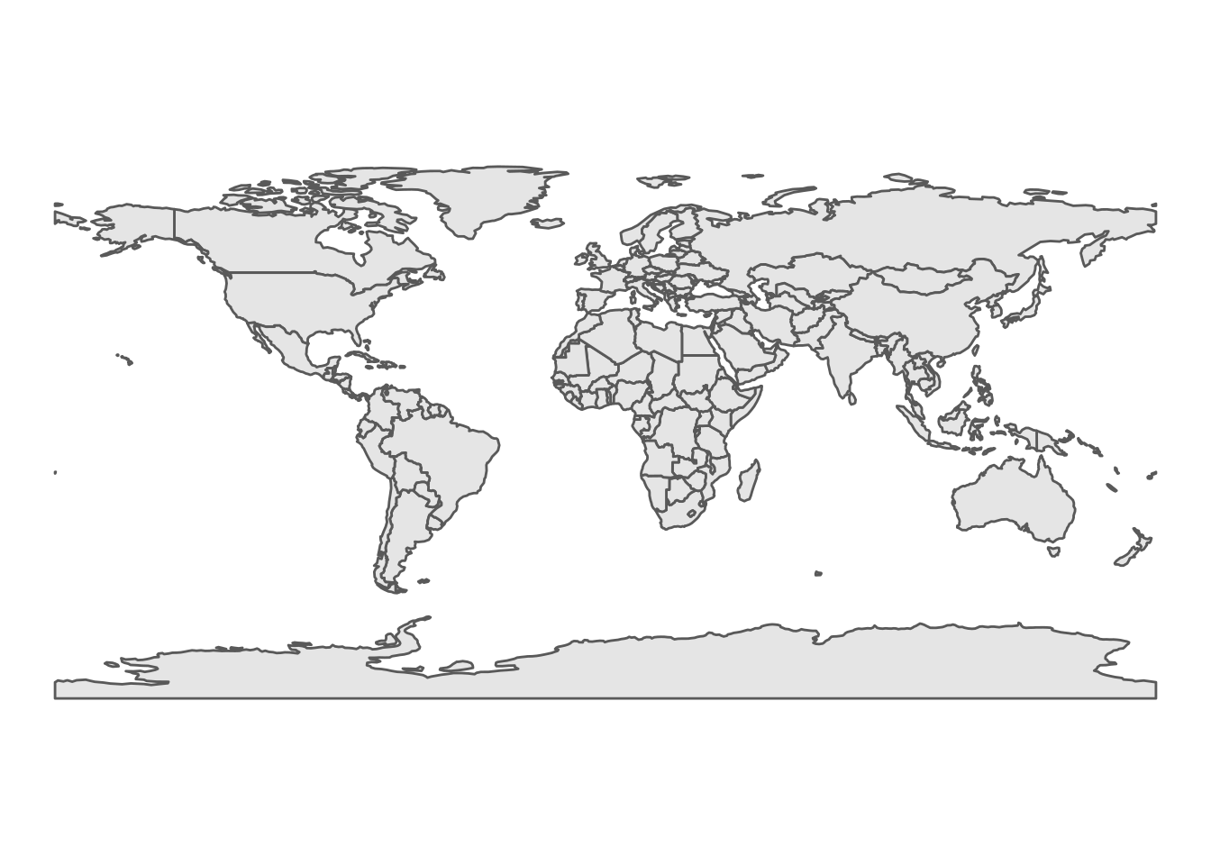
We can plot a subset of countries by filtering rows. Here I am plotting a map of Spain, using a map with higher resolution that includes Balearic and Canary islands.
WorldMap1_10 %>%
  filter(ISO_A3 == "ESP") %>%
ggplot +
  geom_sf() +
  theme_void()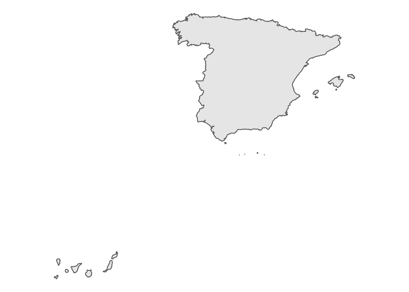
A colored world map
Let’s do a more colourful version of the world map. We need to:
- Put the background of the map in pale blue. We do that in
themewith the parameterpanel.background. - Assign a color to each country. We can use for that the
MAPCOLOR7variable, turning it into a factor. I have also removed the legend of the variable intheme.
For a better aesthetic, I have chosen a qualitative Brewer palette, added with scale_fill_brewer.
WorldMap1_110 %>%
  mutate(map_color = as.factor(MAPCOLOR7)) %>%
  ggplot +
  geom_sf(aes(fill= map_color)) +
  theme_void() +
  scale_fill_brewer(palette = "Set1") +
  theme(panel.background = element_rect(fill = "#CCE5FF"),
        legend.position = "none")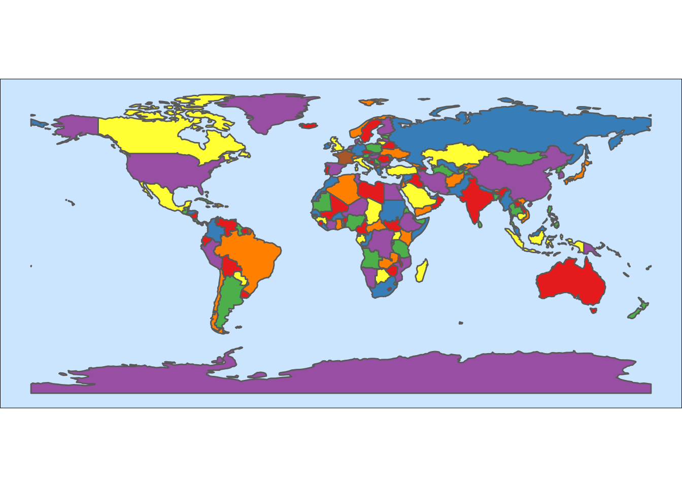
A choropleth world map
A choropleth map is the representation of a statistical variable in a set of geographical regions, using a color or pattern representing the value of the variable.
The colors of the regions are selected among the values of a sequential palette of colors. The most frequently used are the Brewer palettes.
To make a choropleth map we need:
- To transform the statistical variable into a factor with a significant number of areas for each level of the variable.
- To assign a value of the statistical variable to each region of the map.
- Select an adequate sequential palette of colors to represent the categorical variable.
I will use the GDP per capita from WB_gpd_per_capita in BAdatasetsSpatial, selecting the values of 2019. I am using the cut function to obtain a factor resulting of dividing value into breaks = 12.
gdp <- WB_gdp_per_capita %>%
  filter(year == 2019) %>%
  mutate(gdp = cut(value, breaks = 12))
Let’s examine how many countries fall into each category:
gdp %>%
  group_by(gdp) %>%
  summarise(n = n(), .groups = "drop")
## # A tibble: 11 × 2
## gdp n
## <fct> <int>
## 1 (656,1.15e+04] 94
## 2 (1.15e+04,2.22e+04] 60
## 3 (2.22e+04,3.3e+04] 23
## 4 (3.3e+04,4.37e+04] 17
## 5 (4.37e+04,5.44e+04] 18
## 6 (5.44e+04,6.51e+04] 10
## 7 (6.51e+04,7.58e+04] 4
## 8 (7.58e+04,8.66e+04] 1
## 9 (8.66e+04,9.73e+04] 2
## 10 (9.73e+04,1.08e+05] 1
## 11 (1.19e+05,1.3e+05] 2The upper values have few countries. They may not be seen in a map and twelve categories are too much to be interpreted by the user. It makes sense to aggregate the richest countries into one category. We can do that with the fct_lump function of the forcats package.
gdp <- gdp %>%
  mutate(gdp = fct_lump(gdp, 5))
Now the number of countries in each of the six categories looks more balanced.
gdp %>%
  group_by(gdp) %>%
  summarise(n = n(), .groups = "drop")
## # A tibble: 6 × 2
## gdp n
## <fct> <int>
## 1 (656,1.15e+04] 94
## 2 (1.15e+04,2.22e+04] 60
## 3 (2.22e+04,3.3e+04] 23
## 4 (3.3e+04,4.37e+04] 17
## 5 (4.37e+04,5.44e+04] 18
## 6 Other 20Now we need to add the values of gdp to the map. We can do that because a map in R is a data frame. The way to do that is to perform a left_join, because we don’t want that rows of the map dataframe disappear after the merge. The merging variables are ISO_A3 from the map and country_code from gdp. They contain ISO 3166-1 alpha-3 country codes. It is safer to use these codes than the name of the country, which is not standardized.
WorldMap1_110 <- left_join(WorldMap1_110, gdp, by = c("ISO_A3" = "country_code"))Some remarks about the map:
- I have colored each country according to its GDP per capita level doing
geom_sf(aes(fill = gdp)). - I have selected a sequential Brewer palette, ranging from yellow to green: the greener the country, the richer it is. In the
scale_fill_brewerfunction, I have usednameandlabelsto custom the legend. - In the plot
theme, I have put the sea in blue, and set the legend to the bottom to plot a wider map.
WorldMap1_110 %>%
  ggplot +
  geom_sf(aes(fill = gdp)) +
  scale_fill_brewer(name = "GDP per capita", labels = c("<= 11.500", "<= 22.200", "<= 33.000", "<= 43.700", "<= 54.400", "> 54.000"), palette = "YlGn", na.value = "#FF6666") +
  theme_void() +
  theme(panel.background = element_rect(fill = "#CCE5FF"),
        legend.position = "bottom")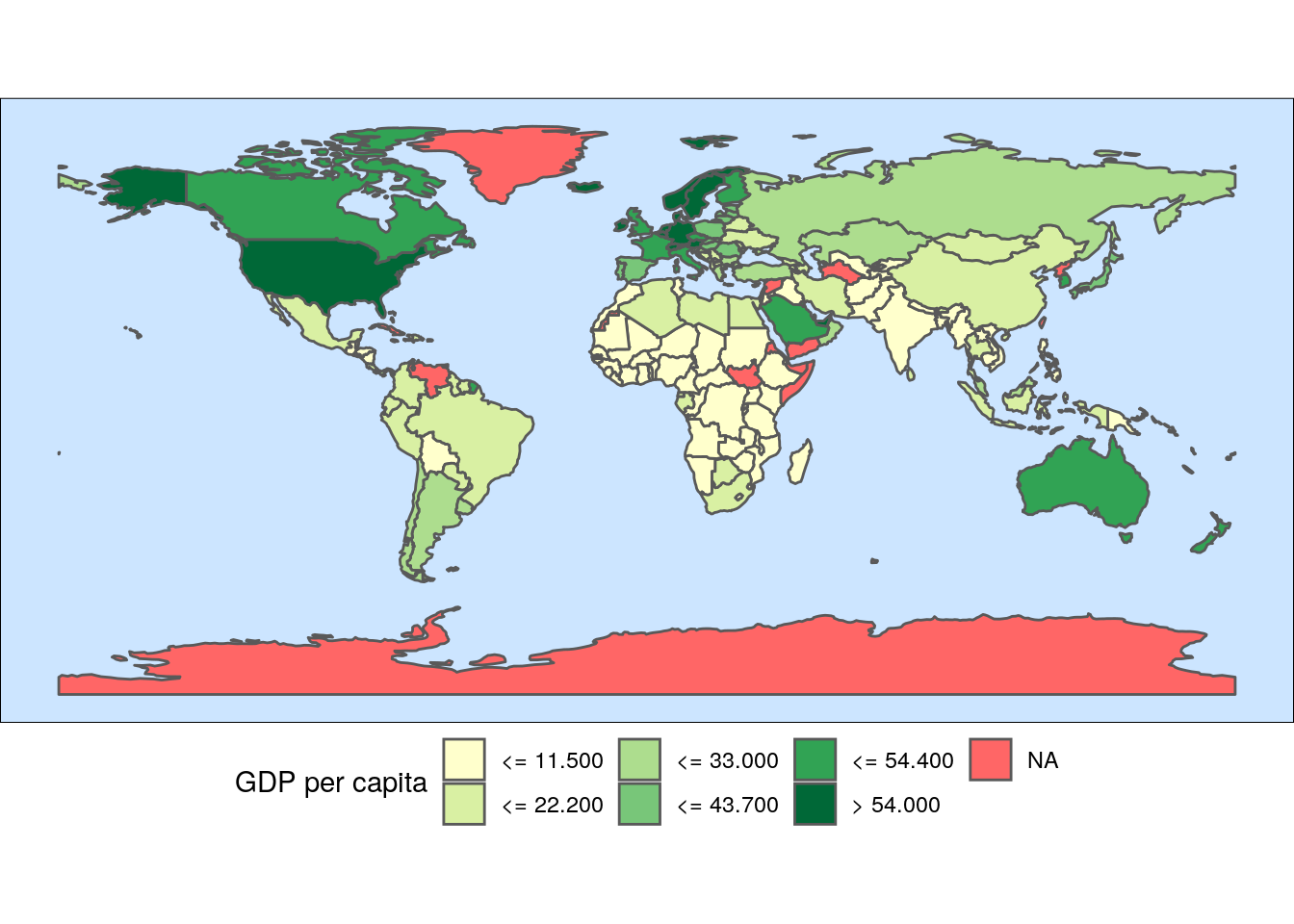
From the map we learn that most of the poorest countries are located in Africa, while the richest are mainly in North America, Europe and Oceania.
References
- Sallan, J. M. BAdatasetsSpatial package https://github.com/jmsallan/BAdatasetsSpatial Accessed on 7 November 2021.
- Sallan, J. M. (2021). The Brewer palettes https://jmsallan.netlify.app/blog/the-brewer-palettes/
- Wickham, H. et al. Mutating joins https://dplyr.tidyverse.org/reference/mutate-joins.html Accessed on 7 November 2021.
Built with R 4.1.2, BAdatasetsSpatial 0.1.0, sf 1.0-2 and tidyverse 1.3.1