In this post, I will present a workflow to produce two line plots at the same ggplot graph representing different magnitudes. These plots are called dual axis plots, double Y axis plots, dual-scale data plots or superimposed plots Then, we will point out why this is a bad idea and present an alternative in form of side-by-side charts.
As we are using ggplot, I will load the tidyverse to access data manipulation functions.
library(tidyverse)As an example, I will be using the economics dataset. It is included with the ggplot2 package and presents some US macroeconomic data as a time series.
economics## # A tibble: 574 × 6
## date pce pop psavert uempmed unemploy
## <date> <dbl> <dbl> <dbl> <dbl> <dbl>
## 1 1967-07-01 507. 198712 12.6 4.5 2944
## 2 1967-08-01 510. 198911 12.6 4.7 2945
## 3 1967-09-01 516. 199113 11.9 4.6 2958
## 4 1967-10-01 512. 199311 12.9 4.9 3143
## 5 1967-11-01 517. 199498 12.8 4.7 3066
## 6 1967-12-01 525. 199657 11.8 4.8 3018
## 7 1968-01-01 531. 199808 11.7 5.1 2878
## 8 1968-02-01 534. 199920 12.3 4.5 3001
## 9 1968-03-01 544. 200056 11.7 4.1 2877
## 10 1968-04-01 544 200208 12.3 4.6 2709
## # ℹ 564 more rowsI am interested in comparing the personal savings rate psavert with the unemployment rate. The later is not directly available, so I will proxy it (we don’t have data of active population) with theuemprate variable, the quotient between the number of unemployed uemploy and the total population pop.
economics <- economics |>
  mutate(uemprate = unemploy*100/pop)
Let’s look at at the evolution of personal savings rate.
economics |>
  ggplot(aes(date, psavert)) +
  geom_line()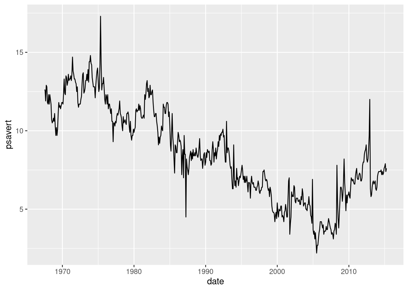
and at the evolution of unemployment rate:
economics |>
  ggplot(aes(date, uemprate)) +
  geom_line()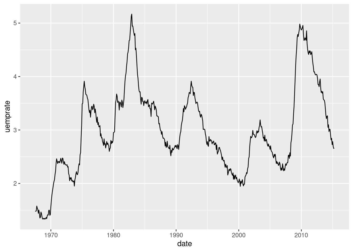
We observe that the values of savings rate are roughly three times larger than unemployment rate, so if we want to compare them we will need two different scales, being the first three times larger than the second.
The Dual Axis Plot
Let’s start plotting the two time series in the same graph. I am presenting the psavert variable as is in red, and uemprate multiplied by three in blue. Note how I am using two different aes() for each geom_line().
economics |>
  ggplot(aes(x = date)) +
  geom_line(aes(y = psavert), color = "red") +
  geom_line(aes(y = uemprate * 3), color = "blue")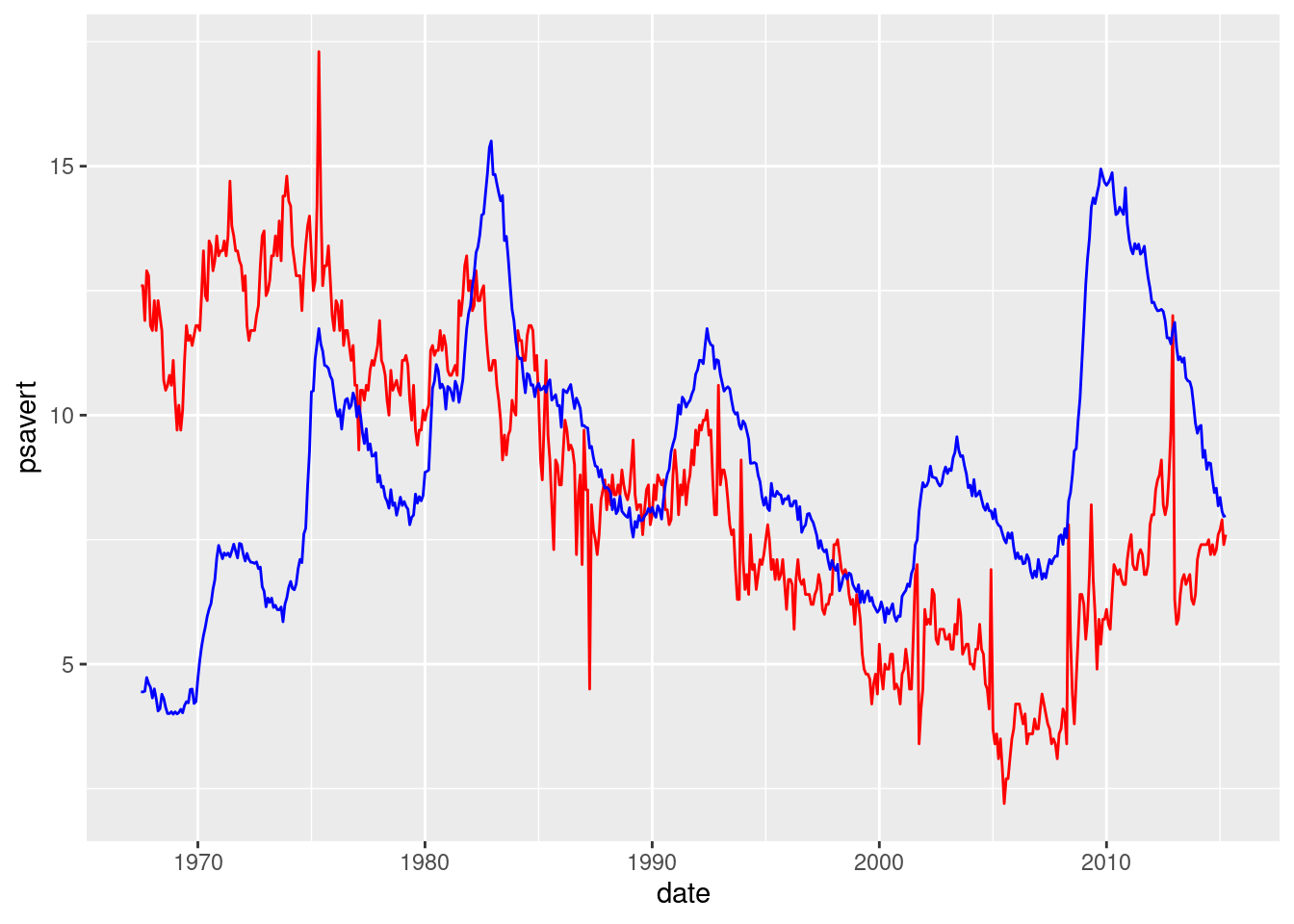
Let’s build now the dual axis. I am doing this with sec.axis within scale_y_continuous(). It defines a right axis with a different scale than the left axis. The relationship between both is done with the ~./3 formula within sec_axis. I finish the job with theme() plotting each axis with its color. axis.title.y and axis.title.y.right control axis labels, while axis.text.y and axis.text.y.right axis text.
economics |>
  ggplot(aes(x = date)) +
  geom_line(aes(y = psavert), color = "red") +
  geom_line(aes(y = uemprate * 3), color = "blue") +
  scale_y_continuous(sec.axis = sec_axis(~./3, name = "uemprate")) +
  theme(axis.title.y = element_text(color = "red"),
        axis.title.y.right = element_text( color = "blue"),
        axis.text.y = element_text(color = "red"),
        axis.text.y.right = element_text(color = "blue"))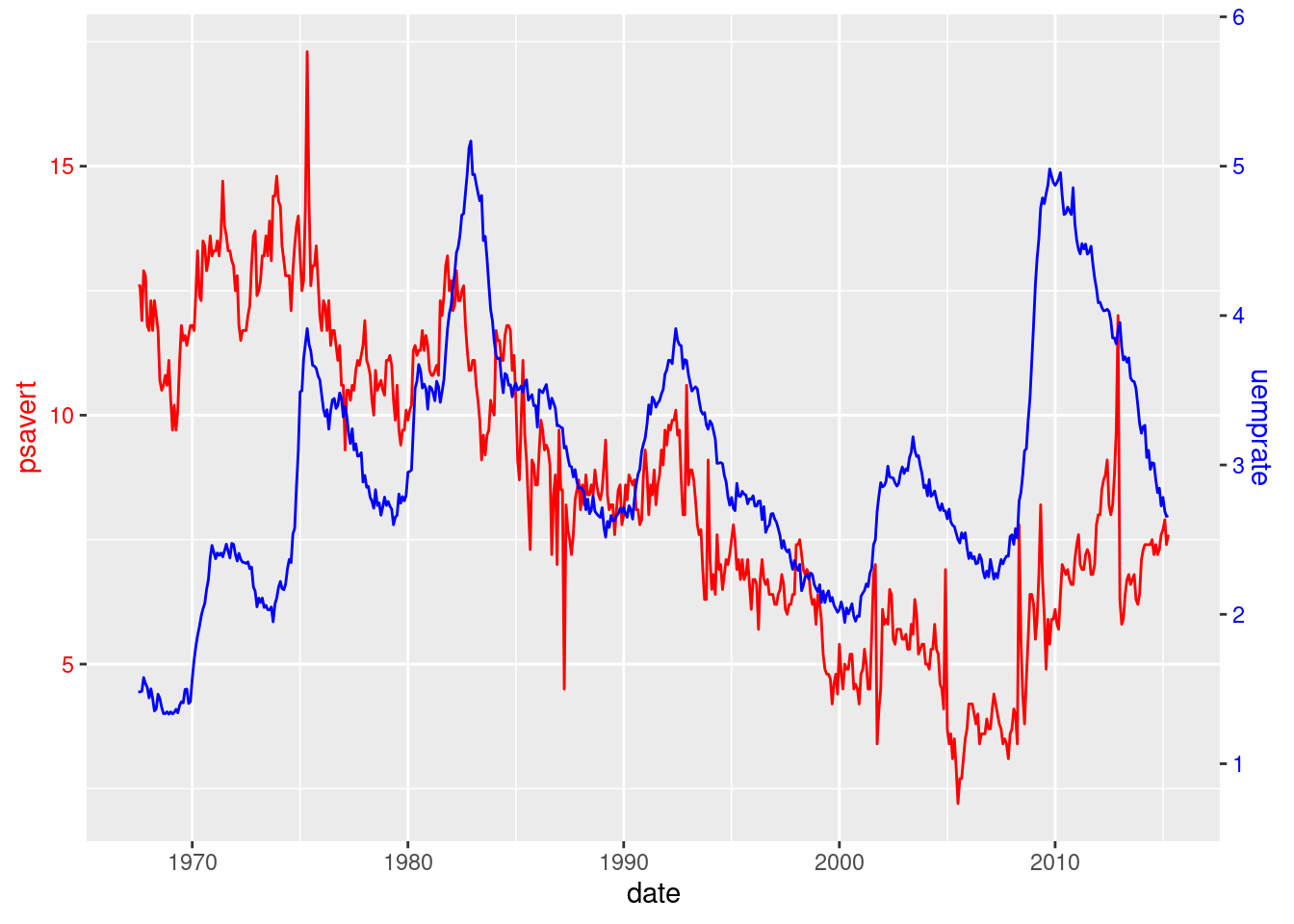
Once the plot is done, we can improve it by removing clutter, slightly changing the colors, emphasizing lines and aligning the title with the plot.
economics |>
  ggplot(aes(x = date)) +
  geom_line(aes(y = psavert), color = "#FF6666", linewidth = 1) +
  geom_line(aes(y = uemprate * 3), color = "#6666FF", linewidth = 1) +
  scale_y_continuous(sec.axis = sec_axis(~./3, name = "uemprate")) +
  theme_minimal() +
  theme(axis.title.y = element_text(color = "#FF6666"),
        axis.title.y.right = element_text( color = "#6666FF"),
        axis.text.y = element_text(color = "#FF6666"),
        axis.text.y.right = element_text(color = "#6666FF"),
        plot.title.position = "plot",
        axis.title.x = element_blank()) +
  ggtitle(label = "Unemployment and savings rate in the US")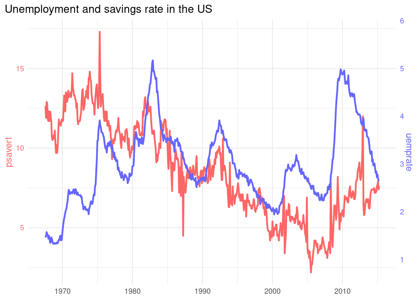
Alternative: A Side-By-Side Plot
Visualization experts disencourage dual axis plots for a number of reasons, presented in the Muth (2018) post. One of the alternatives presented by Muth is the side by side plot. We can do it using the patchwork pachage:
library(patchwork)In the code below, I have obtained the psavert_plot and uemprate_plot and put them together with patchwork.
plot_psavert <- economics |>
  ggplot(aes(date, psavert)) +
  geom_line(color = "#FF6666", linewidth = 1) +
  theme_minimal() +
  theme(axis.title.y = element_text(color = "#FF6666"),
        axis.text.y = element_text(color = "#FF6666"),
        plot.title = element_text(color = "#FF6666"),
        plot.title.position = "plot",
        axis.title.x = element_blank()) +
  ggtitle(label = "Personal savings rate in the US")

plot_uemprate <- economics |>
  ggplot(aes(date, uemprate)) +
  geom_line(color = "#6666FF", linewidth = 1) +
  theme_minimal() +
  theme(axis.title.y = element_text(color = "#6666FF"),
        axis.text.y = element_text(color = "#6666FF"),
        plot.title = element_text(color = "#6666FF"),
        plot.title.position = "plot",
        axis.title.x = element_blank()) +
  ggtitle(label = "Unemployment rate in the US")

plot_psavert + plot_uemprate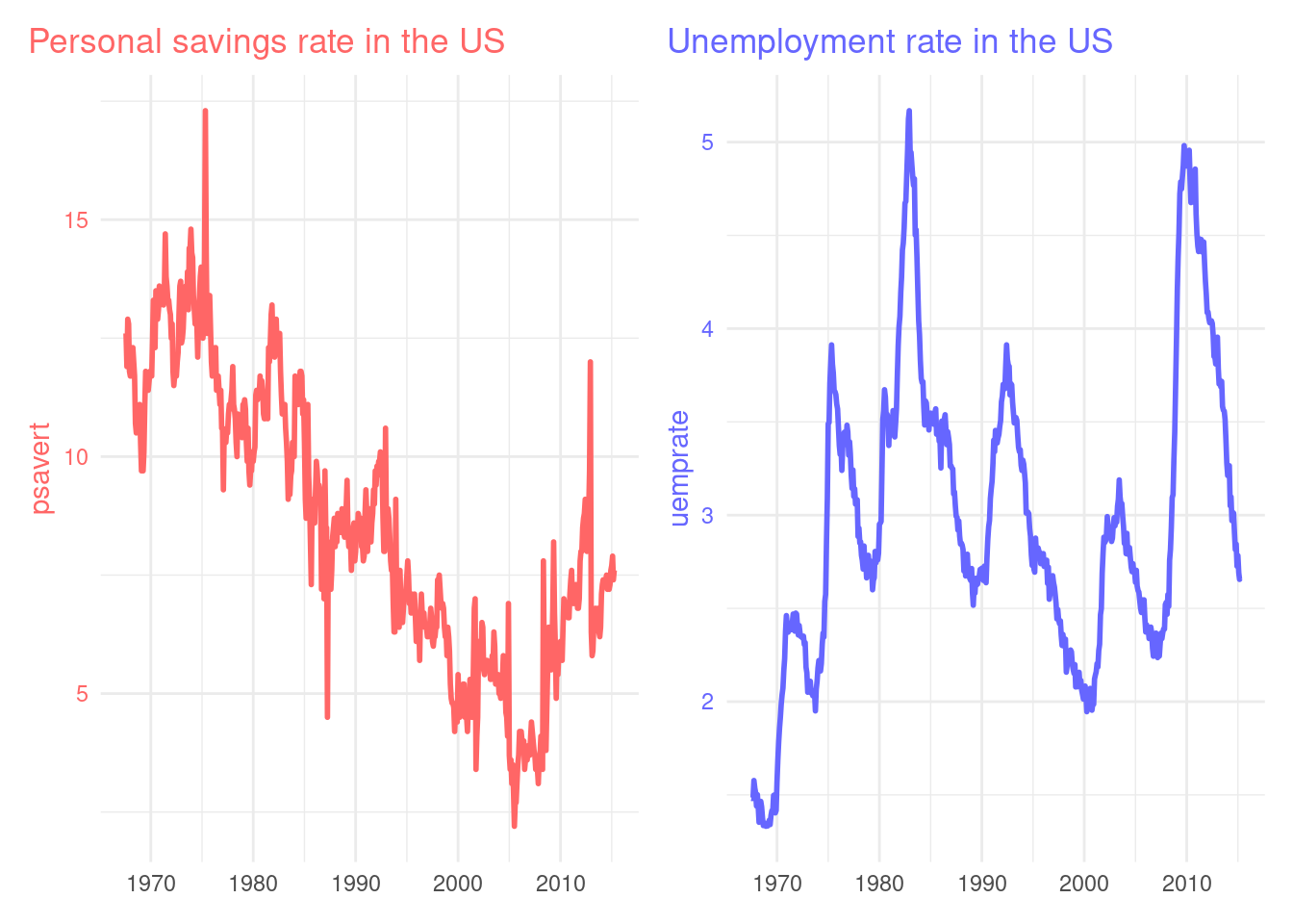
A Two-Line Plot
For this case, the default ggplot solution is a plot with two lines and the same scale, with a legend to identify each factor.
economics |>
  select(date, psavert, uemprate) |>
  pivot_longer(-date) |>
  ggplot(aes(date, value, color = name)) +
  geom_line(linewidth = 1) +
  theme_minimal() +
  scale_color_manual(name = "variable", values = c("#FF6666", "#6666FF")) +
  ggtitle(label = "Savings rate and unemployment in the US") +
  theme_minimal() +
  theme(plot.title.position = "plot",
        legend.position = c(0.8, 0.8),
        axis.title = element_blank())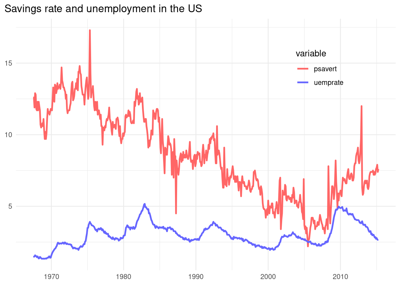
Dual Axis Plots
In dual axis plots, I am presenting two magnitudes of different scales in the same plot. These plots are easy to do with Microsoft Excel, so some R users are eager to replicate them in ggplot. In this post we have presented how to do that, but we have also presented why it is hard to do it: visualization experts disencourage dual Y axis plots. I have presented an alternative of dual Y axis plots, the side-by-side plot, easy to implement with the patchwork package.
References
- The R graph gallery (2018). Dual Y axis with R and ggplot2. https://r-graph-gallery.com/line-chart-dual-Y-axis-ggplot2.html
- Muth, L. C. (2018). Why not to use two axes, and what to use instead- https://blog.datawrapper.de/dualaxis/
Session Info
## R version 4.3.2 (2023-10-31)
## Platform: x86_64-pc-linux-gnu (64-bit)
## Running under: Linux Mint 21.1
##
## Matrix products: default
## BLAS:   /usr/lib/x86_64-linux-gnu/blas/libblas.so.3.10.0
## LAPACK: /usr/lib/x86_64-linux-gnu/lapack/liblapack.so.3.10.0
##
## locale:
##  [1] LC_CTYPE=es_ES.UTF-8       LC_NUMERIC=C
##  [3] LC_TIME=es_ES.UTF-8        LC_COLLATE=es_ES.UTF-8
##  [5] LC_MONETARY=es_ES.UTF-8    LC_MESSAGES=es_ES.UTF-8
##  [7] LC_PAPER=es_ES.UTF-8       LC_NAME=C
##  [9] LC_ADDRESS=C               LC_TELEPHONE=C
## [11] LC_MEASUREMENT=es_ES.UTF-8 LC_IDENTIFICATION=C
##
## time zone: Europe/Madrid
## tzcode source: system (glibc)
##
## attached base packages:
## [1] stats     graphics  grDevices utils     datasets  methods   base
##
## other attached packages:
##  [1] patchwork_1.2.0 lubridate_1.9.3 forcats_1.0.0   stringr_1.5.1
##  [5] dplyr_1.1.4     purrr_1.0.2     readr_2.1.5     tidyr_1.3.0
##  [9] tibble_3.2.1    ggplot2_3.4.4   tidyverse_2.0.0
##
## loaded via a namespace (and not attached):
##  [1] sass_0.4.5        utf8_1.2.3        generics_0.1.3    blogdown_1.16
##  [5] stringi_1.7.12    hms_1.1.3         digest_0.6.31     magrittr_2.0.3
##  [9] evaluate_0.20     grid_4.3.2        timechange_0.2.0  bookdown_0.33
## [13] fastmap_1.1.1     jsonlite_1.8.8    fansi_1.0.4       scales_1.2.1
## [17] jquerylib_0.1.4   cli_3.6.1         rlang_1.1.3       munsell_0.5.0
## [21] withr_2.5.0       cachem_1.0.7      yaml_2.3.7        tools_4.3.2
## [25] tzdb_0.3.0        colorspace_2.1-0  vctrs_0.6.4       R6_2.5.1
## [29] lifecycle_1.0.3   pkgconfig_2.0.3   pillar_1.9.0      bslib_0.5.0
## [33] gtable_0.3.3      glue_1.6.2        xfun_0.39         tidyselect_1.2.0
## [37] highr_0.10        rstudioapi_0.15.0 knitr_1.42        farver_2.1.1
## [41] htmltools_0.5.5   rmarkdown_2.21    labeling_0.4.2    compiler_4.3.2