The lockdowns because of COVID in Spain were more severe than in other parts of the world. During some weeks of April, mobility was severely constrained and there were almost no cars on the streets. In this post, I will use data from the Barcelona Open Data Portal to assess the impact of COVID lockdowns in Barcelona. In a press report published on March 2021, the Generalitat de Catalunya established the dates of mobility restrictions:
- Mobility restrictions went from 14 March to 29 May 2020.
- The most severe mobility restrictions went from 30 March to 12 April 2020.
I will be using the tidyverse to generate different visualizations to better understand the effects of COVID lockdowns on Barcelona air quality.
library(tidyverse)Considering this, I obtained a dataset to compare air quality during lockdowns with similar time windows of 2021 to 2024:
- I retrieved air quality data from measurement stations posted on the Barcelona Open Data website.
- I tidyed data so that each row contains the
valuemeasurement of a specificpollutant, from a specificstationand from a specific hour. - I filtered data going from 14 March to 29 May from 2020 to 2024.
. As hourly data is extremely noisy, I have averaged the level of contaminant on a daily basis. The day of measurement is in
date. - To make the plots, I have created a
plot_datevariable equal to the same date as 2025, and theyearas factor.
The result is in the aq_tw_daily dataset.
aq_tw_daily## # A tibble: 19,821 × 6
## date plot_date year station pollutant value
## <date> <date> <fct> <chr> <dbl> <dbl>
## 1 2020-03-14 2025-03-14 2020 Poblenou 7 3.91
## 2 2020-03-15 2025-03-15 2020 Poblenou 7 3.26
## 3 2020-03-16 2025-03-16 2020 Poblenou 7 1.38
## 4 2020-03-17 2025-03-17 2020 Poblenou 7 1.61
## 5 2020-03-18 2025-03-18 2020 Poblenou 7 9.76
## 6 2020-03-19 2025-03-19 2020 Poblenou 7 9
## 7 2020-03-20 2025-03-20 2020 Poblenou 7 4.74
## 8 2020-03-21 2025-03-21 2020 Poblenou 7 1.52
## 9 2020-03-22 2025-03-22 2020 Poblenou 7 1.54
## 10 2020-03-23 2025-03-23 2020 Poblenou 7 1.83
## # ℹ 19,811 more rowsThe two most relevant pollutants are:
- Particulate matter of 10 microns or less PM10, with
pollutantcode 10. - Nitrogen dioxide NO2, with
pollutantcode 8.
Let’s see several ways to compare the evolution of PM10 and NO2 in each station.
Line Plots
Let’s start with a line plot representing the evolution of the pollutant along the time window across different years with the plot_date variable. For a specific contaminant, I am using facet_grid() to plot values of each station. The orange area represents the period of lowest mobility.
aq_tw_daily |>
  filter(pollutant == 10) |>
  ggplot(aes(plot_date, value, color = year)) +
  geom_rect(xmin = as_date("2025-03-30"), xmax = as_date("2025-04_12"), ymin = 0, ymax = 60,
            fill = "yellow", color = "white", alpha = 0.005) +
  geom_line() +
  theme_minimal() +
  scale_color_manual(values = c("#CC0000", "#99CCFF", "#3399FF", "#0066CC", "#003366")) +
  theme(legend.position = "bottom") +
  labs(x = NULL, y = NULL, title = "Evolution of Values of PM10") +
  facet_grid(station ~ .)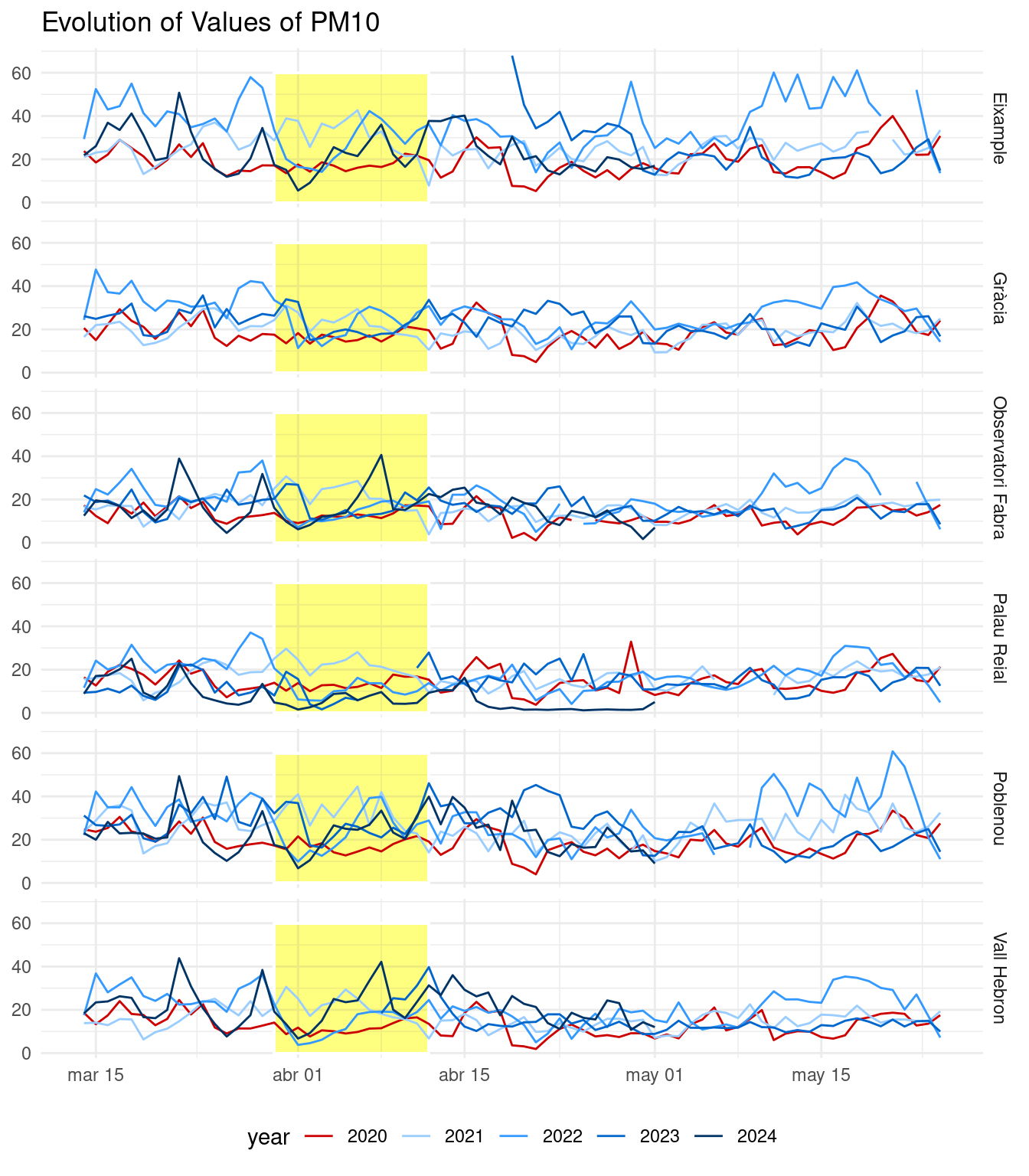
In the plot above, we can see lower values of pollutant for 2020 in most stations, but not the clear divide that one would expect from a significant constraint in mobility. For most stations, the lowest values in 2020 are reached in the third and fourth weeks of April.
aq_tw_daily |>
  filter(pollutant == 8) |>
  ggplot(aes(plot_date, value, color = year)) +
  geom_rect(xmin = as_date("2025-03-30"), xmax = as_date("2025-04_12"), ymin = 0, ymax = 80,
            fill = "yellow", color = "white", alpha = 0.005) +
  geom_line() +
  theme_minimal() +
  scale_color_manual(values = c("#CC0000", "#99CCFF", "#3399FF", "#0066CC", "#003366")) +
  theme(legend.position = "bottom") +
  labs(x = NULL, y = NULL, title = "Evolution of Values of NO2") +
  facet_grid(station ~ .)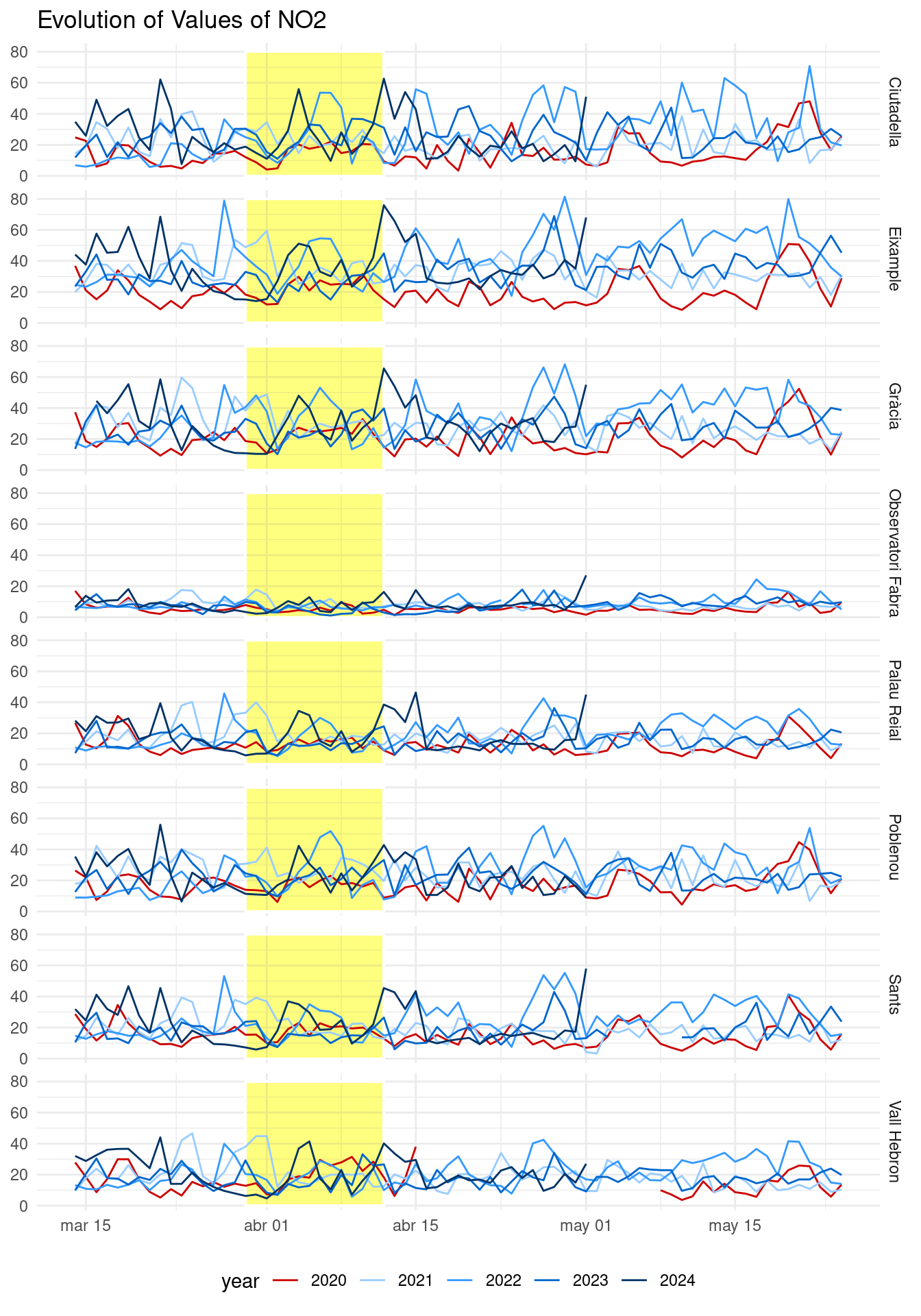
The plot for NO2 shows also that values of 2020 are among the lowest for the analyzed period, but within the interval of usual values for the other years. The highest values of NO2 are reached in station close to more densely populated Barcelona districts: Ciutadella, Eixample and Gracia. The lowest values are found at Observatori Fabra, located in Collserola park and with very low population density compared with Gràcia, Ciutat Vella or Eixample.
Box Plots
The examination of the overall distribution of each pollutant for each station across years with boxplots can be of interest, as extreme values of pollutant are reached in different moments in time.
aq_tw_daily |>
  filter(pollutant == 10) |>
  ggplot(aes(year, value)) +
  facet_grid(station ~ .) +
  geom_boxplot(color = rep(c("#CC0000", "#99CCFF", "#3399FF", "#0066CC", "#003366"), 6)) +
  theme_minimal() +
  labs(x = NULL, y = NULL, title = "Distribution of Values of PM10")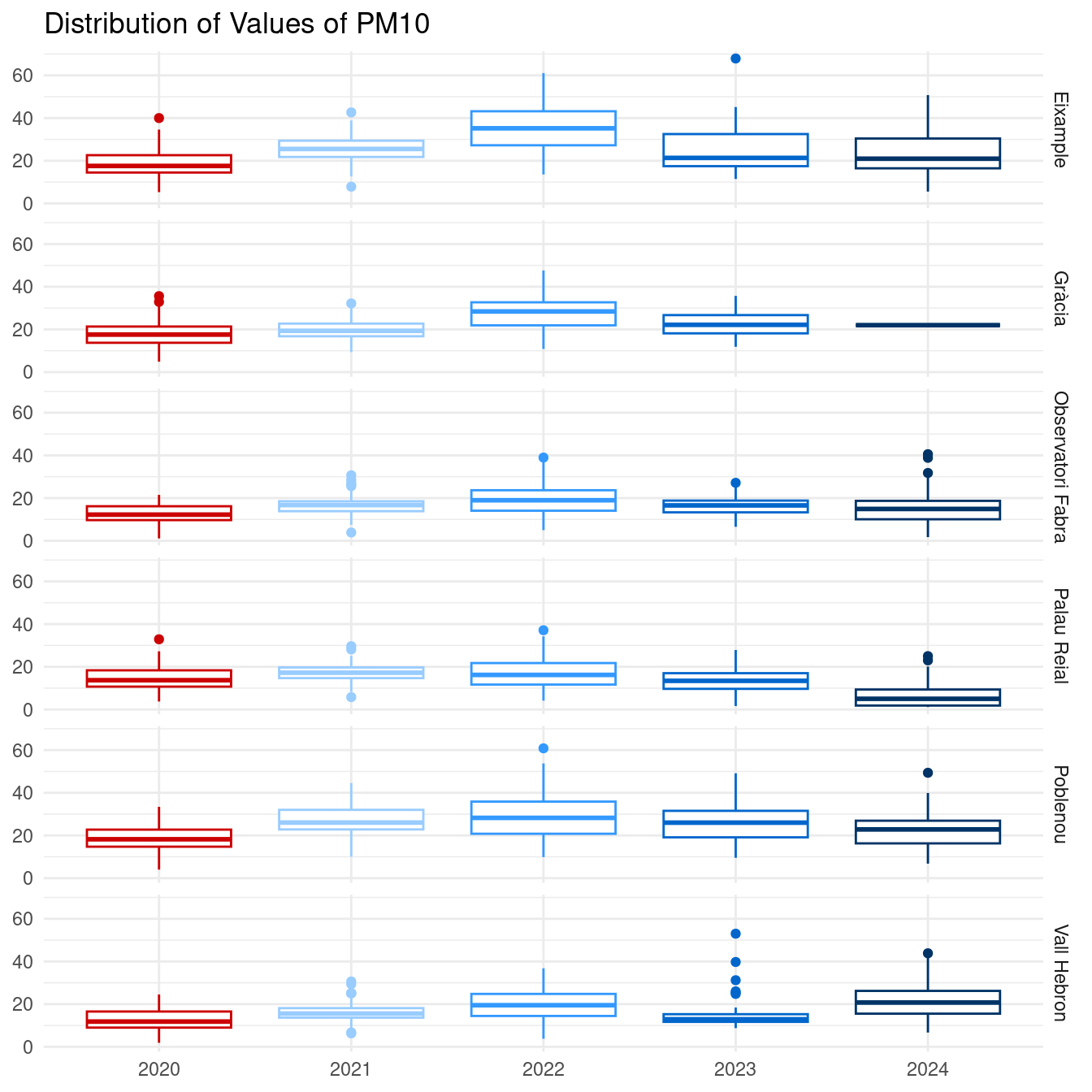
The plot for PM10 shows again that values of pollutant for 2020 are among the lowest of the series, but within the range of values of the other years. An interesting observation here is that 2020 showed no pollution episodes (values higher than 50), while they were salient in 2022 and 2023. The boxplot for Gracia in 2024 shows that only a single value (equal to 22) was gathered during that year in the observed time window.
aq_tw_daily |>
  filter(pollutant == 8) |>
  ggplot(aes(year, value)) +
  facet_grid(station ~ .) +
  geom_boxplot(color = rep(c("#CC0000", "#99CCFF", "#3399FF", "#0066CC", "#003366"), 8)) +
  theme_minimal() +
  labs(x = NULL, y = NULL, title = "Distribution of Values of NO2")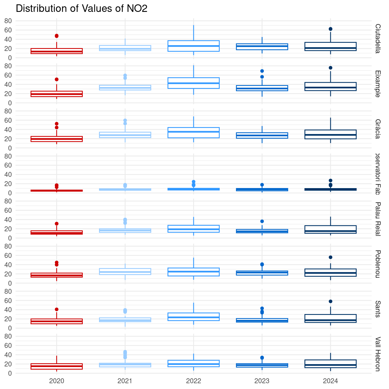
The plot for NO2 shows that 2020 was a year with low values, but not significantly lower than observations from 2021-2024. For the five years examined, the values of NO2 are below 80 during this period. The differences between stations stress the effect of population density on NO2 levels.
Error Bars
Finally, we can compare the mean of daily means and the standard deviation across years for each station and for each pollutant. I will be using errorbars, with bar heights equal to the mean and error whiskers equal to the standard deviation. This plot helps to focus in absolute values of pollution, as all y axis start from zero.
aq_tw_daily |>
  filter(pollutant == 10) |>
  group_by(station, year) |>
  summarise(mean = mean(value, na.rm = TRUE), sd = sd(value, na.rm = TRUE), .groups = "drop") |>
  mutate(across(mean:sd, ~ ifelse(is.na(.), 0, .))) |>
  ggplot(aes(year, mean)) +
  geom_col(fill = rep(c("#CC0000", "#99CCFF", "#3399FF", "#0066CC", "#003366"), 6), alpha = 0.5) +
  geom_errorbar(aes(ymin = mean - sd, ymax = mean + sd), width = 0.3) +
  facet_grid(station ~ .) +
  theme_minimal() +
  labs(x = NULL, y = NULL, title = "Mean and Standard Deviation (PM10)")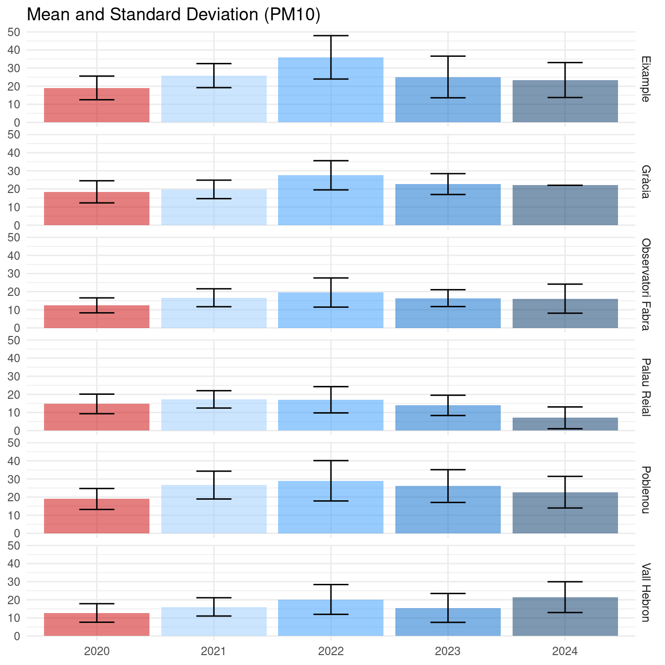
This plot reinforces the conclusions reached in previous plots. Values of PM10 for 2020 are in the low range of the expected values for 2020-2024. The mobility constraints in 2020 lead to lower values of pollution, both they are not a significant depart from values of other years.
aq_tw_daily |>
  filter(pollutant == 8) |>
  group_by(station, year) |>
  summarise(mean = mean(value, na.rm = TRUE), sd = sd(value, na.rm = TRUE), .groups = "drop") |>
  mutate(across(mean:sd, ~ ifelse(is.na(.), 0, .))) |>
  ggplot(aes(year, mean)) +
  geom_col(fill = rep(c("#CC0000", "#99CCFF", "#3399FF", "#0066CC", "#003366"), 8), alpha = 0.5) +
  geom_errorbar(aes(ymin = mean - sd, ymax = mean + sd), width = 0.3) +
  facet_grid(station ~ .) +
  theme_minimal() +
  labs(x = NULL, y = NULL, title = "Mean and Standard Deviation (NO2)")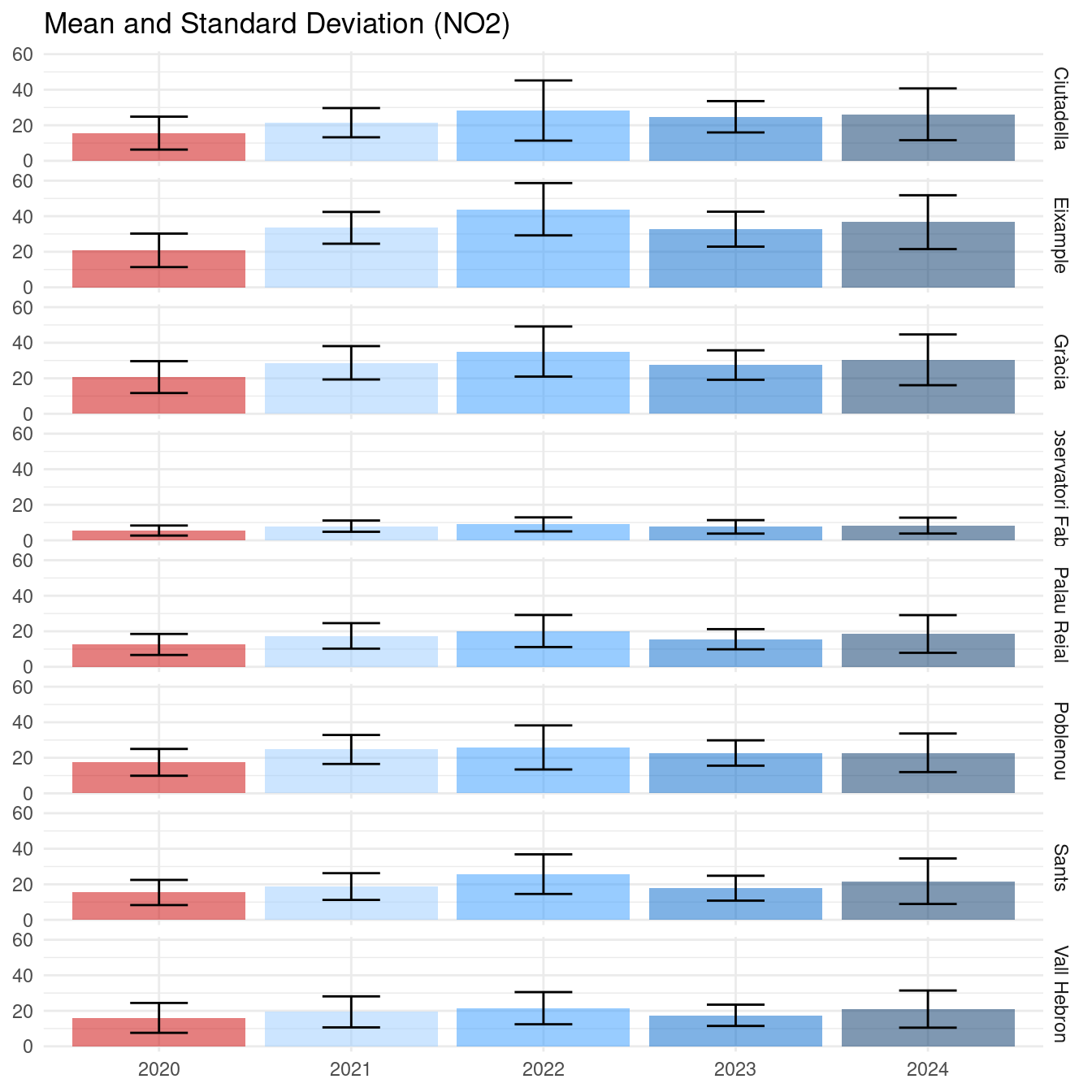
Regarding NO2, we reach similar conclusions. The year 2020 has lower values of NO2, but they do not represent a significant depart from values of 2021-2024. This plot makes more salient the impact of population density. The values of NO2 in Observatori Fabra in any year are lowers than NO2 in Eixample in 2020.
Conclusions
I have used values of pollutants from the Barcelona Open Data repository to compare values of PM10 and NO2 during the COVID-19 lockdown with values of analogous dates for the period 2021-2024. This analysis can be seen as a natural experiment to evaluate the impact of mobility in PM10 and NO2, the two pollutants for which there is a protocol of control of abnormal values in Catalonia.
Results shows that values of 2020 tended to be lower than in 2021-2024, but in the lower range of expected values for these years, rather than being lower with statistical significance. On the other hand, results showed that these pollutants are anthropogenic (that is, created by human activity). This is specially salient for NO2, which seems to depend on human density.
In recent years, policymakers have been focused on mobility-related measures to reduce pollutants in the urban environment. Low emission zones have been created in cities like Barcelona and Madrid, where cars with high pollutant engines are not allowed to enter, although they have not been fully implemented. These results suggest that even turning the mobility to zero does not lead to a significant reduction of PM10 and NO2, therefore it is likely that complementary measures must be implemented to improve air quality.
References
- Generalitat de Catalunya (2021). Un any de pandèmia: evolució de la mobilitat. https://govern.cat/salapremsa/notes-premsa/400091/any-pandemia-evolucio-mobilitat
- Barcelona Open Data. Air quality data from the measure stations of the city of Barcelona. https://opendata-ajuntament.barcelona.cat/data/en/dataset/qualitat-aire-detall-bcn
Session Info
## R version 4.5.1 (2025-06-13)
## Platform: x86_64-pc-linux-gnu
## Running under: Linux Mint 21.1
##
## Matrix products: default
## BLAS:   /usr/lib/x86_64-linux-gnu/blas/libblas.so.3.10.0
## LAPACK: /usr/lib/x86_64-linux-gnu/lapack/liblapack.so.3.10.0  LAPACK version 3.10.0
##
## locale:
##  [1] LC_CTYPE=es_ES.UTF-8       LC_NUMERIC=C
##  [3] LC_TIME=es_ES.UTF-8        LC_COLLATE=es_ES.UTF-8
##  [5] LC_MONETARY=es_ES.UTF-8    LC_MESSAGES=es_ES.UTF-8
##  [7] LC_PAPER=es_ES.UTF-8       LC_NAME=C
##  [9] LC_ADDRESS=C               LC_TELEPHONE=C
## [11] LC_MEASUREMENT=es_ES.UTF-8 LC_IDENTIFICATION=C
##
## time zone: Europe/Madrid
## tzcode source: system (glibc)
##
## attached base packages:
## [1] stats     graphics  grDevices utils     datasets  methods   base
##
## other attached packages:
##  [1] lubridate_1.9.4 forcats_1.0.0   stringr_1.5.1   dplyr_1.1.4
##  [5] purrr_1.0.4     readr_2.1.5     tidyr_1.3.1     tibble_3.2.1
##  [9] ggplot2_3.5.2   tidyverse_2.0.0
##
## loaded via a namespace (and not attached):
##  [1] gtable_0.3.6      jsonlite_2.0.0    compiler_4.5.1    tidyselect_1.2.1
##  [5] jquerylib_0.1.4   scales_1.3.0      yaml_2.3.10       fastmap_1.2.0
##  [9] R6_2.6.1          labeling_0.4.3    generics_0.1.3    knitr_1.50
## [13] bookdown_0.43     munsell_0.5.1     bslib_0.9.0       pillar_1.10.2
## [17] tzdb_0.5.0        rlang_1.1.6       utf8_1.2.4        stringi_1.8.7
## [21] cachem_1.1.0      xfun_0.52         sass_0.4.10       timechange_0.3.0
## [25] cli_3.6.4         withr_3.0.2       magrittr_2.0.3    digest_0.6.37
## [29] grid_4.5.1        rstudioapi_0.17.1 hms_1.1.3         lifecycle_1.0.4
## [33] vctrs_0.6.5       evaluate_1.0.3    glue_1.8.0        farver_2.1.2
## [37] blogdown_1.21     colorspace_2.1-1  rmarkdown_2.29    tools_4.5.1
## [41] pkgconfig_2.0.3   htmltools_0.5.8.1