ggplot2 is the package of the Tidyverse to produce elegant visualizations, based on the Grammar of Graphics. To generate a plot with ggplot2 we need:
- A dataset to pick data from. As with the rest of the Tidyverse, ggplot expects tidy data stored into a data frame.
- An aestethic mapping of the variables of the dataset. Here you will set the plot axis and how you will convey additional information (e.g., coloring points according to a categorical variable).
- One or several layers or geoms.
There are so much things you can do with ggplot, so we’ll explore very basic possibilities here. Let’s use the iris dataset:
library(tibble)
iris_tibble <- tibble(iris)
iris_tibble
## # A tibble: 150 x 5
## Sepal.Length Sepal.Width Petal.Length Petal.Width Species
## <dbl> <dbl> <dbl> <dbl> <fct>
## 1 5.1 3.5 1.4 0.2 setosa
## 2 4.9 3 1.4 0.2 setosa
## 3 4.7 3.2 1.3 0.2 setosa
## 4 4.6 3.1 1.5 0.2 setosa
## 5 5 3.6 1.4 0.2 setosa
## 6 5.4 3.9 1.7 0.4 setosa
## 7 4.6 3.4 1.4 0.3 setosa
## 8 5 3.4 1.5 0.2 setosa
## 9 4.4 2.9 1.4 0.2 setosa
## 10 4.9 3.1 1.5 0.1 setosa
## # … with 140 more rowsA univariate plot
Let’s examine the properties of the Sepal.Width variable with an histogram. To produce it, we need to:
- Specify the dataset,
iris_tibble, - specify the aesthetic mapping: here is a single variable
aes(Sepal.Width), - define the histogram with
geom_histogram().
library(ggplot2)
ggplot(iris_tibble, aes(Sepal.Width)) +
  geom_histogram()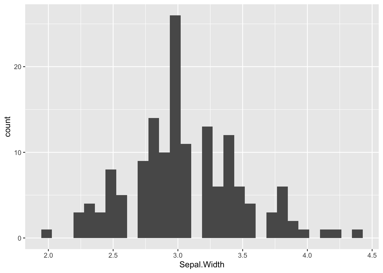
The default value of the number of bins is 30, which are too much bins for this variable. So we have set bins=15. Let’s use labs to set the name of axis and give the plot a title:
ggplot(iris_tibble, aes(Sepal.Width)) +
  geom_histogram(bins=15) +
  labs(title="Distribution of sepal width", x="sepal width", y = "count")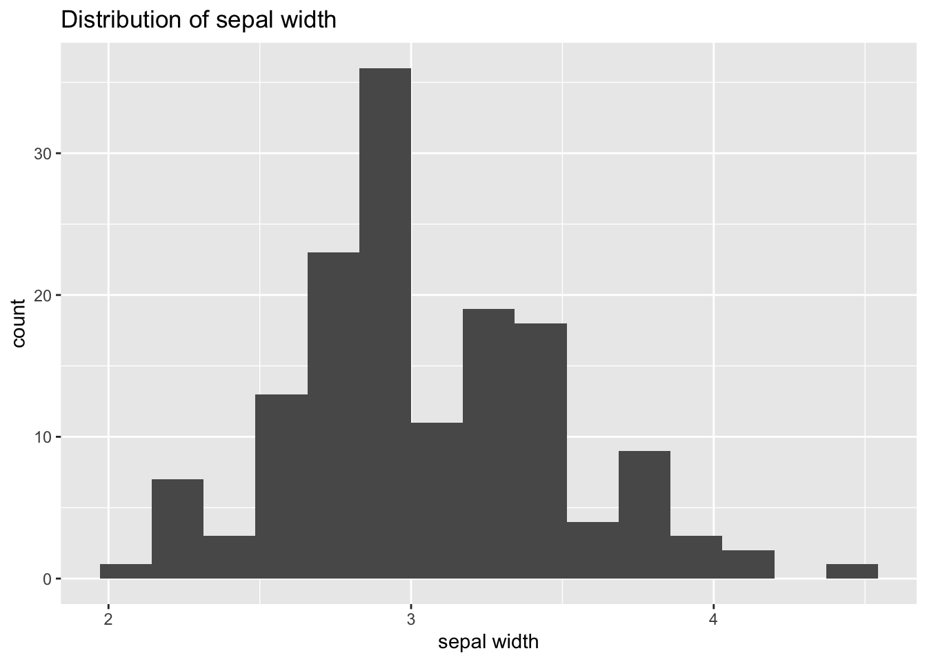
A bivariate plot
Let’s now do a scatterplot to examine the relationship between sepal width and sepal length. Now the aesthetic will be aes(Sepal.Length, Sepal.Width) (ggplot is learning that there are continuous variables in both axis) and as we want a point for each observation we will use geom_point(). We’ll also add title and axis with lab.
ggplot(iris_tibble, aes(Sepal.Length, Sepal.Width)) +
  geom_point() +
  labs(title = "Sepal length versus sepal width", x = "sepal length", y = "sepal width")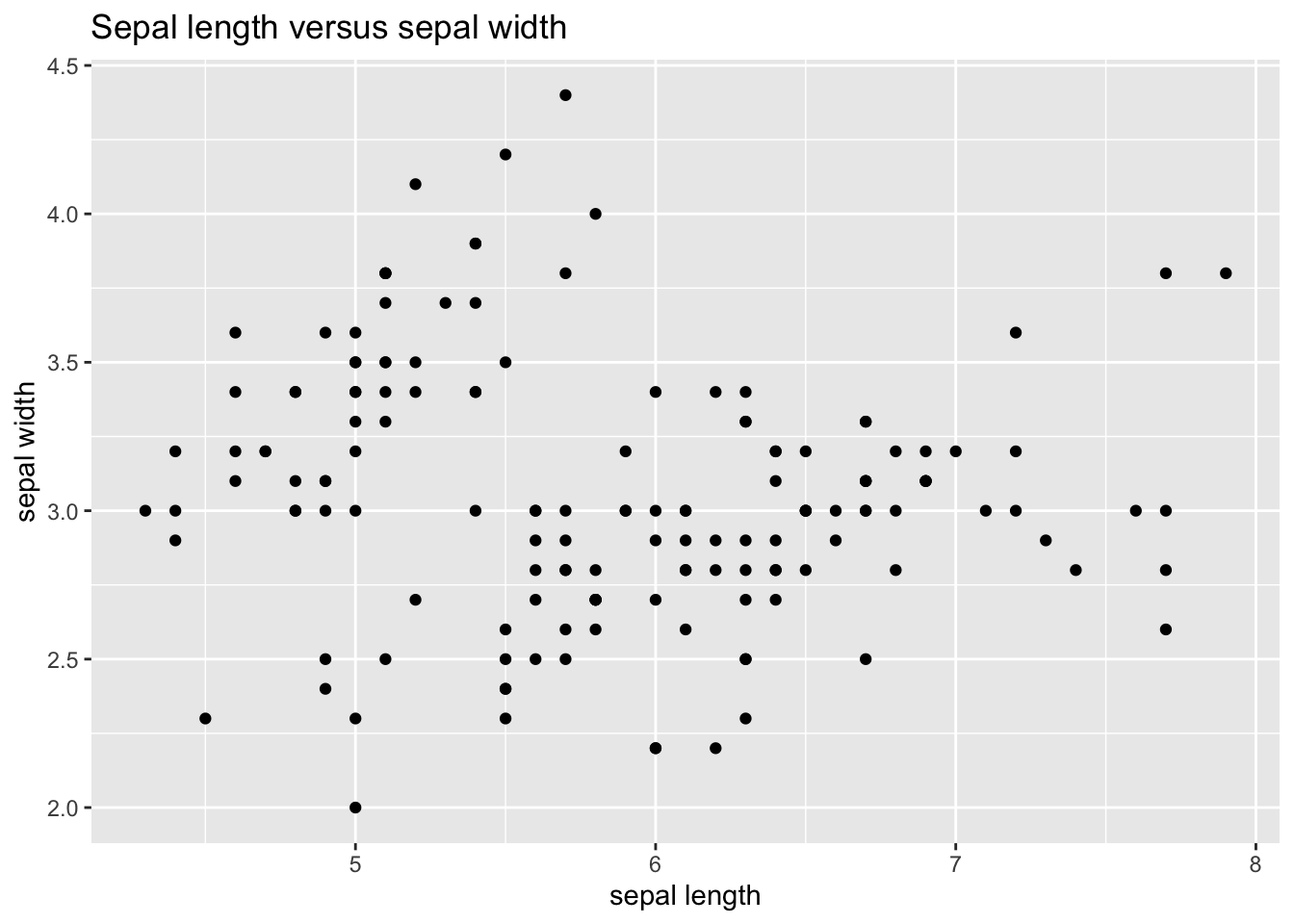
Let’s try know to see if there are any differences between Species. To do so, we’ll assign a different color to each point depending of its species. We can do that by defining:
- a specific aesthetic for the points:
geom_point(aes(color=Species)), - redefining the aesthetic for the whole plot:
ggplot(iris_tibble, aes(Sepal.Length, Sepal.Width, color=Species)).
Note that here we are not specifying the actual colors to plot: we are assigning a different color to each observation according to its species. We’ll see that ggplot will assign a default color to each species, and add a legend that allows us to distinguish the Species of each observation.
ggplot(iris_tibble, aes(Sepal.Length, Sepal.Width, color=Species)) +
  geom_point() +
  labs(title = "Sepal length versus sepal width", x = "sepal length", y = "sepal width")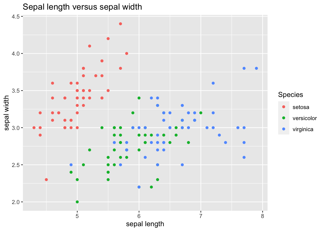
Here we see that the setosa species is quite different from the other two species.
An alternative way of seeing this is by making a plot for each species using facet_grid():
ggplot(iris_tibble, aes(Sepal.Length, Sepal.Width)) +
  geom_point() +
  facet_grid(. ~ Species) +
  labs(title = "Sepal length versus sepal width", x = "sepal length", y = "sepal width")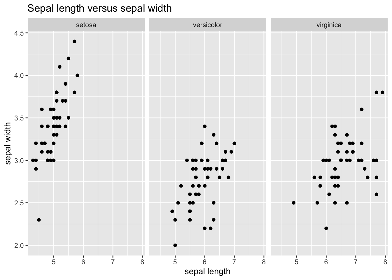
This has been a very basic introduction to what ggplot can do. In forthcoming ggplot-related posts we’ll see:
- how to customize colors, shapes and legends with scales,
- how to define themes to customize the appearance of your plot,
- how to use other geoms.
References
Wickham, H.; Grolemund, G. R for Data Science. https://r4ds.had.co.nz/
Wickham, H.; Navarro, D.; Pedersen, T. L. ggplot2: Elegant Graphics for Data Analysis. https://ggplot2-book.org/
Wilkinson, L. (2005). The Grammar of Graphics. Springer. Statistics and computing series. https://www.springer.com/gp/book/9780387245447